Rebranding Playboy

Playboy
A little while ago, I wrote about my current class assignment to reinvigorate a brand that is “dead, dying or defunct”. As we are nearing the semester’s end next month, I thought it would be a good time to begin describing the process of this project. The final deliverable is a book, in which we describe the history of our chosen brand (and why it’s time for a update), outline the new identity guidelines (visual standards manuals, usage considerations etc), and show potential extensions (mock ups of storefronts, products, etc). For this process post I’ll describe my brand choice and eventual logo development.
(project permalink on my site)

When I wrote the first article, I was considering No Fear as my primary option. With such a versatile name, I figured I could take the brand in a number of different directions. However, as much fun as it would have been to revisit the dominant clothing of my middle school years (along with LA Lights), I was concerned that the project would not really extend anywhere beyond a basic brand overhaul (new logo, visuals, products, etc). I saw little opportunity for humor or much conceptual work, and I opted to move in a different direction.

I decided to rebrand Playboy — a brand that many might say is arguably not dead, dying or defunct. Like many magazines, they actually are “dying” (financially), but for my project I focused on the decay of the overall perception of the brand. The graph below displays how I feel the brand has progressed in a more abstract fashion. Basically, these days, I would say most people would be embarrassed to say they read Playboy. A baseless assumption perhaps, but when was the last time you saw someone reading Playboy in public?

To keep up with the increasing trashiness of the American Men’s magazine, Playboy has been forced to reposition itself as “one of the boys” as it were, and is now indistinguishable from the Maxim’s of the world. Rather than hold on to the sophisticated standards of their early years, Playboy has come to embrace its unfortunately crude place in the magazine world. This evolution (rather, devolution) is tragic and the original soul of the brand has been lost. Maybe not “dead, dying or defunct”, but Playboy has certainly lost something along the way. I saw an opportunity to bring some of the original classiness and sophistication back with a drastic repositioning…

Continue reading “Rebranding Playboy”

Graph
(more…)

Greg Davis+Legowelt+Actress+Animal Co.

Greg Davis
Recently one of the most relaxing songs i’ve been listening to is by Greg Davis, its 22 minutes of soft drone, it doesn’t give you much but also never asks for your attention, its very calming and glides out perfectly at the end.

I’ve been waiting for a new Legowelt EP since his release of Nacho Patrol, this track Day Sailor grabbed me right away, we don’t get this kind of atmospheric synth pop anymore I really missed it. HIGHLY RECOMMENDED

People shouldn’t confuse Minimal and Minimalist in this day in age, Minimal is a dying form of techno made by guys that isn’t meant for dancing but more about how much you can cut up a techno song and then use glimpses of sounds you find around the house while Minimalist is more of a classic sound that is timeless, raw and always a treat to listen to if you get talents like Terrence Dixon, Derrick May or in this case up and comer Actress to unveil something new that sounds old which in this case is a great thing.

Animal Collective has a new EP coming out next month and one of the big buzz songs is a rerelease of What Would I Want Sky which was just a BBC Session track in the past. The song consists of swirling noise and organized chaos which I think is Animal Collective’s strong suit and followed with looped vox to make it indie rock approved.

Greg Davis – Hall of Pure Bliss

[audio:purebliss.mp3]

Legowelt – Day Sailor

[audio:daysail.mp3]

Actress – Ghost Have A Heaven

[audio:gheaven.mp3]

Animal Collective – What Would I Want Sky (BBC Session)

[audio:skyanimal.mp3]

Rimowa Salsa Camper Edition

camper-rimowa-salsa-series-1
camper-rimowa-salsa-series-2
camper-rimowa-salsa-series-3
camper-rimowa-salsa-series-4
camper-rimowa-salsa-series-5
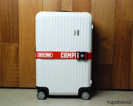
I’m always looking for ways to make traveling easier; it’s a chore lugging heavy gear around airports and trying to scam your way onto planes with oversized, overweight “carry-ons” to avoid checked overage fees. I currently use a custom ATA flight case — which I check — for carrying prints, and an SKB 3I-2011 carry-on for music equipment. I really like the SKB but it’s just a little smaller than I need it to be and sort of cumbersome to wheel around.

Over the years I keep seeing the 4 wheeled roller suitcases here and there — particularly in Tokyo where it seemed like everyone had them. The 4 wheel concept seems great for getting around the apparently the cases are very light (and strong), leaving plenty of overhead to make it under the magic 50 lb. check barrier. On my recent trip to Toronto I finally was able to catch the brand name of one of the nicer ones I’ve seen, the German-man Rimowa. I jotted it down and did a search when I got home. The more I looked into these cases the more I was amazed at the build quality and aesthetics. Unfortunately they’re ridiculously expensive — $1000 for the carry-on model I want — so I’ll be sticking with my humble SKB for the time being.

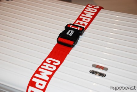
During my search I came across this post on Hypebeast about the limted edition (30!) Camper Rimowa Salsa and was in severe gear-lust mode to say the least. This thing is beautiful, fully appointed with custom strap and everything.

Rimowa also happens to have a pretty interesting Flash-based site (which weighs just about as heavily on your bandwidth as their products do on your wallet). I rarely find Flash-based manufacturer sites like this of any use (in fact I loathe them most of the time, opting to browse via HTML on a retailer’s site instead) but Rimowa’s is pretty slick and actually rather functional. Seeing the models standing by the cases is a clever way to quickly gauge their relative sizes.

You’ll find some more interesting shots of various Rimowas here.

Thank You Toronto

ISO50-F13-Gallery-1
ISO50-F13-Gallery-2
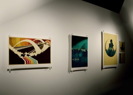
It was a pleasure as always to visit Toronto, I really appreciate everyone who came out to the Function 13 gallery and the show afterward at Nocturne, I had a great time at both. Unfortunately I didn’t bring my camera (it’s a long story, but some last minute baggage issues didn’t leave room) so I don’t have many pics from the night. Luckily, Sean Pollock from The Buzzout Room (a great radio station by the way, you can stream it here) brought along his Canon 5D MK2 and got a couple shots of the gallery (shown above).

A couple others brought out their cameras — among them Bram Timmer who also has a 5D MK2, I was pretty jealous — so I’ll try to get some shots from them and post up a full set of the gallery. If anyone has some decent shots let me know.

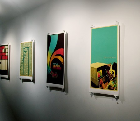
As you can see I went with the bulldog clips for mounting the prints. Thanks to everyone for the great suggestions in the original gallery post. I experimented with neodymium magnets but had some issues with grip, the posters kept slipping from between them. I ended up spray painting bulldog clips white and hanging them over long, thin nails so that the piece stood off the wall a little. There is a strip of 2″ tall foamcore that runs the width of the print clipped behind each at the top and bottom. This helped straighten everything out and give a “mounted” feel without the need to damage the back print. I was really pleased with the results, under the gallery lighting the whole thing really came off dramatic. The lack of a frame and the inch between the wall and the print really made the piece feel more accessible and hilighted the texture and feel of the Hahnemühle German Etching paper. Thanks again to the guys from Function 13 for helping out with everything.

If you missed the gallery opening night you can still catch the show, it will be up until mid-January at Function 13 Gallery, 156 Augusta Ave Toronto. If you were there and missed out on getting a piece before it sold, some of the designs can be had at the ISO50 Studio Shop or the ISO50 Merchline Shop.

Thanks again, see you all again in April at FITC Toronto.

ISO50 Gallery+Tycho Live Tonight in TO.

av-noc-2
I made it in to Toronto tonight, pretty easy day of travel. Unfortunately there’s a little bit of rain but I hear it will let up by tomorrow evening. I went over to Function 13 Gallery tonight to get started setting things up, I’ll be hanging all the artwork for the ISO50 show tomorrow.

The gallery show will feature a lot of new work along with some old stuff. I ended up going back and reworking everything, pulling out the text and just leaving the artwork. It was a pretty fun process stripping things down to their core elements, it’s always a nice test to see which images stand on their own without the accompanying type. A couple posters — such as 1971 and Madrone — couldn’t do without the type so I just tried stripping out some other extraneous elements. Going back through some of the older files was pretty surprising, it was interesting to see how much my technique has changed over the years. Some were just a mess, it felt like restoring an old house removing all the heavy handed distressing and randomly placed elements. It was great to see the results, I feel like the core concepts of a lot of the pieces can breathe a lot better now.

I’ve also got some new stuff in store for the live Tycho set; a few new songs, some remixes, and reworked live visuals. It’s been pretty stressful over the past week getting ready for this but it all came together over the past few days so now I’m just excited to get it all out there. Hope to see you out tonight. Click the links below for more info.

Also, if you enjoy all the music posted on this blog (which is pretty much all Jakub), then you will enjoy Jakub’s DJ set tonight. He’ll be playing as his DJ alter-ego Aarnio tonight at the show.

» Scott Hansen / ISO50 Solo Show @ Function 13 Gallery, Toronto
» Tycho Live – ISO50 Gallery Afterparty @ Nocturne, Toronto

Shiny Suds (Ad)

shinysuds
httpvhd://www.youtube.com/watch?v=C_g2vTFert4
It’s not often I’m very impressed by a commercial but this spot by Droga5 and Method really got me. Super clever, funny, and effective.

Video Link

Cristina Couceiro for NYT

img108
img109
img110
I was reading the New York Times this weekend and was pleasantly surprised to see the work of Cristina Couceiro as part of one of the magazine articles. I recognized her distinctive style from when Scott posted her work a little while back. In the capacity of the magazine article, it was interesting to see how the use contemporary imagery changed the overall impression of her work. I think it was successful — it brings context, and an slight twinge of humor to the work that wasn’t present in some of the earlier ‘found imagery’ pieces. Something about Steve Carrel especially just works for me…maybe it’s that ridiculous shirt he’s wearing.

This is probably the third time recently I’ve randomly stumbled upon the work of an artist I recognize in a magazine; I saw Leandro Castelao in a recent issue of GOOD, Mark Weaver in Wired, and someone else I’m forgetting now. It’s great to see how their work translates into an editorial environment. And great to see that magazines are supporting the amazing talent of all these artists!

J.Molina + B.House + F.Rabbit + R.Estate

Juana Molina
Here are 4 bands that I think really bring something special to the indie rock table, bands that are pushing the envelope on sound and their passions reaching for something different.

Juana Molina makes me want to dig thru the world music crates and pick her brain, the drive in her voice in this song could make 101 yr old man stand up and dance, I need to see this song being played live, my jaw would probably hit the floor.

What can you say its a new Beach House single that just leaked and the indie world is fumbling over itself to get a listen and I have to say its pretty impressive, catchy and i’d like to throw out this genre idea – woodgaze [woodsy shoegaze], yes or no?

After Pitchfork’s Festival all I heard about was how outstanding Frightened Rabbit sounded live, this is my first taste of something that I like by them on CD, wow a collection of songs[this plus the other 3 songs and some shoegaze and maybe Red House Painters and thats really it, and The Police too] that actually make me want to listen to lyrics, its such a nice feeling.

I have to give it to Tom Croose, he called Real Estate being great in the spring and now look at us all, I have to go back to how I visually described it back in August: “to me its laid back feel makes me want to bust out the Yo La Tengo’s Summer Sun LP but i’m too busy chillin’ in my kids pool filled with hose water that is being warmed by the sun and I have grass blades stuck all over me that i’m trying to pick off, so lets just keep the Real Estate CD in.”

Juana Molina – Un DiÌa

[audio:und.mp3]

Beach House – Norway

[audio:norway.mp3]

Frightened Rabbit – Fun Stuff

[audio:funs.mp3]

Real Estate – Let’s Rock The Beach

[audio:rockbeach.mp3]

Synth Pioneers Pt.4: Synth-Pop

Screen shot 2009-11-18 at 2.59.25 AM
httpv://www.youtube.com/watch?v=WeVRYPjcVXg

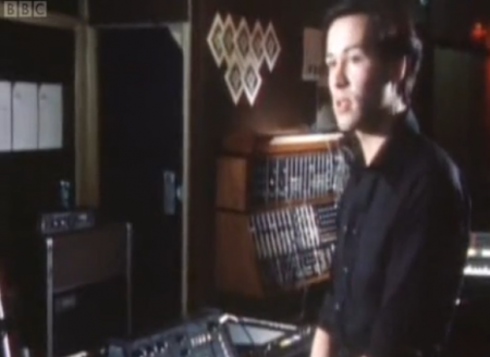
My friend Eli (who needs to do an Italo Disco installment of Synth Pioneers) put me onto this documentary, which is likely the best exploration of the English synth-pop moment. With great interviews from heroes like Daniel Miller, Vince Clark and Martin Gore, it really got my blood pumping so I wanted to write about a few other acts who were originators of the international electronic pop sound.

Kraftwerk – Computer Love

[audio:computerlove.mp3]

Talking about the greatness of Kraftwerk is like talking about the necessity of air, so I’ll keep it short. They just released all of their most well-known albums, remastered and with original artwork. “Computer Love” is one of my al time favorite songs. The way the lead seems to phase shift at the end always takes my breath away. Let’s get this straight: A song about loneliness and computers, made before the internet was invented which glides like classical music? Sounds like a plan.

Yellow Magic Orchestra – Technopolis

[audio:technopolis.mp3]

Yellow Magic Orchestra have been called the Japanese Kraftwerk, in that they were both pop innovators and an awesomely stoic synth band. Ryuichi Sakamoto has since gone on to collaborate with Fennesz and Christopher Willits amongst others. Their work may pre-date synth-pop but it’s surely in the canon of influential works. I often play their hit “Computer Games” if transitioning between sounds in a DJ set. When the beat drops at 1:50, it always lights up the room.

Japan – Gentlemen Take Polaroids

[audio:gentlementakepolaroids.mp3]

A band that is sorely overlooked is David Sylvian’s Japan project, which married glam and (some would say, invented) new romantic aesthetics to synth austerity and elegant arrangements. Their full sound was more complex than their peers and more sinister by a long shot. Recently, Sylvian has also collaborated with aritsts like Fennesz and covered acts like Blonde Redhead with stunning vocal clarity.

Simple Minds – Glittering Prize

[audio:glitteringprize.mp3]

Scotland’s Simple Minds were another band not included in this documentary, probably because they are more associated with the New Wave movement, but like labelmates the Human League, they’re example of a band moving from experimental work to pop success. Their work became increasing U2-like and less electronic, but this track captures them at the peak of a rewardingly sweeping sound, with pitch-perfect production to boot.

Parts 1, 2, and 3 of the Synth Pioneers series can be found here.

JOYN:VISCOM Workshop: Natural World

2009.4.30_16.48.20_7617
2009.4.30_17.17.16_1182
2009.4.30_17.14.20_9698
2009.4.30_17.15.53_4306
2009.4.29_17.55.44_8905

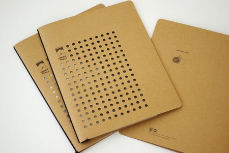
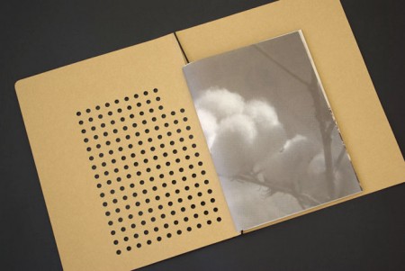
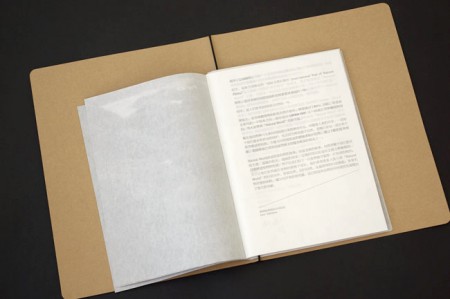
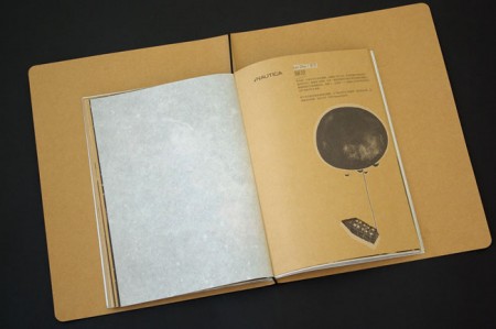
Absolutely beautiful work from Beijing-based JOYN:VISCOM Workshop. Loving the die-cuts and texture, would love a notebook that looked like this.

Via the excellent Graphic Exchange