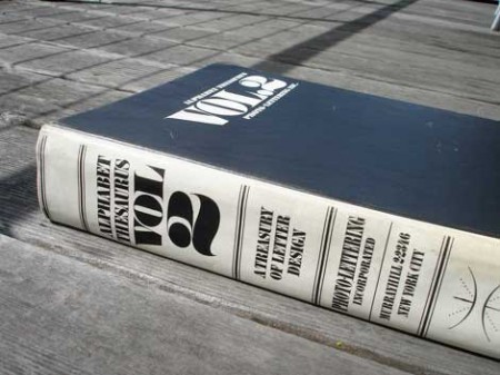
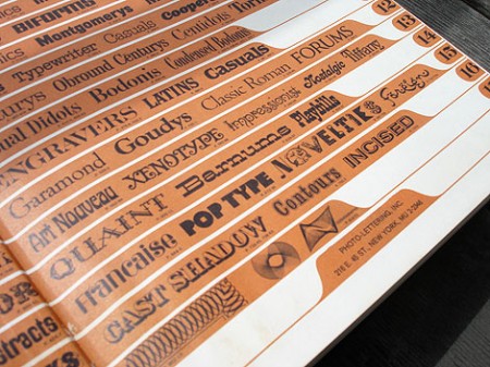
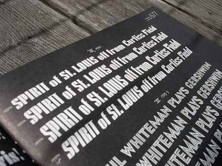
Grain Edit has a great post on the upcoming Photo Lettering Site from House Industries. When I first saw the headline for the original post I was half hoping for some sort of digital way to achieve that awesome blurred edge style from old movie titles and magazines. Sadly, that wasn’t the case. But the reality was just about as good, a bunch of great until now defunct vintage typefaces. The Photo Lettering Site is not fully operational yet, but you can check out some posters featuring some of the fonts here.
Photo Lettering
Spacetime | Kitsune Noir x Poketo
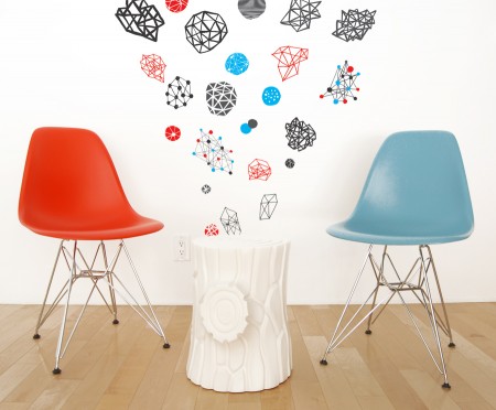
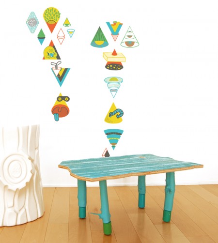
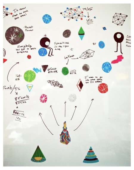
The Spacetime Collection is a set of whimsy outer outer space-themed wall decals co-curated by Kitsune Noir and Poketo. They enlisted a talented group of artists to design the collection; Mike Perry, Cody Hudson, Damien Correll, and Andy Miller. Each set is different, but the idea is to combine them to make any kind of wall galaxy that you want.
I spent my morning pasting up the decals and my galaxy is displayed above. This was extremely fun; just pasting things every which way and creating something wacky on the spot. Compared to my normal, highly regimented routine on the computer, this was a refreshing change of pace. I find that I do less and less work “offline” so to speak, and it’s great to spend some time creating without a mouse and keyboard (or design brief and deadline for that matter). My roommates were surprised to find our whiteboard transformed into a very unusual (and exciting) combination of space diagrams and whimisical illustrations. ‘Wonderfully weird’ we determined.
Information regarding the project can be found over at Kitsune Noir or the Poketo website.
The Streets + Homerun + OTT + RSD
This The Streets song came to me after Sam and I shared a few UK videos that we liked, the lyrics make me think about the times I use to be a silly worrywort in high school over girlfriends, ahh glad those feelings don’t come around anymore.
The Balearic sound is still ramping up into the rest of the world, slow disco seems to be creeping into the main stream even. iTunes has been in full support of Eskimo’s incredible Cosmic Balearic Beats series which volume 1 included this Homerun track that’s a full on epic bomb. I am still waiting for a song as gorgeous as this to make it to the masses, these instrumentals just have such thought out choices in synths and kicks compared all the studio club crap.
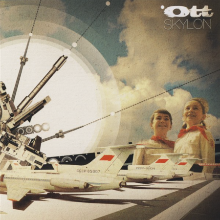
I actually found this cover art by OTT before I found the song. I can’t say i’m in full support of the song because of the vocal but that driving Telefon Tel Aviv low end synth keeps me from thinking about the bad vox, also a ton flute action for the flute fans out there.
UK’s Dub banger RSD puts out an extraordinary track called Good Energy, the beginning synth vividly remind me of ambulance’s in the EU in the 80’s and early 90’s and cold rainy days in UK/DE/PL, I can’t believe a simple dubstep track can give off such crazy exact memories.
[audio:blinded.mp3] [audio:homerun.mp3] [audio:sparks.mp3] [audio:rsd.mp3]Thanks Seattle
Big thanks to everyone who made it out Thursday for the Ghostly show in Seattle, we had a great time playing for you. Hope to see you all again soon.
By the way, did anyone catch that Mad Professor / Banga show at Nemos afterwards? Amazing, I couldn’t breathe from all that bass.
Photo by +Russ who also has some more shots of Decibel Fest up.
In Praise of a Typeface: United
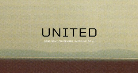
United by House Industries has been my go-to typeface over the last few semesters. It is a massive family — 105 total fonts (three styles, seven weights and five widths). This variety makes it an incredibly versatile collection. I really hate it when I find a typeface that I love, but find it missing a crucial weight or style. (DIN for example — would love to be able to wield more styles). United does not have this problem. I’ve used it on many projects (a few you know; ISO50 EP, Mega Cities book) and in each case the variety allowed it to be implemented in a unique and effective way.
I discovered it a long time ago while searching for the typeface used in a Nike ad (can’t recall which one, but it was amazing). I don’t actually remember if United was employed in the advert, but if you spend any amount of time searching around the typography of the sports world, you are bound to come across United at some point (Fox, I’m pretty sure, uses it for in game football graphics). There is an obvious resemblance of a few of the weights to a very collegiate look, which might be a turn off for some people, but the rest of the styles make up for this ten fold.
The most exciting part for me has always been the fact that each style has five different widths. I love condensed or extended widths and it’s nice to find a worthy competitor to the standards (Univers, Trade Gothic etc). When you need an extra touch of personality, especially if the project skews toward the technical or urban, United does the job nicely.
I don’t know many other designers (at least at school) that use it regularly and I thought I’d spread the word a little. Finding a new typeface is always pretty exciting, so hopefully if you haven’t tried United before, you can give it a shot and experience the sweetness. Anyone else have any hidden gems? I haven’t come across a new super typeface in a while — would love to hear about what people are unexpectedly enjoying these days.
Helvetica vs. Arial
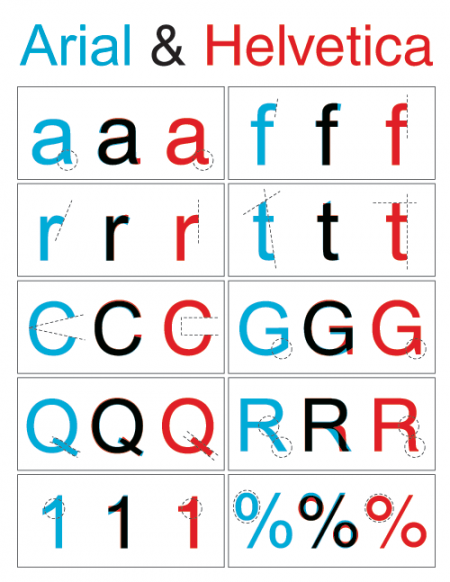
Nothing too involved here, just a simple diagram outlining the key differences between Arial and Helvetica. You can find the full alphabet overlayed here. Just in case you’re unfamiliar with the unique history these typefaces share, here’s an in-depth analysis. And here’s the battle mode.
Via Swissmiss, who’s workspace is way cleaner and more Helvetica-ish than mine:
Font or Typeface?
Alex and I were discussing this a while back so it was nice to see the whole subject wrapped up in a nice post over at Shelby White’s blog. Now you can annoy the hell out of all your non-designer friends by constantly correcting them when they use “font” incorrectly. Be sure to start off with “Actually…..”, people love that. I liked Nick Sherman’s take the best:
“The way I relate the difference between typeface and font to my students is by comparing them to songs and MP3s, respectively (or songs and CDs, if you prefer a physical metaphor).”
– Nick Sherman
For a while I thought font was sort of a dirty word, like it really didn’t have any proper usage when talking about design. Typeface still sounds better but it’s nice to know that font does have it’s own place in the world.
The Prisoner – 60’s British Spy TV

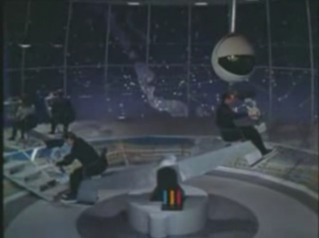
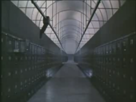
Sad to think that never again will we ever get to discover such a look and feel in a TV show, elegance and hi end style in the aesthetics won’t ever reach this level again, especially with what is on TV now.
The shameless side of Club Music – Part. 1
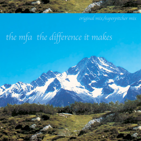
No matter how much you might hate certain kinds of music you can always find something that appeals to you unless you have a one track mind or prefer a safe and conservative lifestyle. So you’re definitely not looking for trance, you definitely don’t want what’s playing at Crunch gym, and your sick of what your friends are suggesting because the vocals make you uncomfortable or there are too many spare rolls or it gets too cheesy dreamy sounding. Maybe you just want one dancey anthem for the week, well i’m gonna do my best to help steer you in the right direction before you have a bad club remix of Pet Shop Boys on your hands.
Book Worship
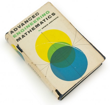
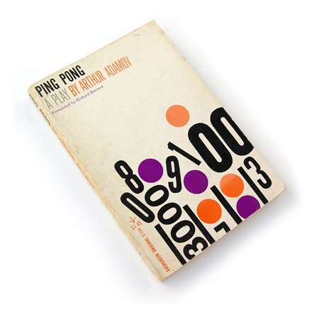
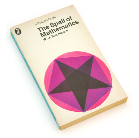
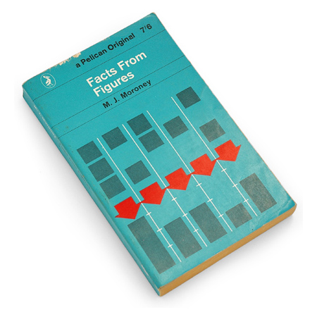
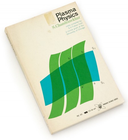
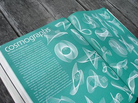
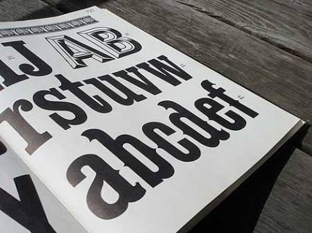
I’ve been enjoying the terrific blog Book Worship recently. The images above are some of the many beautiful books that Shawn Hazen has collected. As I’ve mentioned before, I have never had very good luck combing used bookstores in San Francisco — most of the cool stuff seems particularly adept at hiding from me (that or it’s long gone from the troves of other SF designers looking for the same things). Shawn, as you see, is much better at this than I. Definitely going to keep checking back often for more posts about these books he describes as “…graphically interesting, but otherwise uncollectible, books that entered and exited bookstores quietly in the 50s, 60s, and 70s.”
