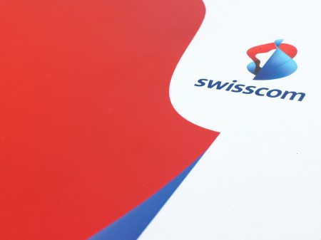
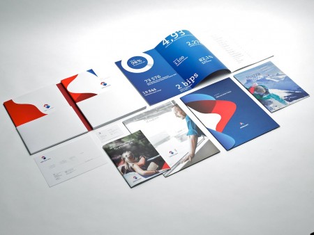
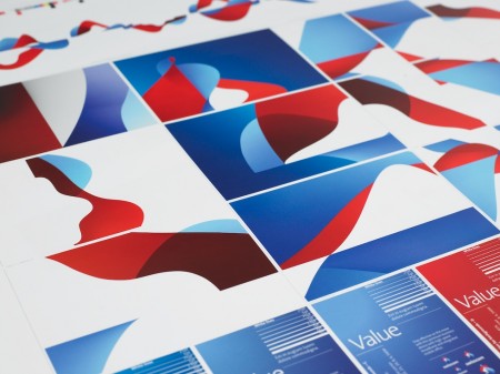
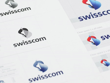
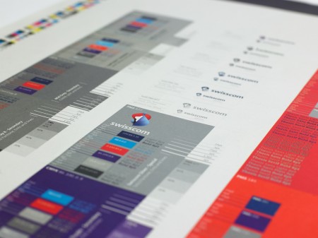
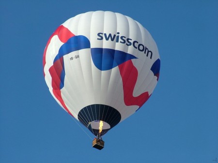
After writing last month’s post on the Swisscom rebrand film I stumbled across this page at Moving Brands’ site containing the images you see above. I have to admit that it cast the project in a whole new light for me. I still can’t say I’m a fan of the core logomark in all it’s gradient-clad glory, but on a large scale across various formats I think the branding system is very strong. I’m really enjoying how the logomark works in 1 color mode, looks sharp and far more focused. At any rate, I just thought these photos were great and really capture a nice aesthetic that I hadn’t fully appreciated the first time around. And of course the hot air balloon seals the deal. There’s something about well designed hot air balloons and sails; that’s about as good as it gets. Swisscom should all pitch in on a yacht and make a badass sail with the logo on it and they could all wear these.
I noticed some people weren’t too keen on the logo when I last posted on it, do these images change your mind? Let us know in the comments
