ISO50 Color Management: Tomorrow

iso50-color-soonb
Those who have been following along will know that we’ve been talking about doing a color management guide for a while now. Well, it’s finally done and should go up early tomorrow morning. I’ve always been annoyed that there really aren’t any consolidated, plain-english resources out there for getting your head around color management so after talking with Alex, we thought it was time to put our own together. Over the past couple years I’ve begun to focus more and more on proper color management in my workflow and with the recent addition of the Epson 9900 it’s become even more important. After Alex and I worked through the the process of getting the 9900 online I figured it was finally time to put all that we had learned into a post as a reference point for others who are struggling with maintaining color integrity in their work.

We put this guide together because whether you are designing for print or web, it is important to have a good understanding of color management to ensure that your image looks the way you intended it once it leaves the confines of your computer. After considering the many factors that go into this process, Alex has written a comprehensive guide to color managing your documents from concept to finished product. We certainly aren’t billing this as the definitive manual for color management; it’s intended to be a working guide, a condensed set of essentials based on our own experiences working with various printing companies and our own equipment over the years. To help with the finer points, we enlisted color expert Kirk Economos of Meridian Cyber who has helped edit the guide to make sure everything is correct and in line with accepted industry practice.

So stay tuned, you should see the guide pop up here shortly.

Design Magazine Overview

magazine spines
As much as I love my Google Reader, I still prefer to get my design fix in printed form. In addition to providing the necessary dose of inspiration, magazines usually include insightful commentary and design criticism. I love this sort of writing on design and it seems like the best place to find it is still in the “unplugged” land of printed media. Additionally, with each one you get an actual piece of design to hold in your hand. It’s easy to forget how cool this is if you’re used to bouncing from blog to blog. After the jump, I’ve put together an overview of a the major players in the design magazine realm. Check out the list!

(more…)

Adobe Inspire #5: Julius Shulman


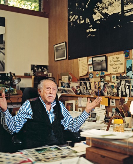
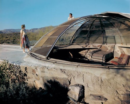
My fifth and final post as guest blogger for Adobe Inspire is up. In this installment I talk about the godfather of architectural photography, Julius Shulman. Read the full article here.

I just wanted to say thanks to Adobe for having me and to everyone for checking out the articles this week. I had a great time writing for Inspire, be sure to keep an eye out next week for guest blogger Joshua Davis.

And now for a few selections that didn’t make the Inspire post:

koenig2106dailyicon
0433-30K
3875-11K
0043-16
0853-03KP

Coma+DJ Koze+Kohncke+The Field

Kompakt TOTAL 10
We follow a lot of Kompakt on the blog, they actually have been a big influence on the Moodgadget label as in having a Pop Ambient compilation series, Michael Mayer’s IMMER mix series and the classic TOTAL series. I picked 4 tracks that I think really stand out for me while giving it a good listen. This Coma track been perfect for these middle of the night insomnia sessions i’ve been having, a ton of quiet drives that swell while you’re finally dozing off sounds lovely to me.

I’ve been trying to think of another album that samples tennis and nothing comes to mind besides this new DJ Koze track, kind of reminds of something Philip Sherburne would use in a mix to separate some 90’s shoegaze and the most recent Villalobos 12″.

Justus Köhncke should be in Sebastian Tellier’s position and greeting you at American Apparel with 7 inch vinyl and One Size see-thru tee shirts, Justus has been doing the sexy playful and distant slow dance music since I can remember. Dirk Leyers of Closer Musik does an outstanding edit here by taking the original to a 10 min mark.

Thomas Fehlmann of The Orb doesn’t receive enough credit for his work under his birth name, the man did a crazy record with Dabrye, a gorgeous album called Honig Pump, and now adds another class remix to his catalog for The Field.

Coma – Sum

[audio:ksum.mp3]

DJ Koze – 40 Love

[audio:klove.mp3]

The Field – The More I Do (Thomas Fehlmann Mix)

[audio:kmore.mp3]

Justus Köhncke – (It´s Gonna Be) Alright (Dirk Leyers Remix)

[audio:kgonna.mp3]

Adobe Inspire #4: Neil Krug

2880293318_eefefc4286_o
3268620546_98675d87f0_o
3375064180_060da07c77_o
3268592274_0707e95139_o
3186231697_bfc104971b_o
3345961466_a280df3df6_o

In my fourth post for Adobe Inspire I cover the master of retro-lofi photography, Neil Krug. Read the full article here.

This is part of a guest blogging series: Part 1, Part 2, Part 3.

Adobe Inspire #3: Timothy Saccenti

576
824
752
510

My latest post at Adobe’s Inspire Blog (where I’m guest blogging this week) is up. I focused on Photographer/Director Timothy Saccenti, who’s work you might recognize from some past posts.

Read the full article at Adobe Inspire

Underworld+Paul White+Hud Mo+Calvin H.

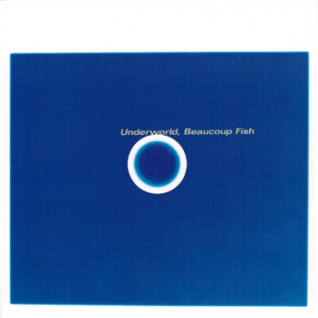
Underworld - Beaucoup Fish
Underworld’s Jumbo will always go down as one of those songs that no music snob should feel right making fun of because its just an overall beautiful classic song with one of the best samples in the intro with the old guys talking about vests OR they’re just kidding themselves and their bitter and on one of these levels:
A. They listened to Underworld Beaucoup Fish way longer than all of us and now hate it because they showed up late to the other music genre parties.
B. They had a great experience at Love Parade hearing it as a raver but some sweaty muscle dude walked by and just smeared body sweat across their face and every time they hear “Nice lil vest, light!” they can still smell that sweat on their face.
C. they have a bad collection of music with not much depth and are very critical and own a lot of R.E.M. CD’s that their hiding for no reason and are too embarrassed to even share high school photos of themselves on facebook.

I remember someone was so kind enough to turn me onto Paul White on the blog and I just tried to search the comments but no luck to give them any credit. Paul White is pretty similar to Bullion(by the way, Bullion and Pilooski killed it last night, super nice guy, had dinner with him and told him about the blog and he dropped this amazing track that Busta Rhymes sampled to make Dangerous that blew my mind) but with a more silly side to him, really love the tracks and just soo much fun to listen to but a little short but hey it makes me press rewind.

Been waiting for a new Hudson Mohawke song forever, this bad boy has been floating around all day yesterday on twitter and blogs, the good people at Warp are nailing it this year. Rising 5 has this Onra feel to it but the highs and instruments really make your eyebrows raise in a good way.

To be honest I never listened to Calvin Harris, you know how you just see a musician’s name around certain brands and promotion that you just never get around to hearing what they do because they’re tied in with just odd pop culture that you’d never feel like you would enjoy whatever the person is offering creatively? well thats how I feel about Calvin Harris BUT when this song picks up after the intro I really had to throw all that other crap out the window that’s tied to Calvin Harris in my head, all in all pretty great remix work here Mr. Harris, is the album good?

Underworld – Jumbo

[audio:jumbo.mp3]

Paul White – Cheese Special & A Draw

[audio:cheese.mp3]

Hudson Mohawke – Rising 5

[audio:rising5.mp3]

The Hours – See the Light (Calvin Harris Remix)

[audio:cthe.mp3]

Branding Strategy: Names

names
If you’re like me, you have piles and piles of notebooks filled with half-baked name ideas for firms, bands, and the like. When I was in college, I think I went through about 30 pages of (truly) terrible names before settling on something for my former band*. Basically I’ve never really perfected this technique. Whether it’s for a new band, new client, or my own (eventual) design studio, it is always a long and arduous process to think of the perfect name. (Herein lies the problem — looking for the “perfect” name is often the creativity killer for me.)

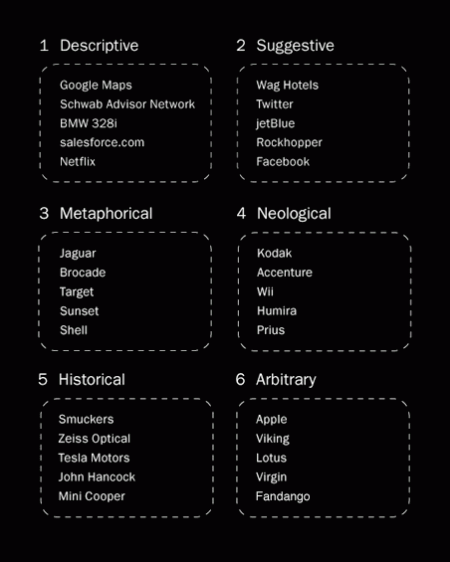
My process generally starts with a pencil, thesaurus, dictionary, and my iTunes playlist (pieces of song titles have served me well). It’s worked in the past, but for a recent project, I decided to try something new. I based my exploration off of Josh Levine’s useful chart that divides naming styles into six categories. You can see the chart above for examples and read the full descriptions here. I tried to go through the list three times, thinking of a potential name for each category on every rotation. What ended up happening was I thought of about 30 names in the metaphorical category, avoided the descriptive, and thought of one or two for each of the others. After about two hours I had my name, at the bottom of my metaphorical category list.

Of course, my normal process is not unlike this most recent one — but the added structure and formulaic approach really seemed to help me in this case. I just hope to be able to replicate it in the future. I would recommend giving this chart a try if you are looking for new brainstorming techniques. Just switching things up is really all you need to spark something cool. I’m sure everyone has their own strategies and I’d love to hear some if you’ve got them!

*Crazy story actually — the name I eventually decided on (Running Lights) was the same name my Mom had sent me in response to my plea for suggestions. We had thought of the exact same name, on the same day, without any direction or communication. I told this story to my band mates and that was that — how could we go with anything else!

Adobe Inspire #2: Kalle Gustafsson

_MG_2193
n-3
nc2b02
org_image_36251
img_39422

As I mentioned earlier, I’m guest blogging over at Adobe’s Inspire Blog this week. Today I talked about the work and process of one of my favorite photographers, Kalle Gustafsson. Read the entire article at Adobe Inspire

By the way, Kalle has a great new portfolio up with loads of new work to look at. You can check it out at www.kallegustafsson.com

ISO50 x Epson 9900

As Scott mentioned, the ISO50 studio recently added the hulking Epson 9900 to its arsenal. We purchased the printer through Kirk Economos of Meridian Cyber Solutions, and he was on hand to help us set things up and make sure everything was working properly. I filmed the set up procedure and a trimmed down version is displayed above. Many thanks to Kirk for helping out! If you are in the market for a large format machine or other print supplies, we would highly recommend the guys over at Meridian.

In case it doesn’t come across on screen, this is one serious machine. I’m used to working with the much smaller R2400 and there is really no comparison. It’s been pretty exciting to have the ability to output such massive prints with the 9900. We had a few color profile and paper issues initially, but everything is working smoothly now. Look for a detailed post about color management and calibration next week.