Ghostly International 10 Year Poster

ISO50---Ghostly-10YR
Update: If you’re looking to purchase the print it is now available here: studio.iso50.com

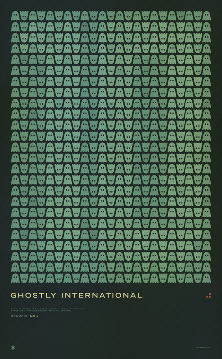
Ghostly International (the label I record for as Tycho) asked me to design a commemorative poster for their 10th anniversary concert series. This is the first print in a series I created for the events. The others will be released over the coming week with the flyer hopefully coming tomorrow. This print will be available soon as a limited edition large-format Giclee; pricing and availability will be announced next week. If you would like to reserve a print please contact studio [at] iso50 [dot] com.

The next poster will be the individual design for the upcoming Chicago 10 Year show where I’ll be playing a Tycho set along with Solvent, Kill Memory Crash, and Dark Party. More information is here.

This first poster lists all the Ghostly 10 year show cities:
San Francisco
Los Angeles
Detroit
Toronto
New York
Barcelona
Moscow
Berlin
Chicago
London
5D Fireworks

Canon 5D MKII capturing the NYC 4th show by Mike Kobal (24-70mm at 2.8 at ISO 2000). Once again, the MKII delivers amazing video quality. Still waiting for Nikon’s answer before I take the plunge though. There are some more 5D MKII video examples over at Kobal’s Blog.

By the way, did anybody else happen to catch the San Francisco fireworks “show”? This puts it to shame and then some. I’ve seen better displays at Dolores Park (before they started parking that mobile command station RV out there and ruining it for everyone).

Clark+Throbbing Gristle+Avey Tare+STL

Avey Tare
Clark comes off to me as someone thats passionate and confident every time I put one of his songs on. To be able to turn something in like this to Warp Records and asking them to put it out and it being so drastic and harsh at times is its own thing but making it sound this good on this other level is another.

Simon Ratcliffe of Basement Jaxx destroys this remix of Throbbing Gristle in the best way possible, such epic theatrical moments that remind me of the movie Bloodsport with Jean-Claude Van Damme when he’s fighting in the Kumite lol or this should of been the music to play along to when those drummers from the Chinese Olympics played in the opening ceremony, either or.

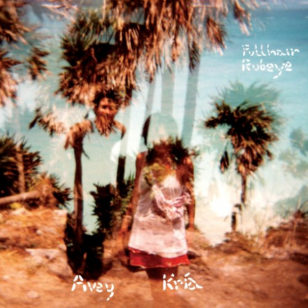
Avey Tare of Animal Collective put out solo project in 2007 and I found this piano experimental piece pretty enjoyable to say the least.

If I could be on a european label it would hands down be Smallville, its just a quality boutique label run by some of the guys from Dial Records. Smallville always puts out those songs that make me think what am I doing listening to anything else and thats usually just fueled purely on nostalgia of what got me hooked to deep melodic music.

Clark – Talis

[audio:talis.mp3]

Throbbing Gristle – Hot On The Heels Of Love (Ratcliffe Remix)

[audio:hotheels.mp3]

Avey Tare & Kría Brekkan – Was Onaip

[audio:was.mp3]

STL – Silent State

[audio:sst.mp3]

Leandro Castelao

tom_dixon
birds
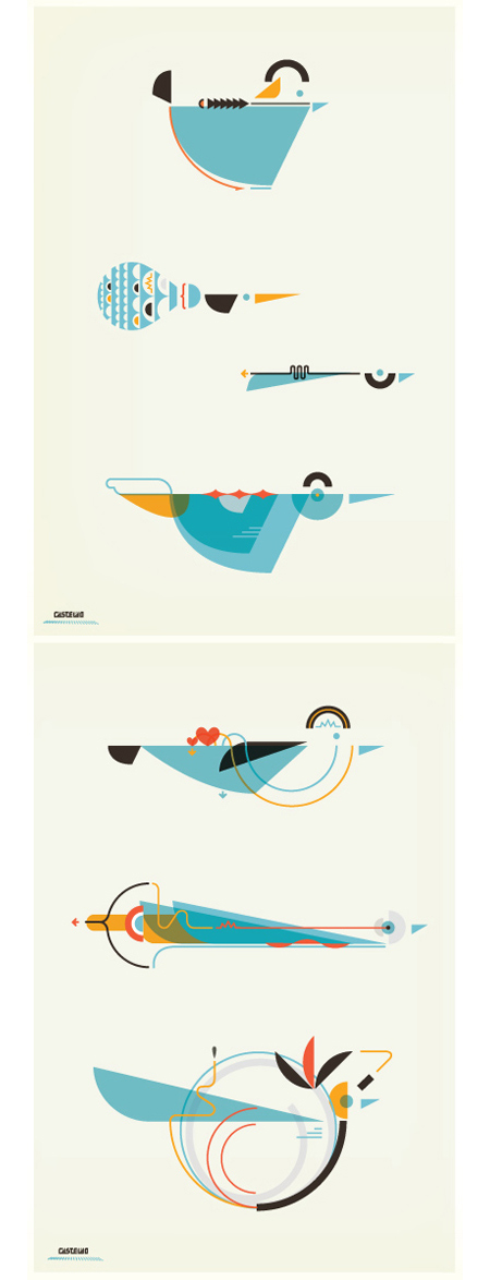
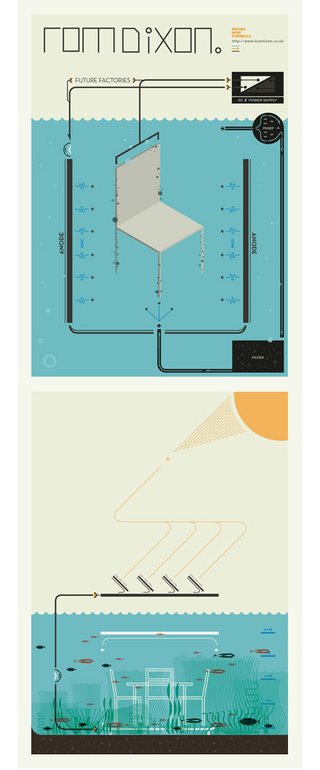
A few pieces by Argentinean illustrator Leandro Castelao. Terrific attention to detail and great color at work here. I feel like I’m looking at a retro instruction manual for some super bad ass birdhouse. Illustrations like this remind me of the work of Feric. Castelao’s are a little less intricate, but the playful/scientific aesthetic is reminiscent of some of the Fevolution renderings. Some impressive work from both artists.

Bodycode+Russell+Buckingham+Benga

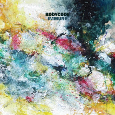
Bodycode - Immune
South Africa’s Alan Abrahams in my opinion makes the most authentic and unique tribal house, he takes you into the thickest brush on the back of a black panther and just drops you off to fend for yourself while being pretty much assaulted by pure body music, I really couldn’t ask for more of an intense musical experience.

Found these edits on this label called Galaxy at Turntable Lab, some great limited 12’s, recorded a few to MP3, enjoying this Arthur Russell one, i’ll post the Towa Tei one soon.

Saw Prince Language DJ a few weeks ago in Brooklyn with Tom Croose and he dropped an edit of this Lindsey Buckingham track as the last cut of the night, classic jam!

Alright here is some dubstep rowdiness, its on some other tip that my mind doesn’t understand but my ears love, maybe save it for the weekend? or just turn up your speakers as loud as possible. Woooooo the low end and that slow of a tempo just gets me everytime, just think submarine battles and helicopters indoors.

Bodycode – Meaning and Memory

[audio:meaning.mp3]

Arthur Russell – In The Light (Edit)

[audio:inthe.mp3]

Lindsey Buckingham – Trouble

[audio:trouble.mp3]

Benga – Buzzin’

[audio:buzzin.mp3]

Paper Embosser

iso50-emboss1
iso50-emboss2
iso50-emboss5
iso50-embosser
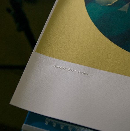
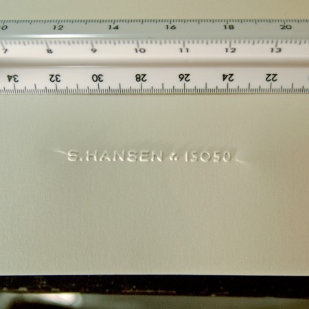
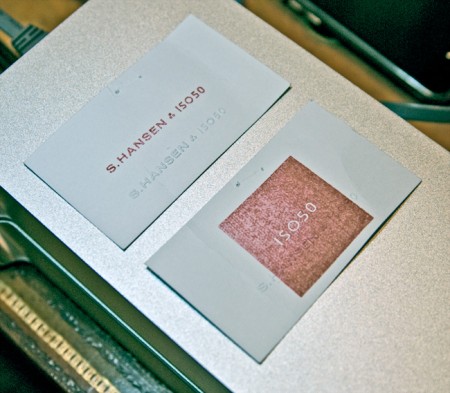
I’ve always loved official stamps and seals; as a kid I used my dad’s Civil Engineer’s certification stamp to make official looking paperwork and IDs for fun. I was looking for a way to add something like that to the upcoming Giclee line I’ve been working on but I rulled out rubber stamps as I wanted something a bit more subtle. So I recently started looking in to getting a paper embosser made with my signature logo. I was pretty surprised by how easy it was and how great the results are. The pictures don’t really do it justice, but you get the idea. The stamp can be embossed or debossed and it really adds a nice crafted touch to a project. It’s so fun I’ve started just embossing everything around the house; just cool to see the thing work.

The main cost is the press which runs about $200 (seems steep for what looks like a glorified stapler). The dies themselves — the circular part that hold the custom design — are included in this initial cost and are interchangeable. The only issue I’ve run into is with creasing at the edges. Depending on how you stamp it there will be moderate (first photo) to severe (second photo) creasing toward the edges. I am working with the vendor to fix this and depending on the technique I am able to minimize the effect. This may just be an artifact of this particular stamp as most are circular seal designs that fill the entire die, but I’m waiting until I can get it to be almost invisible. To be fair though, the flash is really exaggerating the effect in both shots, the creases really aren’t that noticeable in normal light.

Another fun — and far cheaper — alternative is rubber stamps (see third pic). I had a couple made by the same people and it’s been fun blasting those all over everything. But I was thinking the embosser in particular would be a really good buy for design students wanting to add a little extra something to their projects and also to mark their text books. It really has that old school real-world graphic design feel.

The unit pictured above is a heavy duty desk press from Made to Order Stamp and Seal out of New Mexico. We tried some local vendors initially, but the customer service of Made to Order was much better. They really work with you to determine the best option for your needs, and can turn around a custom job within a week. Highly recommended.

Milton Glaser Contest Winners

miltonposter-sig-450x538
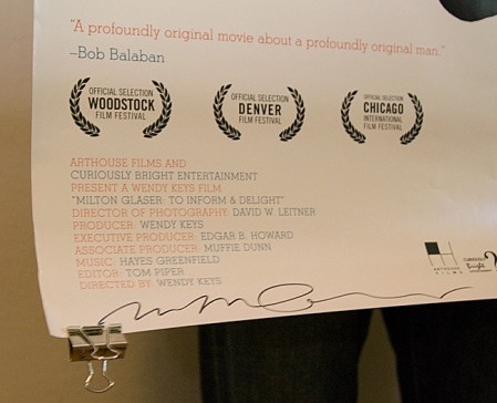
The Milton Glaser giveaway has come to a close! Here are the winners:

Grand Prize: David Bilodeau
Runner Up: Christian W

Congratulations guys! Your prizes are in the mail and should arrive within the next few days. As for everyone else, thanks for entering, it was great to see so many people excited about Glaser and the new film. We’ll be holding more contests and giveaways in the future, so if you didn’t win this time, keep an eye on the blog for more to come.

Radio Dept+Infiniti+Grand National+Lalo S.

The Radio Dept.
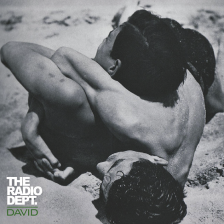
When I first heard this Radio Dept. song I thought I was hearing the beginning of White Town – Your Woman but that definitely wasn’t the case because I check out that song on youtube and they sound nothing alike, I guess thats how long its been since i’ve heard White Town. I really like this David song, it doesn’t follow any trends, the panning on the harp going by at a certain part made me laugh a little, the catchiness and instrumentation might not start a dance party but i’m sure if you played it for friends they would ask who it was.

Some people might not be into Juan Atkins(aka Infiniti), like right now i’m trying to pretend i’m hearing this song for the first time and i’m not from the Detroit area, alright wait okay mind blown at 1:08 & 2:06, i’m sold.

Grand National came along and were overshadowed by The Rapture, Interpol, and The National but if you have even one ounce of excitement when a good slower Indie Dance Rock comes along then this song will definitely give you goosebumps when the bassline drops in and when he says “I blame it on myself ‘cos i can’t keep anything down”.

I think the horns at the beginning of Lalo Schifrin’s were stolen by Who Wants To Be A Millionaire so Mr. Schifrin please collect your royalties on that but other than that the horns in the rest of this song are magnifique

The Radio Dept. – David

[audio:david.mp3]

Infiniti – Game One

[audio:game1.mp3]

Grand National – Talk Amongst Yourselves

[audio:amongst.mp3]

Lalo Schifrin – Bullitt, Main Title

[audio:bullt.mp3]

Film the Blanks

Picture 3
Picture 4
Picture 7
Picture 6
Picture 2
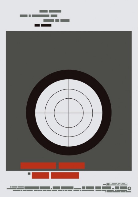
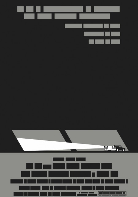
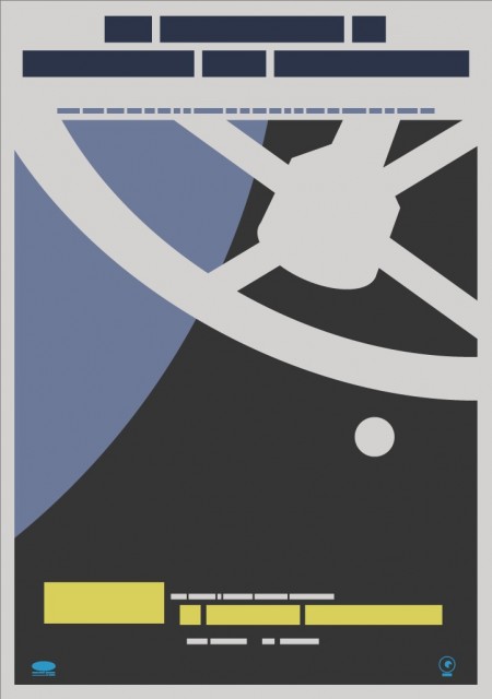
Film the Blanks is an ongoing design experiment that takes existing film posters and abstracts them down to their core elements. The project has garnered much press over the last few months, and I figured I’d post up some of my favorite pieces. I like the work because of the visuals, but there is also a strong participatory component that sets it apart. Each time a “blank” is uploaded to the site, users are invited to guess which film the abstraction represents. In some cases the solution is obvious, but it’s often remarkably difficult to discern which poster is hiding behind the blocks. Eventually clues are released and points are awarded to the successful guessers. It’s an exciting format for a design project; one that takes a strong concept, built around a fairly standard medium (poster), and twists it into something unique and engaging.

You can find all the posters in the Flickr set. You can also buy a few over at the Buy the Blanks store.

Ring Geigy for Service

img093
img096
img094
img095
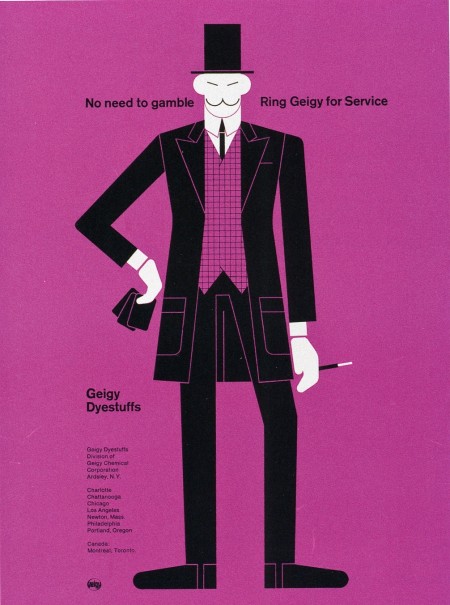
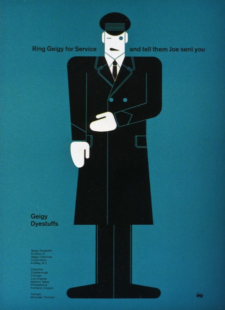
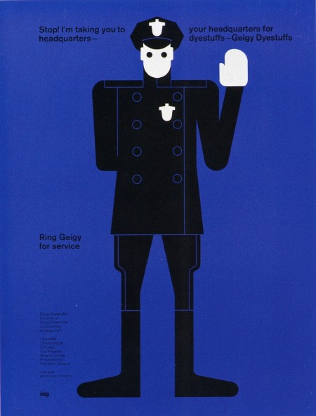
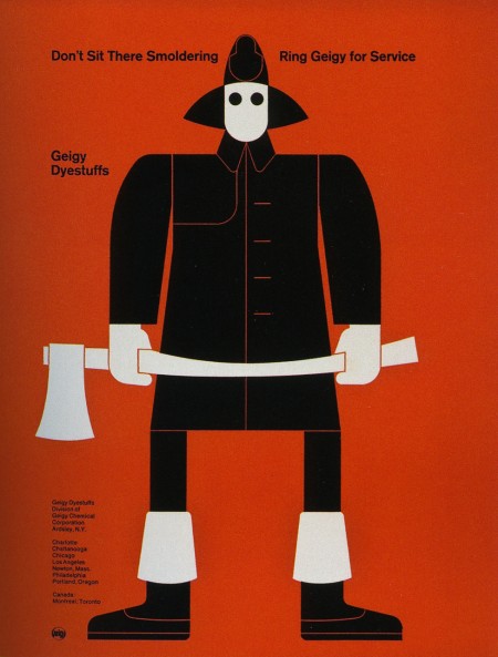
These advertisements are part of a Geigy campaign from 1965. They are all letterpress illustrations by Fred Troller. Each version pairs a striking figure with a related slogan and encourages you to “Ring Geigy for service.” I probably would have called these guys up even if I had no idea what “service” they could provide.

I like Winkreative’s identity for Porter Airlines for similar reasons. I wouldn’t stack one against the other by any means, but the use flat colors, stark figures, and limited perspective at least puts them in the same inspiration folder for me. (And the panda is awesome)