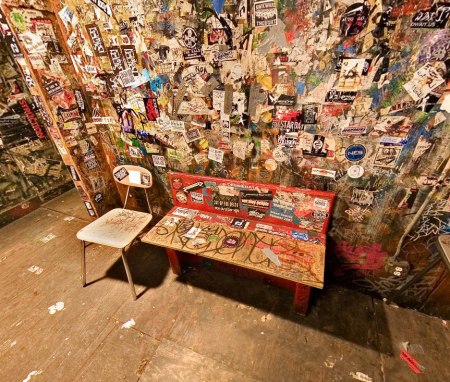

As you probably know, CBGB — the cradle of the NYC punk scene — was shut down in 2006. But not to worry, this site has got you covered with a 360° panoramic tour of the entire club photographed shortly before (or after?) it closed it’s doors forever. While this concept would surely make most of the bands who made the place famous roll over in their graves, it’s nice to know that the place is preserved in some form. The tour is solid as far as functionality is concerned (nice that it’s in Flash and not Quicktime VR) but the downright awful — and un-hideable — interface elements sort of detract from the experience. At any rate, the photos are high quality and you can zoom in and explore the very detailed shots of the interior and exterior of the club. Link
CBGB 360 Virtual Tour
Loworks Japan
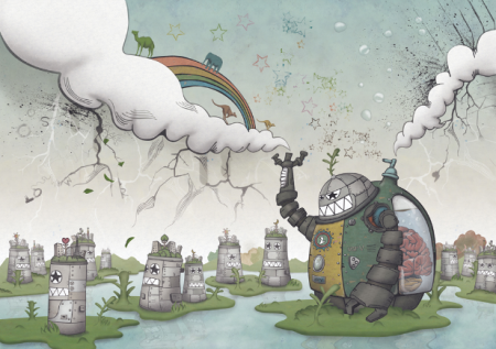

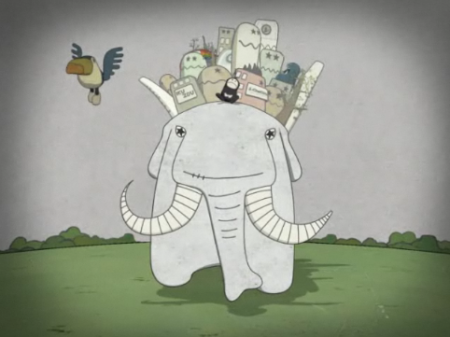

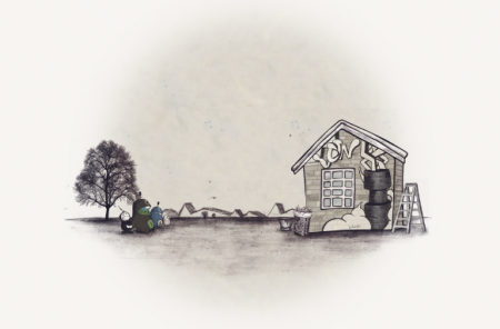
Loworks is a design company based in Japan. I’ve been on a wacky illustration kick recently, and it’s always fun to see what Loworks is up to. Their old site is one of my all time favorite website designs. It may not be the best design from an accessibility standpoint, but you can’t beat the creativity and absolute craziness at work. I wish it was still active, always made me happy. Computer Arts did a small feature on Loworks if you are interested.
Grizzly Bear+Choir+Sonic Youth+Joker

Excuse the abstract image but i’ve already posted about this album in March which featured Cheerleader so I thought something a little different might be a good change of pace because every blog has been writing about this Brooklyn band. I still haven’t dove into this album completely because of DEMF but if I heard Ready, Able I wouldn’t of posted Cheerleader or Two Weeks. Ready, Able has a slow waltz and Eddie sounds abit like Benoit Pioulard to me, you see now that’s a duet I wanna hear in 2009.
One of the best voices i’ve heard live since i’ve moved to Brooklyn is a no brainer, 24 year old, Danish, Greek and Indonesian Jannis Noya Makrigiannis gave me goosebumps. He stayed at my place for about a week, one of the nicest guys, dressed like a southern European Italian Vogue farmer and right off the bat you could tell the guy had a kind heart and when he performed he looked like he was made to perform music and sing.
Nothing wrong with just throwing in a random Sonic Youth song to ground us.
Okay so i’ve become a Dubstep junkie, don’t tell anyone. I’ve looked high and low for the most energetic yet slow moving and heavy hitting tracks. I really think this might take over the US finally in 2010. This Joker cut has elements of a Top 40 rap anthem but its soo chunky, 8 bit, and twisted, i’m sure my neighbors love it too.
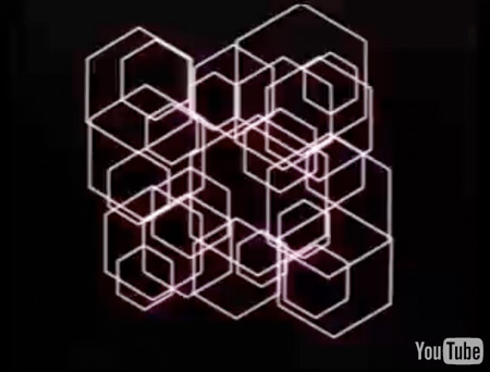
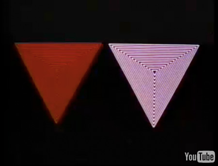
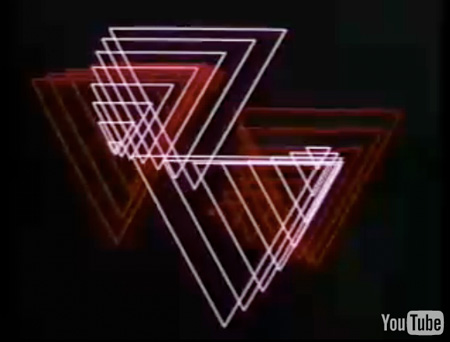
[audio:able.mp3] [audio:reaction.mp3] [audio:sprawl.mp3] [audio:joker.mp3]John Whitney’s 1972 Matrix III
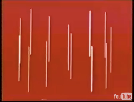
httpvh://www.youtube.com/watch?v=ZrKgyY5aDvA
Just got back from Toronto today, thanks to everyone who made it out last night, I had a lot of fun playing the Drake. While waiting at the airport I caught this great clip via Create Digital Motion. “As visualists, the sad truth is we have a poorer sense of the history of our medium than musicians. Part of this is simply a lack of access. YouTube is a weak substitute, but it’s a start.” Very true, it’s sad to think how many great works in video (and design for that matter) have been lost to time and obscurity. Hopefully more work like Matrix III slowly make their way into the digital domain. Via Create Digital Motion
Bibio+Deastro+City Center+Lindstrom
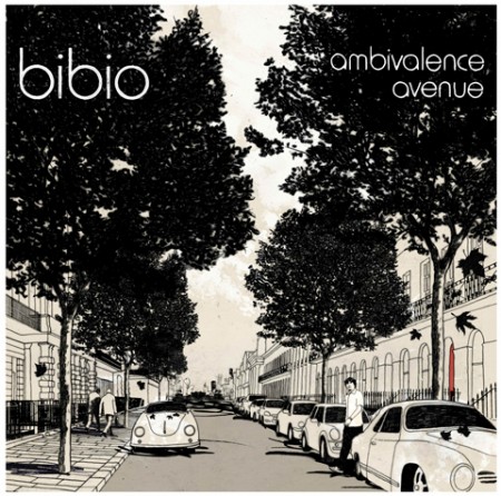
As you can tell i’m a huge fan of Bibio and his new direction isn’t too surprising but definitely a noticeable difference, it’s less lo-fi and sounds like he added some dubstep kicks to makes the whole overall sound more round. A 7 inch vinyl single will be coming out on Warp on June 8th with this song will drop before the LP, I look forward to hearing the B side and all the other songs, should be a great surprise.
Type Records grabbed up the distant serenading City Center and this new LP is full of echoed vocals and gentle guitar strumming, such good atmosphere and timing in all his music, it really helps me to relax.
Deastro is giving away a free EP called Grower, its all instrumental and almost sounds like he woke up in the middle of the night and had an amazing brainstorm for an EP and knocked it out in hours by finessing very similar sounds. Its an epic masterpiece at times and its super kind of him to just give it away for free like that.
Lindstrøm & Prins Thomas are back at it again, first off they make me feel like I should never touch a synthesizer because really they make it sound soo easy. This track takes me on this journey like i’m riding into space on an all silk loosely put together yacht and I have an epic plan and a long to do list of how to save the universe but i’ll doing it at 15 MPH and not worrying about how and when I do it though. Within a minute of just listening you might end up starring at your computer and just thinking who are these guys and how do we make sure they never stop making new music.
[audio:aa.mp3] [audio:whale.mp3] [audio:defri.mp3] [audio:rothaus.mp3]1000th Post Winners

It’s been a lot busier trip than I an anticipated so I just got around to picking the winners in the 1000th post giveaway. First off I just want to say thanks for all the kind words, the response was overwhelming and it’s nice to know you’re all enjoying the blog. Now on to the big winners:
1st Prize: Luci (lucizzle)
Runner Up: Rob (norby)
Runner Up: Bill (searrano)
I’ve emailed each of you, but if for some reason you don’t get it (try checking your spam folder) email me at talk [AT] iso50 [DOT] com. Thanks to everyone else for playing.
DEMF Finale: Seth Troxler Mix

With Detroit Electronic Music Festival over I needed to find a mix that summed how good it got at times and this recent Resident Advisor mix does a great job and I think some of you Tim and Eric fan might like the tracklist towards the end.
Seth Troxler has been the face of the new generation of DJs coming out the US that gets it because he has the depth when it comes to knowing new and old records, has the confidence to throw out that curve ball track to a full dance floor, and lives the lifestyle that many of us would just stare at and be floored that he can live thru it all by being able to DJ at 6pm or 5am or even noon the next day.
TRACKLIST
Home and Garden – Broken (Brennan Green (On The) Reprise) – Icon Recordings
Omar-S – I-Love-U-Alex – FXHE Records
Woolfy vs. Projections – The Return of Starlight – Permanent Vacation
Beat Happening – Our Secret – K
Chromatics –In The City – Italians Do It Better
Michael McDonald – I Keep Forgettin’– Warner
Talking Heads – Slippery People – Sire Records Company
Jimi Hendrix – Castles Made Of Sand – Polydor
Animal Collective – Prospect Hummer – FatCat Records
Cat Power – Can’t Get No Satisfaction – Matador
Louderbach – Autumn – M_nus<
David Bowie – Space Oddity – RCA Victor
Arthur Russell – Your Motion Says – Rough Trade
Marine Girls – 20,000 Leagues – Whaam! Records
Handsome Boy Modeling School – I’ve Been Thinking – Elektra
Home and Garden – Sexuality – Classic
Home and Garden – Broken (Brennan Green (On The) Reprise) – Icon Recordings
Tim and Eric – Universe – Adult Swim
The Pack – Vans – Jive
Factory Records Posters
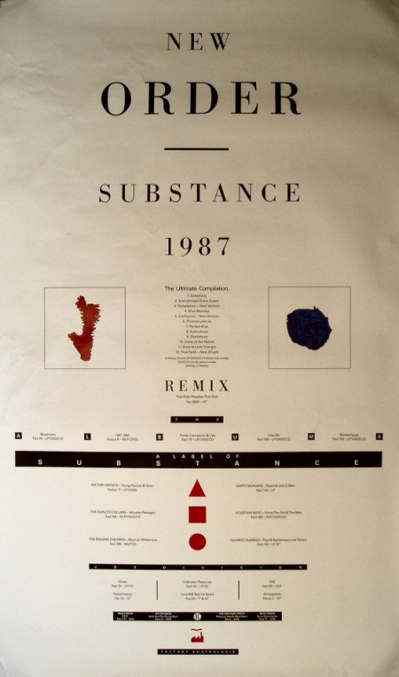
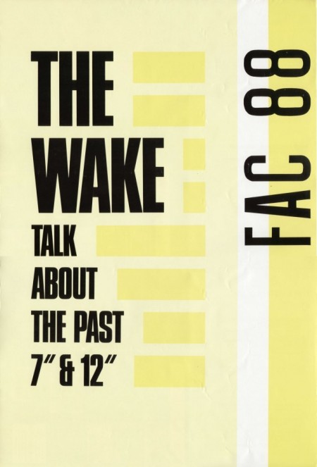
So we’re finally in Toronto for the final Ghostly show tomorrow. The Drake Hotel has put us up in the Artist Apartments next door which actually have internet, which has been a rare commodity on this trip. Sam and I were sitting here looking through his favorite saved images and he pulled up the Peter Saville designed New Order poster above. So nice, I looked it up and found this other FAC88 poster — reminds me a lot of this. The top one is all you Alex.
Toronto Set Times

We drove from Detroit to Ann Arbor (Ghostly’s home town) last night to sleep off the head trauma suffered at DEMF and get ready for the train ride to Toronto today. Can’t wait to play the Drake again, such a great venue, the three big screens really add to the visual side of things. Congrats to the ticket giveaway winners, check your inboxes, I just sent the confirmations. I also just got the set times for tomorrow night’s show, see you in Toronto!
SV4 8-9
Lusine 9-10
Michna 10-11
Tycho 11-12
Milosh 12-1
Sv4 DJ – close
@ The Drake Hotel Toronto, Weds. May 27th
Buy Tickets ($10 Presale/$15 Door)
Photo by Duchamp
Film Festival Project Completion
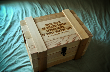
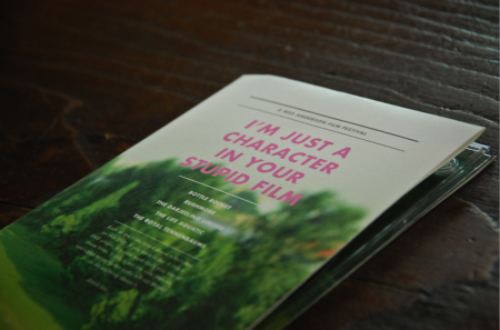

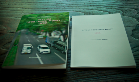
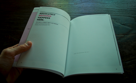
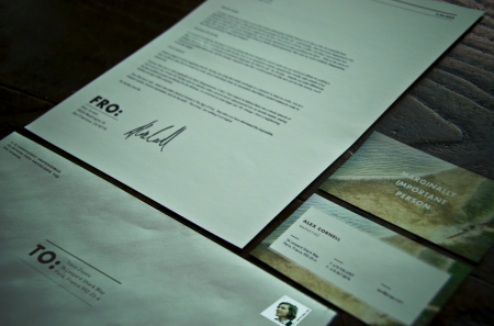
It’s done! The semester came to a close last week and my hypothetical Wes Anderson Film Festival went off without a hitch. On the final day, the project consisted of a presentation box, DVD set, poster (30″ x 44″), fold out schedule, identity system, catalog book (63 pages), website, soundtrack packaging, tickets, billboards and outdoor signage, iPod/iPhone skins, a trailer, and a few other assorted doodads. It was crazy to see it all in one place. I was very happy with the way it all turned out and am relieved to have made it through successfully. This semester was a particularly intense one (as we were also presenting our thesis proposals), and it’s exciting to have made it halfway through the graduate program. Next up will be thesis development over the summer.
This semester’s project really helped us develop our conceptual and technical skills, as we were challenged to create a integrated brand system across a variety of mediums. Everyone had to work with a number of vendors (easily my least favorite part) and be able to coordinate a massive design effort on a strict schedule. My process was not without its speed bumps; color calibration issues at the printer, boxes delayed by weather for weeks, and unfortunate stylistic meanderings early on, all contributed to periodic frustration along the way. Thankfully, once I knew how I wanted everything to look, the implementation of the brand became systematic. The last couple weeks were just a matter of hammering things out.
Above I’ve included some of the pieces that I have not written about previously. First is the presentation box which housed all of the other materials for the festival. It was constructed by Wood Box Supply and is branded with an irreverent slogan. I liked this, but still wish I would have thought of something a little funnier. Next is the DVD set which came in a similar wooden box. These were created out of paper folds and a plastic DVD tray. You’ll also see the catalog, which was one of my favorite things to design, as it allowed for the most copy to be written. As usual, no one will probably ever read most of what is contained within, but it was still fun to put together. Next you’ll see the identity system for sending things to and fro, and which classified my rank as ‘marginally important person.” The rest of the project, in its entirety, can be seen here.
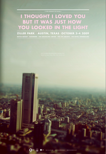
The last image is one of the final versions of the poster (there were many color variations). This was one of the first things I designed for the project. After I completed the rest of the system, I really didn’t feel like the poster fit as well with the other elements. The photograph, especially the dominant color palette, didn’t mesh very well with the warmer tones at work elsewhere. I was aware of this as I worked through the rest of the system, but had unfortunately already printed the poster very early on. It can be a real nightmare printing at the end of the semester (due to the student rush at the vendor), and I always try to finish early and get the printing out of the way if possible. In this case, I would have liked to switch out the photo for something more consistent with the rest of the project. I really had a hard time seeing my picture of a Tokyo skyline (tilt shifted as it may be) conjuring Wes Anderson.
Given that the photograph didn’t really feel like the festival, I tried to at least bring it a little more on brand with the language used. The original title of the poster was “I love you too but I’m going to mace you in the face”, a line from The Darjeeling Limited, but this was determined to be “too violent” and I changed it to a Fall Out Boy lyric that possessed the same dry wit. This title fit with the rest of the identity marks and I was happy with the tone it set. The last issue was finding an appropriate text lock up to fit in the sky section. Eventually I settled on one that didn’t fill out the whole space. In the empty area below I wrote “Here is an awkward space where we weren’t sure what to place. For now it just looks like this, we don’t care if you don’t like it.” That made me laugh and I figured it was as “Wes Anderson” a solution as I could muster. It was that or leave it blank, but on a 30″ x 44″ poster, there needed to be something there. I like the poster as a stand alone piece, but as part of the system, I feel like it is the weakest link.
So that’s it, all done! As I’ve mentioned, the project is for a hypothetical Wes Anderson Film Festival and there is no actual event. I got more than a few confused emails after the trailer was posted. So just to be clear, this doesn’t actually exist. If Mr. Anderson is reading this, and would like to actually hold the festival, that would be fantastic for all involved.