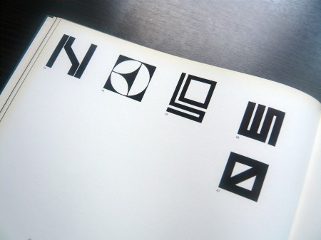
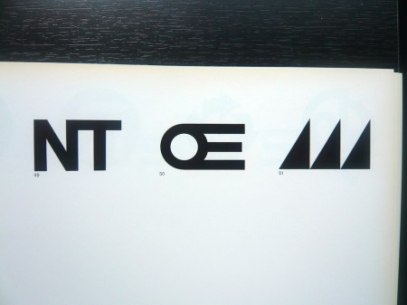
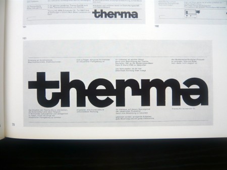
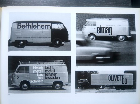
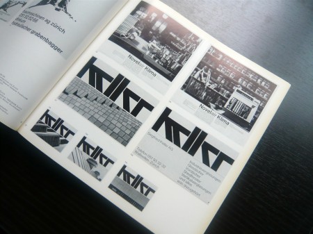
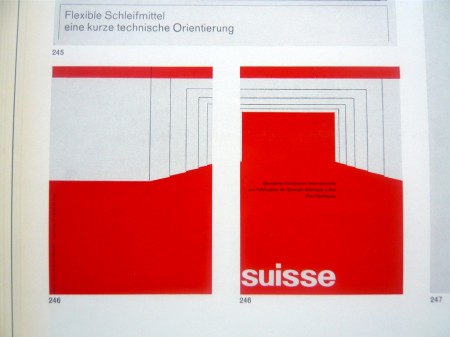
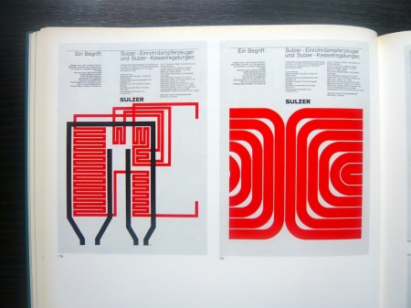
There’s a certain point at which you just have to give up on graphic design because the Swiss beat you to it like 30 years ago and you know it. AisleOne has managed to capture that exact point and wrap it up nicely into a flickr album. Enjoy: Graphic Design in Swiss Industry / Schweizer Industrie Grafik Pleasantly reminiscent of the World of Logotypes stuff.
Graphic Design In Swiss Industry
Moby – Shot In The Back Of The Head
httpvh://www.youtube.com/watch?v=Q7zQlsLgYhg
Moby’s got a new album coming and this is the first single. Whether or not you think Moby’s still relevant, he’s probably the only electronic musician who can get David Lynch to direct his video. At any rate, much better than what I heard from him last year and the video is great.
The official music video for Moby’s “Shot in the Back of the Head” directed by David Lynch. From Moby’s forthcoming album “Wait for Me” (out June 30 on Mute).
Christine+Machinedrum+FeverRay+Joakim

The debut EP from Vancouver’s synth pop duo Julian Carnrite and Kevin Schmidt has the right idea with a stripped down poppy soundtrack to a late night that is filled with inviting random friends out to hang out and enjoying cheap wine. The song Cool Your Shoes reminds me a little bit of Circlesquare meets Midwest Product, definitely a great cool down track for the long summer nights.
The new Machinedrum LP is finally out and the track Para Did is on repeat all the time at my place, its on this Outkast meets Blackalicious tip. Travis will be doing a lot this year so this won’t be the last time i’ll be posting on him.
I already posted this Fever Ray song but it was the remix, the lyrics won’t get out of my head i’m usually not a big lyrics fan so that means a lot I guess in my small world.
I don’t know much at all about the Clashing Egos but I do know Joakim always comes with the heat on remixes. The producer from Paris take us on a Beverly Hills sounding soundtrack cut with dreamy stabs that never begs for attention and layer upon layer of synth melodies, definitely worth your time.
[audio:coolshoes.mp3] [audio:para.mp3] [audio:growup.mp3] [audio:joakim.mp3]Festival Project Process / Stickers
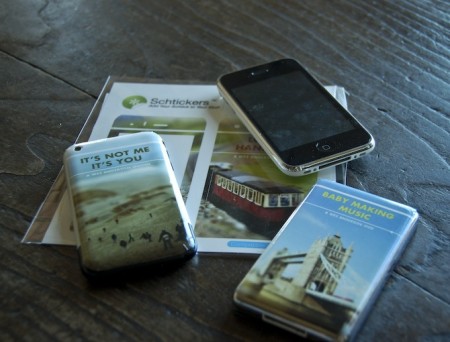
I’m still chipping away at the project I mentioned last week. One of the requirements is the creation of three products to complement the film festival we are creating and branding. The products can be pretty much anything, but one has to tie conceptually to our overall vision for the project. I have no idea what I’m going to do in this regard, and I figured I would knock out the other products first. I decided to try out Schtickers and get a few custom iPhone/iPod skins made. I can’t imagine ever actually wanting to ruin the impeccable design of either device with a sticker, but for a hypothetical film festival mock up, I figured it could at least be interesting. As I am also creating a website for the festival, I thought the iPhone/iPods would look good next to the laptop displaying the page on presentation day. The “electronic” portion of the festival brand fully fleshed out.
Overall, I would recommend Schtickers if you happen to find yourself in the market for some custom skins. I think they are most useful for in-class projects, or perhaps an unusual gift, but are definitely not a serious design option for professionals. Print quality is fairly good, but nothing close to what you’d get on paper. For my image style, it actually ends up looking dead on, but I can’t imagine many people appreciating the softer edges and slight blur you get with the vinyl print. The design/order process was very easy and smooth, and the stickers arrived within two days. Compared to some of the other vendors I am outsourcing to, this was amazing turnaround.
For the above sticker mock ups, two of the images come from agnusleonard and matstace. For the final versions, I will be using my own tilt-shift work like on the record cover. Next up should be the poster, which if all goes according to plan (when does that ever happen?), should be printed tomorrow.
Semi-related, Zweiphone will make your iPhone look like another, out of date phone. (via Subtraction)
Scariest Posters: Watchful Eyes
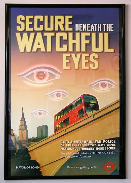
I just came across this recently and was convinced it was a hoax, but apparently this poster was actually posted around London bus routes around October, 2002 in the civil-liberties crushing wake of 9/11. The imagery is shocking to say the least; shocking mostly for the fact that someone, somewhere actually thought this was a good idea. I would love to have been in on the design discussion during the production of this Orwellian gem. Who actually creates this stuff? Did anyone see it when it was up? More info
Apparently we have our very own version of this stateside.
Swiss Graphic Design: Geigy
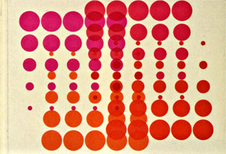
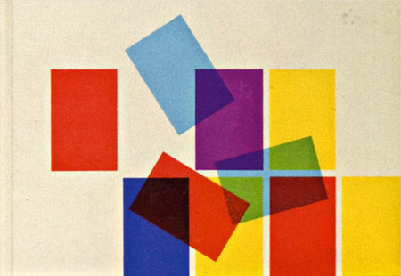
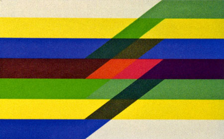

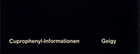
Swiss pharma company Geigy (now Novartis) cranked out tons of drugs and tons of great designs to sell them during their time. The images above are from the book “Corporate Diversity : Swiss Graphic Design and Advertising by Geigy 1940 – 1970” (amazon) which chronicles their best work during that period. There are more images and info over at Things To Look At and Grain Edit.
Images via Things To Look At
8 Simple Ways To Improve Typography
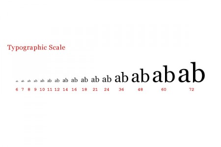
Antonio Carusone from the always excellent Aisle One Blog has written a great article covering the various problems we as designers face when setting type and how to best approach them. The article focuses on using web-based CSS solutions for type layout, but the concepts covered are universal to typography and can be applied to print layout as well. The hanging quotes part is great, but they’re missing the part about “hanging T’s”, I always have trouble with that one. Link
Chairlift+LemonJelly+Lashes+SnowMexico

A lot of people may know Chairlift from their Apple commercial but yesterday these 2 friends from Brooklyn turned me onto them by playing me their edit of Chairlift’s Evident Utensil and I thought I had to share it here since it was really catchy and reminds me a little of Kate Bush and that cute IDMish video of the girl singing, download the edit here exclusively, oh yeah I went there.
I really like the packaging for this Lemon Jelly album even though it doesn’t fit in any CD rack that I have, the cover above is great, the actual title(which isn’t shown) is a red balloon sticker that sits in the top right corner usually and has the bands name in it. The song Spacewalk builds nicely, it has this excitement to it because when the drums kick in its hard not to smile.
The same friends that shared the remix above of Chairlift showed me this video of Bat For Lashes, I guess i’m a little late to this party but better late than never going to the party.
I found this Snow In Mexico EP as a free download/donation site run by the musician, some really slow dizzee shoegaze from this Italian born rocker, I highly recommend Cinema 5010.
[audio:woodhull.mp3] [audio:spacewalk.mp3] [audio:agirl.mp3] [audio:5010.mp3]Arctic Survival
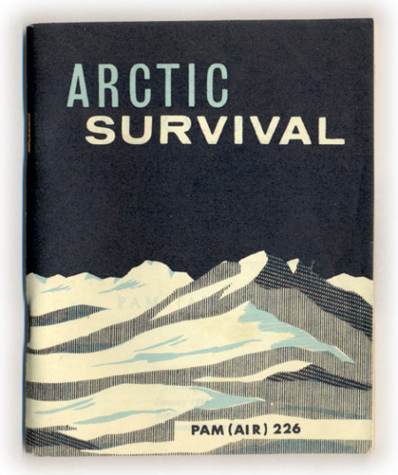
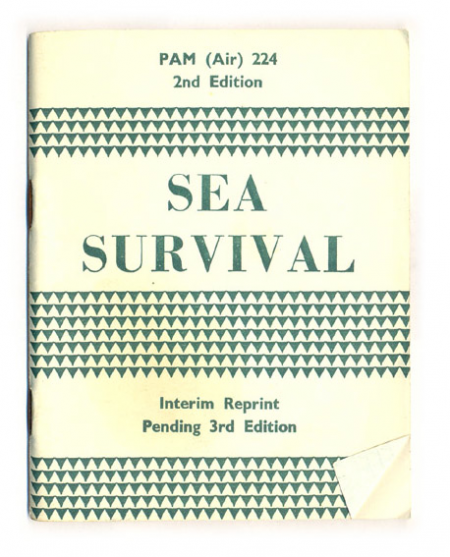
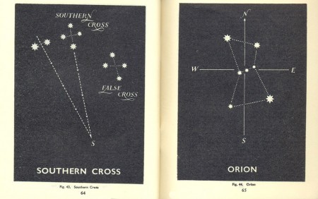

Hopefully won’t be needing either of these anytime soon, but with a cover like that, I’d take the Arctic one around with me regardless. Both survival manuals, along with a desert and jungle version, are up over at things magazine. You can even read the entire book if you think you might find yourself in an ice or sea related predicament.
Conserve your energy. Do not rush around aimlessly. Avoid fatigue. Get plenty of sleep. If you cannot sleep, just lie down and relax your body and mind. You will not freeze to death unless you are utterly exhausted. (link)
F5 Festival Ticket Giveaway
Sorry for the late notice, the hotel wifi is down so posting from my phone. Anyways, first 10 replies get a FREE pass to the F5 Festival in NYC tomorrow ($250 value!). Be sure to include your email in the comment email form field (will not be published). Good luck!