The Selby – Workspace Photographs

8_07_08_alexander_wang1153
11_6_08_dustin_yellen_65
10_14_08_xavier_veilhan_17496
_mg_3434
9_20_08_magnus_berger2972
8_24_08_paolak_jamesp2266

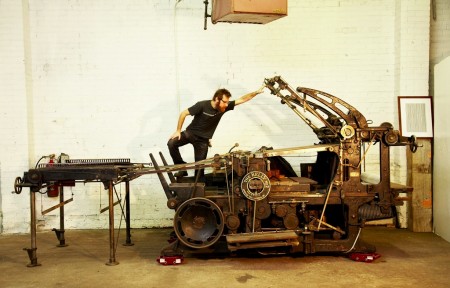
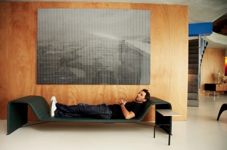
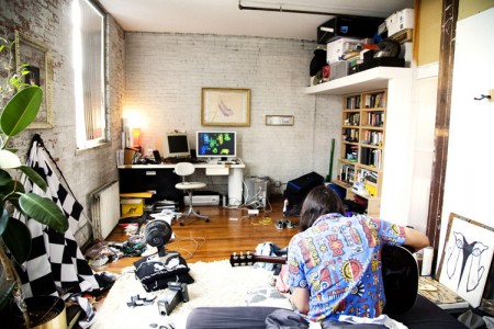
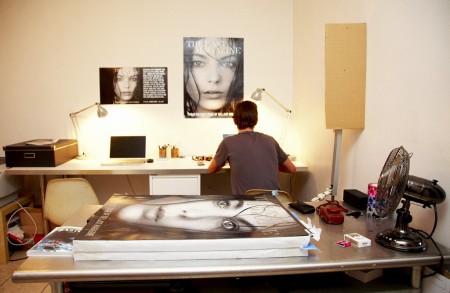
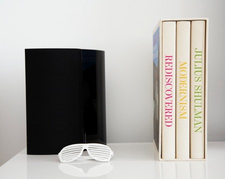
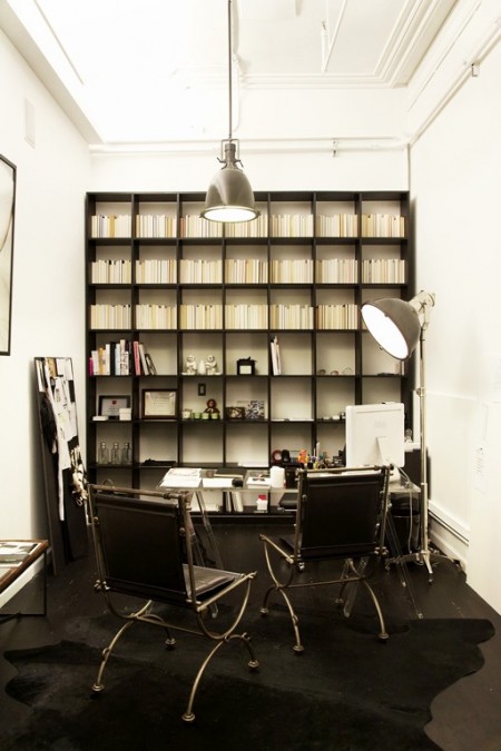
I’ve been considering a workspace overhaul for a couple months now. For inspiration, I’ve been browsing the photographs at The Selby, a blog dedicated to the workspaces of creatives. Each post includes photographs of artists in their homes and studios, and usually a little handwritten interview at the end. A majority of their subjects are from New York or LA, but I’m hoping they’ll make it out to San Francisco one of these days.

With my space, it’s amazing I’m able to get anything done; clothes are everywhere, bookshelves overflow onto the floor, and wires tangle their way into everything. It takes me at least five minutes to find just about anything. In all likelihood, it will stay this way forever, but I figure if I spend enough time looking at other people’s workspaces, I might actually get motivated to make mine picture worthy. Then again, as most of the pictures indicate (and Scott has suggested before), a pristine workspace isn’t a prerequisite for productivity.

Frederic Chaubin: Soviet Sci-Fi

frederic_chaubin04
frederic_chaubin01
frederic_chaubin03
frederic_chaubin
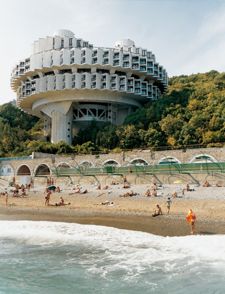
Pop Up Storefront Los Angeles showcased some great photos from Frederic Chaubin, the Cambodian born French-Spanish editor of Citizen K magazine. The show, entitled “CCCP: Cosmic Communist Constructions Photographed”, focused on Chaubin’s fascination with the sort of futurist architecture that came out of Soviet Russia’s Cold-War era. I’ve always been quite impressed by Soviet architecture like this; they somehow built real versions of all those artist’s renderings of future societies that people were cranking out in the 50’s and 60’s. I’ve never seen it represented quite so faithfully; Chaubin’s photos really capture that whole utopian society vibe.

PingMag Interview With Caubin
NYT coverage of the show

Audio Cassette Inserts

2436739845_c14682bd8c
2436735119_4eff875ef9
2435322082_e2cc60dc3d
2436730467_8f076bfe1c
2435320878_f9d95c26f6
2434506709_a3bd36ed63
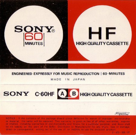
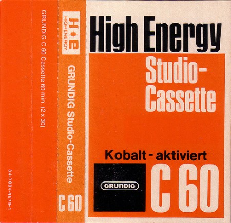
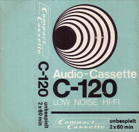
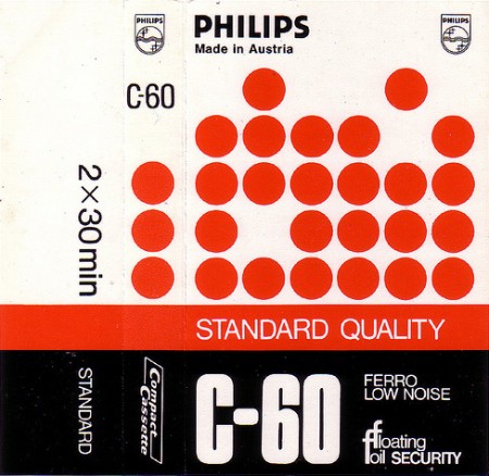
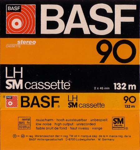
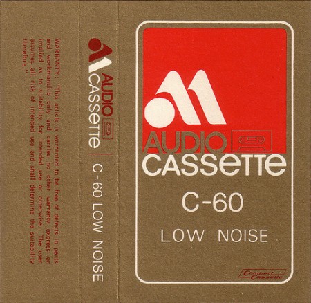
Talk about inspiration; these are all simply incredible. I used to obsess over tapes when I was a kid, always looking for the coolest packaging or interesting design. But never in all those years did I come across any as cool as these. Most of these look to be a little before my time and, of course, are of European origin. I always wonder what effect growing up around such interesting design might have had on me. All we had in the states was this crap, while German kids got to record Ege Bamyasi to little plastic boxes coated in design goodness. Maybe it’s for the best, I guess now I can appreciate things like this more. Jubru has posted these scans to a flickr gallery where you’ll find many more great examples.

Via thened

Matthew Barney

Cremaster Logo
Matthew Barney’s attention to detail and elegance has always grabbed me because I have always felt that he’s the man that can help the art world grow. The logo for the Cremaster Cycle series is gorgeous, if you ever get a chance pick up a copy of the book.

Matthew Barney – Drawing Restraint 9 feat. Bjork

Art of the Title Sequence

picture-17
picture-112
picture-6
picture-131
picture-5
picture-14
picture-21
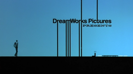
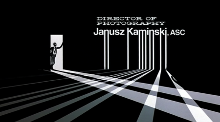
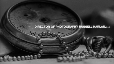
I’ve just started a film oriented design project in one of my classes, and I’ve been spending a lot of time browsing through the archives over at Art of the Title. Started in December 2007, Art of the Title is a blog dedicated to the film title sequence, and is a great resource for film buffs and designer alike. They post high quality videos of each sequence they chronicle, and usually have an interview with the creators as well. It’s amazing to see what can be done with little to no footage from the actual movie.

My favorites are Catch Me If You Can, Kung Fu Panda, and Stranger Than Fiction.

Branca+Addled+Simon+The Sea and Cake

Glenn Branca
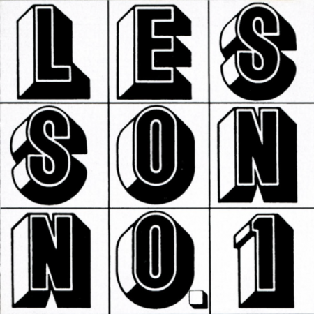
My friend Danny passed on a Glenn Branca EP to me tonight, one that I didn’t have and we started talking about him. Glenn Branca seems to be the poster boy for all the experimental guitar bands that want to do something new these days but they don’t understand that they can’t repeat the past and pretend like their doing something groundbreaking. I don’t think anyone these days would be able to put out music similar to what Glenn Branca did during the time he was doing it, you’d only be doing it for the wrong reasons. This new wave of bands in the past 8 years or so are enjoyable but in my opinion just come off as “I need attention but don’t actually look at what i’m doing because i’m actually not creative at all”. Sadly these musicians today can buy their way into sounding and mainly looking like they have some talent. Walking up and down the streets of Brooklyn you can almost smell and see the fake talent, at first you can fall for it but then talking to more and more people you end up finding out they aren’t offering up anything pure or willing to potentially going mental to perfect their technic and sound. I just want people like Glenn Branca to get more credit because listing him off as an influence only is almost saying that your similar to him but you aren’t you actually have to take any of the time that you’re getting any attention and use it thank the originator.

Addled is half of Worst Friends and he loves his Boston Red Sox, sharing what great good house/techno records come out on Tuesdays, and most importantly making a variety of music. Recently he’s worked on music that was used in a Prada video and in the past he made some of the music for The New York Times. His first EP as Addled is one that follows the footsteps of James Holden and Paul Kalkbrenner but touches a new level of listening since its less clubby than both and is more on the deeper side and melodic side.

I feel like I post a lot of Paul Simon but really I don’t actually if anything I don’t post enough Paul Simon.

I always thought I liked Sam Prekop more than The Sea and Cake but then I listened to some more Sea and Cake and realized I was thinking crazy things. Whenever I have to deal with the rock guy that thinks electronic music is too repetitive than I just have to share with him The Sea and Cake and say Its not that you don’t like repetitiveness because obviously this is amazing, it’s just that the person doesn’t care for unique sounds or can fathom the idea a synth playing more parts than their are people on stage and that just ticks him right off.

Glenn Branca – Lesson No. 1 for Electric Guitar

[audio:lesson1.mp3]

Addled – Heartbreachno

[audio:heartbreachno.mp3]

Paul Simon – The Coast

[audio:thecoast.mp3]

The Sea and Cake – Weekend

[audio:weekend.mp3]
Eliot Lipp – Live from the Beat Bunker

Eliot Lipp - Live At The Beat Bunker
Eliot Lipp’s 2009 has been one of the more productive one’s out there, having released his new album Peace Love Weed 3D and organizing a 40+ date tour you wouldn’t think he’d have the time to head into the studio to record a live studio session. The mix features some of the more talked about names in Electronic/Hip Hop right now like Mux Mool, Nosaj Thing, Black Milk, and Michna. Some of the highlights in my opinion are Beamrider which is a live set favorite of mine and the ever so popular recent Warp track Overnight.

Eliot Lipp – Live From the Beat Bunker
DOWNLOAD THE FULL LIVE SET HERE

Eliot Lipp – Live From the Beat Bunker

[audio:beatbunker.mp3]
When Is It a Rip-Off?

2862811405_611180f062_o
2867263061_e1478d2339_o
3010929916_fddf400829_o
2862790447_a09d32385c_o
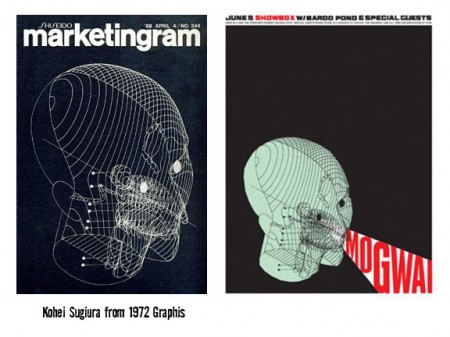
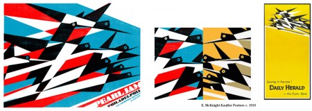
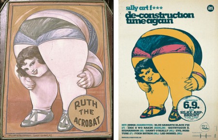
Hot on the heels of our recent, and thoroughly rousing, discussion on the subject, I came across B.Caruther’s gallery of “inspired” designs and their original counterparts. I thought it was an interesting illustration of the the whole concept of “borrowing” artwork. If you’re going to make the argument that someone like Shepard Fairey is stealing (and therefore their work has no merit), you would have to make the exact same argument for each and every one of these and the countless others out there.

Sure, that argument would be pretty easy for a lot of them. Many are sort of tongue-in-cheek riffs on design classics while others are what I would characterize and blatant rip-offs. But some do stand up as something new and engaging for reasons other than the imagery they borrow. The “Clockers” poster is a perfect example. Yes, it borrows heavily from Bass’ original, but it takes the imagery and re contextualizes it in a way that creates something fresh and provocative. Nevertheless, Bass regarded the poster as a “rip-off” while it’s creator, Art Sims, called it an homage [source]. I guess with an issue as subjective as this, people will never reach consensus, but it’s fun to try!

Selected Milton Glaser

314306489_b23e7c0a99_o
274063398_5dfed4d382_o
glaseritaly-2011
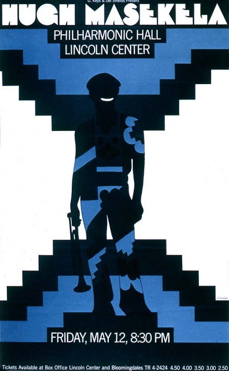
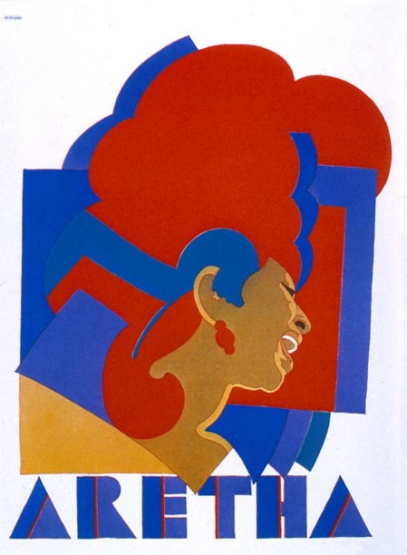
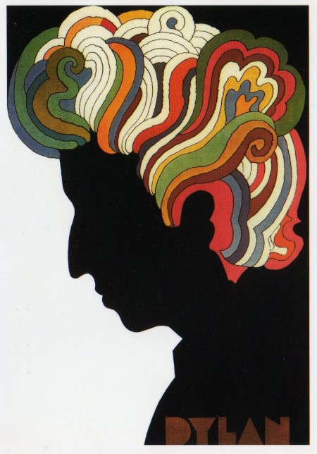
A few classics from Milton Glaser.

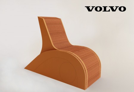
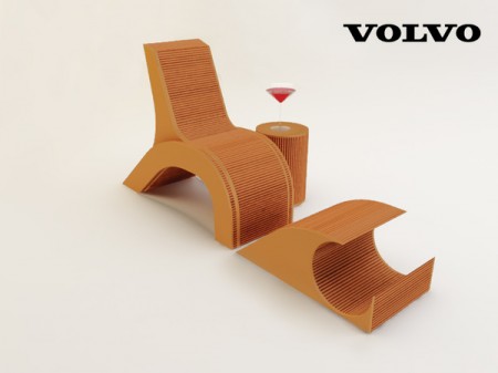
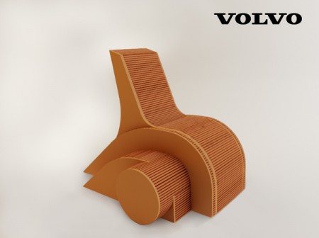
Volvo Chair

Volvo1Volvo2Volvo3
Apparently the tail lights of the Volvo C30 have inspired industrial designers to construct a well thought out 3 piece chair set.