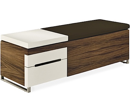
Herman Miller Cognita

2962_photo_2_172727.jpg
2962_photo_1_172727.jpg

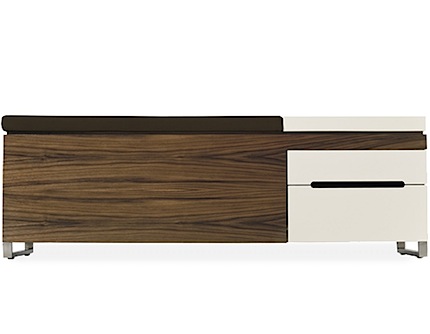
I’ve been obsessing over Herman Miller furniture lately, spending way too much time browsing Hive. Herman Miller introduced it’s new Lifework Portfolio recently and I have to say it’s pretty clean. Included are some old favorites like the Nelson Swag Leg Desk and also some great newcomers. This Cognita is what stood out to me, I’m always a sucker for the whole wood-grain/white/stainless-steel look. The only problem is the price: $999. I can’t imagine spending a grand for something billed as a “storage bench” any time in the near future but it’s always fun to look.

I feel like if I did get a piece like the Cognita it would make everything else I have look so bad I would have to throw it all away and start from scratch. I guess it could be reasoned that buying one expensive piece of quality furniture that will last you a lifetime is a better investment than constantly buying sub-par stuff (Ikea) and replacing it every few years as it breaks or starts to look dated. I guess I just don’t have any experience with Herman Miller in particular so I don’t really know if it would hold up long enough to be worth the investment. Anybody splurged on high end furniture like this and if so, has it held up well? Was it worth it or do you regret the indulgence? Let us know in the comments

Web Design Sketchbook

hyper1_0.jpg
hyper3_0.jpg
hyper5_0.jpg
hyper4_0.jpg
This is a pretty clever concept, a real sketchbook for web mock-ups. I think I’ll stick with Photoshop but this would probably be fun now and then. Via Paranaiv

Russell+Shadow+Efdemin+Runaway

Brooklyn Club JamSo you lose all your music right? what are your go to albums to keep you sane during the rebuilding process? Well the first thing I went for was Arthur Russell because I knew I could grab all the songs I have on ISO50 second but what didn’t I have up here for you guys to hear was the question. My friend Fred Thomas aka City Center is suppose to get me some of the other essential Arthur Russell but this album “Another Thought” is just so refreshing when you listen to so much instrumental electronic thru the day.

I know everyone here probably has DJ Shadow’s “Endtroducing…” CD or LP but its probably not a go to day to day listening for everyone and that’s not posted on sites a lot. The key melody at 3:42 kills me every time in this song, does anyone know where he sampled it from? The album is in the Guinness World Records as being the first album created entirely from sampled sources so it has to be from something else.
One disc that I had the day I lost my hard drive was left to me by Peter Kersten aka Lawrence which had a lot of unreleased Dial Records releases. It had the new Efdemin EP on Curle which is simply gorgeous when played on a large system. One thing I noticed is this song reminds me of an Aphex Twin track, All that comes to mind is the Classics LP but nothing on that is it I don’t think.
If you ever go to a DFA party in New York you usually get the pleasure of hearing one of the 2 guys from Runaway DJ sometime during the night. I know it’s Monday but if you want to dance a bit in your sit to “Brooklyn Club Jam” its alright by me.

Arthur Russell – Keeping Up

[audio:keeping.mp3]

DJ Shadow – Building Steam With A Grain Of Salt

[audio:building.mp3]

Efdemin – America

[audio:America.mp3]

Runaway – Brooklyn Club Jam

[audio:jam.mp3]

Brand New Best & Worst of 2008

brandnew-bestworst.jpgWith all this talk of branding lately it was interesting to see Under Consideration’s Brand New blog’s picks for Best & Worst Brands for 2008. The ever-controversial Pepsi re-brand predictably made the worst list while 826 Valencia and Taca headed up the Best-of column. There were some surprising omissions as well as a few controversial picks–as the 126 comments and counting thread will attest to. Check out both full lists here.

Pepsi redesign

Pep1
Pep2
Pepsi stepped up it’s game in my opinon and simplified their brand really nicely (Please excuse the iPhone camera photos but I didn’t bring my camera to the grocery store like usual). Not only did they change the logo, but they’ve changed the swoosh slightly a bit for each variety of (i.e. Diet, Caffeine-Free, and Max). I was pretty impressed mainly because they had the new logos sitting next to the old ones which has these blue pixel explosions in the background and so much unwanted text. Stepping back and seeing a wall of the simple new blue pepsi 2 liters all aligned was pretty beautiful even though i’m a Coca-Cola fan. One other good layout addition was the abbreviation of the 0 calorie, carbohydrates, and sugar text aligned nicely under the logo. Don’t get me wrong though, i’m not a complete fan of the Microsoft gamer X in the font. Do you think this means Mountain Dew will get a new logo? Oh my there is a graphic design god and he cares.

In celebration lets listen to Aphex Twin:

Aphex Twin – Polynomial-C

[audio:polynomial.mp3]

Happy Holidays!

3083395581-663a7aaf76-b.jpgHappy holidays to everyone! Here’s hoping you get something as cool as this. Image via Breath Less

Lone – Lemurian

Lone - Lemurian Cover
Can I redo my 2008 best of list? So my hard drive completely died this week and most of my music wasn’t backed up. Now I’m piecing back together my iTunes library with the help of a lot of friends. My friend Praveen sent me this Lone – Lemurian LP this morning and my jaw has slowly been dropping throughout the day. It’s if Flying Lotus and Casino Versus Japan had a baby, I can’t stop listening to it. Maybe I’m overly passionate because of the hard drive failure, but I think this may be the real deal. Let me know what you think, I know there are some Boards Of Canada fans lurking around on the blog from time to time but Lone isn’t as dark as BoC, at least not from what i’ve heard. How unfitting is that cover though?

Lone – Interview at Honolulu

[audio:honolulu.mp3]

Lone – Koran Angel

[audio:koran.mp3]

Lone – Phthalo Blue

[audio:phthalo2.mp3]

Preparing Your Sites For IE 8

ie8.jpg Yes, I have been quite kind to Microsoft lately, but if you count yourself among the ranks of web designers you know that Internet Explorer is still the bane of our collective existence. At some point, long ago, when Microsoft ruled the browser universe, some genius over there decided to give a big middle finger to all of us designers and our so-called “web standards”. The result is that things just don’t look the way we as designers intend in IE: CSS elements don’t render properly and various functionality breaks down forcing us to implement IE-specific hacks and tweaks to make it all work. Well, MS, in their infinite wisdom, have finally decided to back down and have announced that the forthcoming eighth iteration of their Internet Explorer browser will embrace web standards. What a novel concept! Embracing web standards in a web browser? What will they think of next?

This certainly is cause for some celebration, no more tweaking and comparing, writing IE-specific code to make things look right across all the browsers. But wait, we’re dealing with IE here, so of course there’s a problem with this new development, sort of the last stand of IE’s stubborn unwillingness to play by the rules. Because IE8 now adheres to normal web standards, it can actually break sites that were written to accommodate it’s older versions. Thankfully the solution is an easy one and Ed Bott has a great article over at ZDNet explaining the issue and how to apply the rather simple fix (one line of code!). We’re not out of the woods yet, but at least we can look forward to a day when the IE8 install base becomes large enough that we can all but forget about making our sites look pretty for the previous, less accommodating versions.

Anybody out there done much testing with IE 8 yet? Have you implemented the fix and if so, how is it working out? Let us know in the comments…

Armada ISO50 Skis


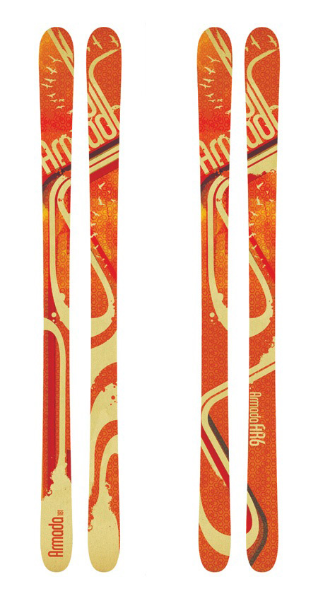
With all this talk of snowboards and all the new snow up in Tahoe, I thought it would be a good time to post about these Armada skis I did a couple years back that have just recently been released. In November of 2006, Armada asked me to design the 2009 AR6 line (there is a relatively long period that separates the design phase and end product in the production cycles of most snowboard / ski manufacturers). Based on the timeline and budget, we decided I’d deliver 2 reference designs which would be extrapolated by in-house designers to fill the 5 versions of the AR6 line. I believe Mackel Vaugn put together the final designs based on what I turned in. The top image (orange, very top) shows the early tests I showed Armada to illustrate what I was going for. Skis are an interesting form factor to design for; you have these two narrow canvases and you sort of have to choose whether to treat them as a whole or individually. Based on the very wide design of the AR6’s I decided to try and tie the two skis together to feel more like one large design across a canvas.

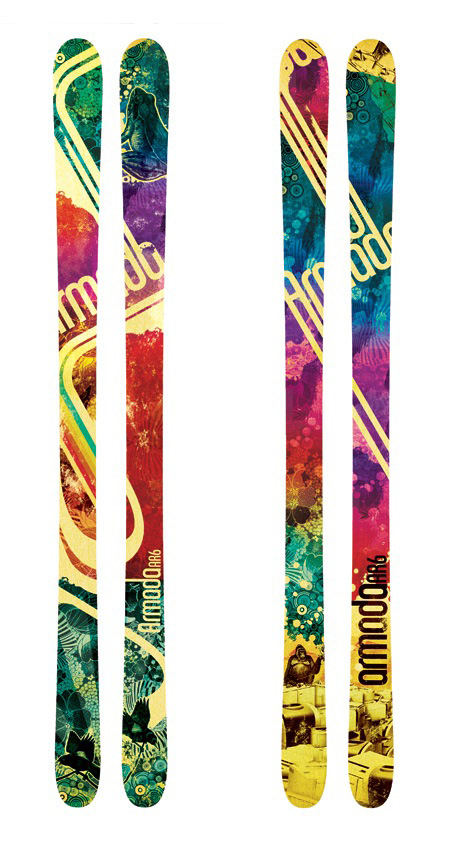
After some meetings with Armada about the tests I had sent in, we decided to stick with the basic forms for the final versions but bring up the overall color and variation of the designs. The results were the final two reference designs (directly above), I delivered the PSD files along with various image collateral and they worked those into final five ski designs. I’ve done a couple ski projects and all my snowboard projects this way. It’s an interesting process, handing off the design and later being surprised by what they end up looking like (the bottoms were a surprise too, only designed the tops). The whole thing reminds me of layer tennis, sort of like a design remix. You can see all the final versions of the AR6 at Armada’s site and you can see some in action in this video review. These are out now, you can check Armada’s dealer list if you want to pick up a pair. I did the 2010 AR6 line as well so you should start seeing those out next fall. Here’s Armada’s product video for the 2009 AR6:

Video Link

Charles Harper Book Cover

Picture-2.jpg Picture-1.jpg Picture-4.jpgPicture-5.jpg Picture-6.jpgPicture-3.jpgPicture-8.jpg Crabstick has some nice shots of this amazing Charles Harper book up on flickr.