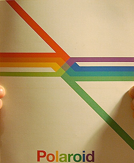
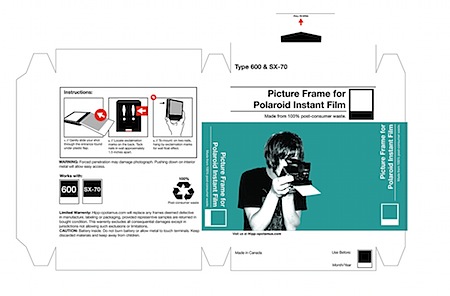
 Blog reader Christopher Edwards has some interesting Polaroid-related projects over at his flickr page. There’s a mock Polaroid annual report with a very nice cover graphic (above) and some packaging concepts too. Be sure to check out his other photography, he’s got some great time zero film examples in there.
Topher Edwards
TOP 10 Albums of 2008

Peter Kersten and his label Dial is my go to music when I just need to not fiddle with a playlist for an hour, nod my head with a smile, or just lay back and enjoy simple beautiful 4/4 deep techno. “The Essence ” is packed to the brim of exactly what I want to hear if every else was gone or if I made music.
Peter strips down songs to their essentials, he doesn’t rely on popular band instruments or lyrics. He just goes straight to what is deep and comfy like a rich man’s large living room couch. The Essence lets you have the option of focusing and listening to his songs and never needing your attention.

Studio has become that band in my life that i’ll always check out no matter what, you can say it’s become my essential NPR listen for the Subaru Outback driving lady that’s heading to work at the recycle center. Listen to Rubies: Room Without A Key (Studio version).

Not once this year have I skipped over a Flying Lotus song off Los Angeles when my iTunes is on shuffle, thats kinda huge if you think about it. Listen to Flying Lotus – Roberta Flack (feat Dolly).

Bradford Cox of Atlas Sound brings me to my knees, If I listen to the track “Recent Bedroom” anymore right now i’ll end up putting it #1 for the year but I have made up my mind. Listen to Atlas Sound – Recent Bedroom.

Whatever Benoit Pioulard does is magic in my eyes. If it’s printing limited colored 7 inch vinyl randomly thru the year to selling his polaroids. When I heard “Temper” this year it became that record that I wanted to give to everyone I knew, I wanted to scream about Temper from the top of a mountain but all I had was Scott’s ISO50 blog which will always do. Listen to Benoit Pioulard – Brown Bess.

Do you know anything about analog synth heaven? well, pack your bags tonight, empty your bank account and steal a convertible preferably maroon or that 80’s silver because you my friend need night driving music. You will be driving on the coasts and living the secret life now as Hatchback. Listen to Hatchback – Everything is Neu.

The disco group that went all out and did it right. Full band, dancers, horns, and not in your face just the perfect party starting music from start to finish. Listen to Hercules And Love Affair – Blind.

The Balearic sound really showed its true colors this year, we had the very talented Eskimo label put out a nonstop slue of treasure and this continuous mix became a vinyl collectors best friend packed with a various amount of new Balearic tracks. Listen to Maelstrom – Petrichor.

Even though the Carl Craig’s, the Kevin Saunderson’s and the Derrick May’s are flying around the world and enjoying the fruits of their labor by playing shows, there are still heads left that rock out proper Detroit Techno day after day and I have to support it because I adore it.
[audio:omarsday.mp3]
The kids look like their 17 and their making slow disco edits of Bruce Springsteen, Feist, John Lennon and Paul Simon, how promising is that!
[audio:cousin.mp3]Imaginative/Creative Design Fail
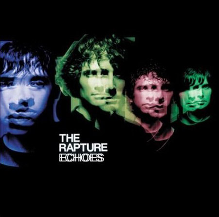
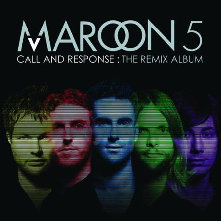
There is absolutely no excuse for this, I mean I see designers rip off other designers every day – we even get emails weekly about this sort of thing – but when you do an album cover in 2008 and you know everyone is going to see it, why go this route? I don’t do album cover design but even I can see there is no sense in this. Aren’t there plenty of obvious solutions for the Maroon 5 designer to choose from that aren’t completely forgeries? One of these three things would of sufficed, and i’m going easy: 1. A different color background 2. Not using band member photos that weren’t just from the shoulder and up floating around in the background 3. Don’t use the same colors, its as simple as that, why not natural colors? I could also throw in “don’t use any stupid effect over their faces”, I mean at least the echo effect made sense. I’m no expert but I just see pure laziness, and you know this designer got seriously paid.
Farewell Polaroid: Shaun Tubridy
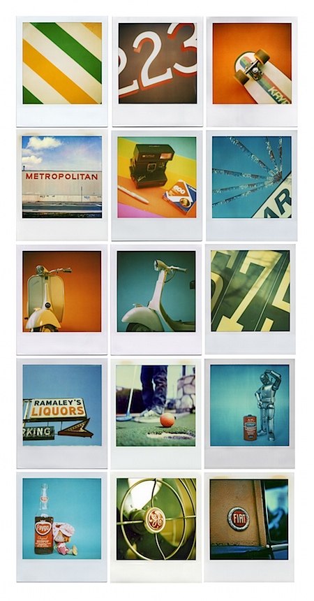 In case you missed it, Polaroid has ceased production of it’s iconic , eponymous film. The company says there’s enough to last through 2009, but after that it’s all over. Shaun Tubridy set up the Save Polaroid site to raise awareness and CNN ran a piece on the whole situation and Tubridy’s efforts. Turbidy, a graphic designer, is also an avid Polaroid photographer with a very nice flickr portfolio, the source of all the images in the collage above. Pretty sad to see such a wonderful piece of pop culture be pushed into extinction by digital, but I suppose it was inevitable. Let’s hope Lomo or some other third party picks up the torch and finds a way to reproduce Polaroid film. How man of you use Polaroid film? Has the production shutdown effected you yet?
Update: As Jones pointed out in the comments, Polapremium.com is still selling Polaroid film but, as the name implies, they’re selling it at a premium: $15–$130 per pack. At prices like these, just buy a medium format Rolleiflex with the money you would have spent on film.
Links: Shaun Tubridy | SavePolaroid.com | CNN article
Top Albums of 2008 – Honorable Mentions

2008 was a great year for music, so good that an honorable mention section is a must. Before I post my top 10 albums of 2008 here are 3 albums that didn’t make the list that should of if there was room.
No.3
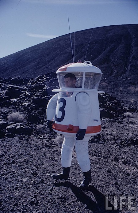 This was too good not to post, I’ve never seen graphic design walk around before. The hits just keep coming from the Google Time/Life Archive. Via Digg
Helvetireader
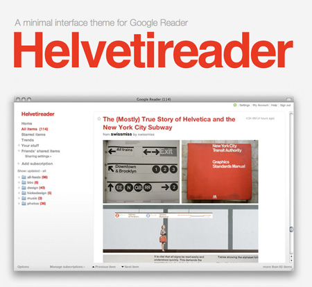 If you read anywhere as many blogs as me, you probably use an RSS reader. My absolute favorite is Google’s Reader; it’s web-based, lightweight, and has all the functionality I could ever need. The only problem is that, like all other Google products, it looks like a Google product. Enter “Helvetireader”, a minimal, Helvetica-themed interface for Google Reader. The theme works with most browsers, more info is here.
Canadian Logo Collection
 James has posted a very nice collection of logos from the Canadian Design Recource. Link
Ken Garland and Associates – UK
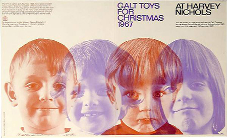

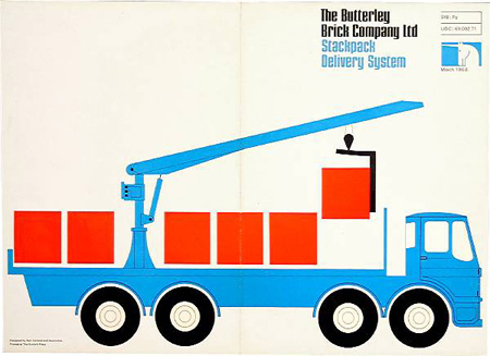
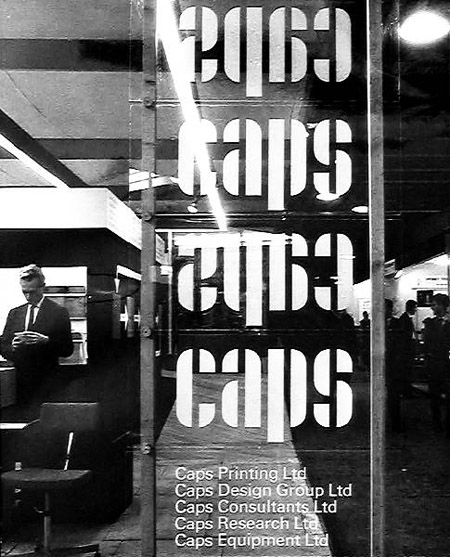
The beautiful graphic design of Ken Garland and Associates, from storefront font layout to pamphlet covers these guys have been putting together solid work since 1962.
Making of the Obama Logo
Sol Sender walks us through how he and his team created the now iconic Obama 2008 campaign logo in this two part video (above). However you feel about the finished product, this video is a great window into the inner workings of branding at high levels. Logos are so deceivingly simple that we often don’t realize the amount of thought and effort that goes into creating them. In a similar way, we often don’t realize how the subtle nuances of a design can effect us as viewers.