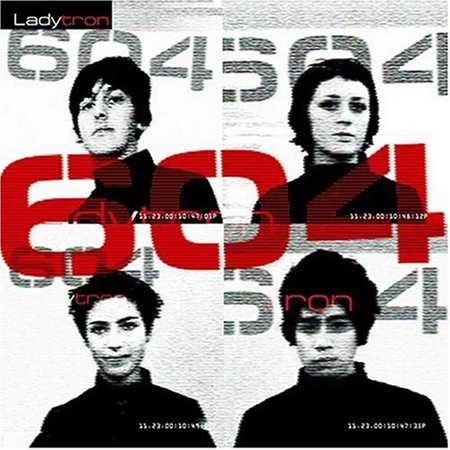
Last night I was working on a poster for the upcoming Terrabyte 3 show (L.A. Sept. 14). I had the MP3s on shuffle and Ladytron’s Mu-Tron came up. It prompted me to go back and play the rest of their 2001 release 604 in it’s entirety. It’s not that I really forgot about Ladytron, I guess I just forgot how good they are. Maybe I played them out back when Light and Magic was in full swing. They have a new album out entitled Velocifero which is in the vein of their previous record Witching Hour. Both albums are a departure from the 80’s inspired electro sound of 604 and Light And Magic. It’s good that they evolved (the two latest albums are superb in their own rights), it’s just sad that we won’t be getting any more gems along these lines:
Ladytron: 604
HP Elitebook: MBP Killer?
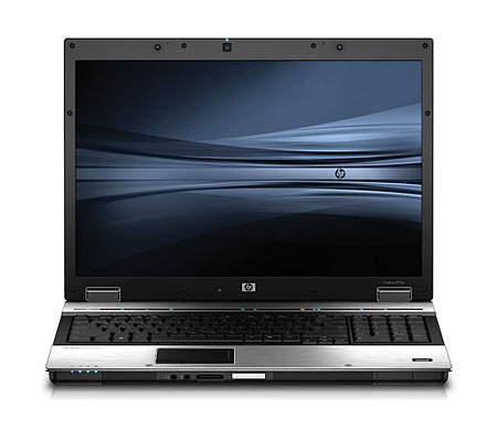
 HP has announced several new notebooks, but one in particular has a design-centric feature set that has really piqued my interest. I have been using HP notebooks for years now, it’s not that I’m really in love with them, it’s just that they are so damned powerful and ridiculously cheap. Of course that has come at a cost, the construction is downright shoddy; both of mine have broken at one time or another, luckily I had warranties on them. I travel with a TX-1000 series for internet / email chores and a hulking DV-9000 series for on the road video / graphics duties (along with running the visuals for live shows). I am really tired of the sub-par display quality and power management of most PC notebooks so I have been looking at replacing mine with a MacBook Pro. I really like the physical construction of the MBPs and the the power management of OSX (my HPs both have abysmal battery life stats). But HP’s past offenses aside, I may have to reconsider my switch in light of this new breed of designer-targeted notebooks.
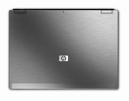
The recently announced HP Elitebook 8730w comes with a Dreamcolor display. That’s pretty impressive for a laptop; the specs on the Dreamcolor displays are amazing (1,000,000,000 colors?!) and to have that kind of color reproduction on the road would be a huge advantage. Add to that a dual-SATA drive option (two physical disks for Photoshop Swap Drive duties or RAID-0/1 configurations) along with dual DVI outs (one onboard HDMI/DVI socket, one external via the optional dock) and docking capability (something the MacBook inexplicably lacks) and you have yourself a portable graphic design powerhouse. Another incentive is the anodized aluminum "Duracase" which is hopefully better than the brittle plastic they made the previous models out of. Given the specs (Quad Core Intel / 8GB RAM / 1GB VRAM!) you could get away with using this as your desktop machine as well.
My only concerns with this new offering are the lack of a 15" screen option (17" is a bit too large to really be portable in my opinion) and the fact that HP is gloss-happy when it comes to screens. On both my laptops the screen is so glossy that the glare prevents me from seeing the screen in most outdoor environments (and many indoor environments). The don’t seem to specify whether the screen on the 8730w is glossy or matte, but if they end up offering a 15" matte screen option they can put me down for one.
And the real kicker? It’s $1699. That’s US dollars, and it’s not a misprint. $1699!!! A comparably equipped MacBook Pro doesn’t exist, but even a lesser-equipped MBP would run you over double that figure. It’s times like these I feel lucky to be so entangled in the complete disaster that is Windows. I learned on Windows and really can’t fully divorce myself from it and therefore am at it’s mercy, so when a great hardware option like this comes along I have to be thankful. Oh yeah, and a Windows XP downgrade option is also available on the 8730w; this is opposed to the earlier HP / MS bed-buddy policy of forcing you to use Vista on new laptop purchases. They went as far as to remove the XP drivers from their site for my DV9000 when Vista came out just to force me to upgrade. To tell the truth, XP has matured into a remarkably stable operating system. I have tested it extensively versus OS X and it’s stood up to the challenge. I will admit that OS X is overall a more stable and reliable OS, but when configured properly, XP gets the job done and gets it done faster.
So here’s to hoping that the 8730w lives up to the hype and eventually spawns a 15" incarnation; it would be a valuable addition to any designers arsenal and a very cost-effective one at that.
Have you used or do you own a Dreamcolor display? What do you think? Any other potential Mac switchers swayed by this recent development? Let us know.
70’s Finnish architect Matti Suuronen
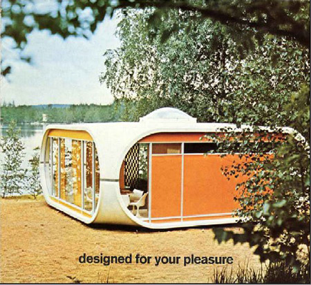

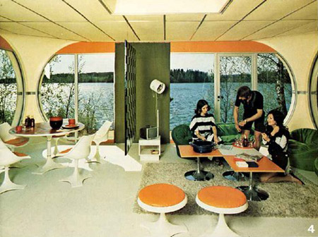
Lately i’ve been looking into a prefab home and how much they run so i can start saving maybe. Anyone here know anyone that owns one or stayed in one? do they like it? i heard in Germany that it’s actually something people are buying.
On a side note i can’t believe this house isn’t treated well.
J Dilla+Madlib+Metal Fingers+Madvillian
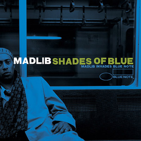
This is part 2 of what was posted the other day about a few other producers that make some of the best hip hop instrumentals.
Olympic Logos
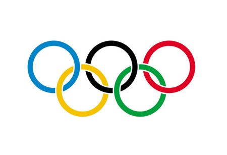
So the much anticipated / extremely controversial Beijing Olympics are in full swing and despite the issues surrounding the host country, the games themselves have been incredibly entertaining. From a visual perspective the whole production is off the charts. If you didn’t see the opening ceremonies, do yourself a favor and watch the replay. I can’t even begin to describe it so I’ll just say there was a roll-up LCD screen about the size of a football field and a mass-scale drum display that looked like some sort of giant human Tenori-On.
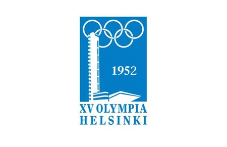
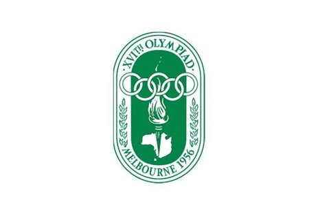
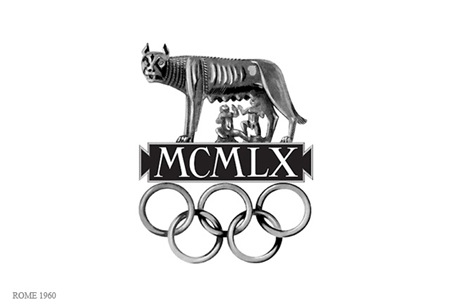
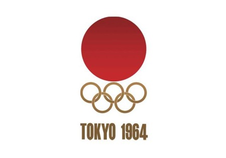
Obviously branding and information design are central to each Olympic experience and while I’ve posted a lot on past Olympics, I thought it would be good to get all of the logos together in one post. It’s very interesting to scan through these; the stylistic transitions say a lot about the country and historic era of origin. Helsinki kicked off the modern approach, but then Melbourne and Rome had to go and screw everything up for 8 years. Tokyo ’64 started what turned out to be a 24 year winning streak of incredibly well thought out, masterful logo designs which continued unabated until Seoul decided to kill the party with something that can only be described as inexplicably bad. From then on out it was a lowest common denominator free for all of middle of the road mediocrity. This, of course, coincided with the dawn of cheap, accessible desktop publishing where everyone all at once decided to forget everything they had ever learned about typography and color theory. I think this was also around the time that the Olympics was maturing into the massive corporate money machine it is today, so the shift in style makes a lot of sense given the new set of imperatives driving the branding (i.e. MAKE AS MUCH MONEY AS HUMANLY POSSIBLE).
Although there were 8 games prior 1924, I’ve started with Paris as it seemed to be the first of the modern games that had a specific logo mark associated with it. Most of the earlier games had posters but nothing you would consider a logo. Also missing are 1940 (Tokyo > Helsinki) and 1944 (London) which were both canceled due to World War II.
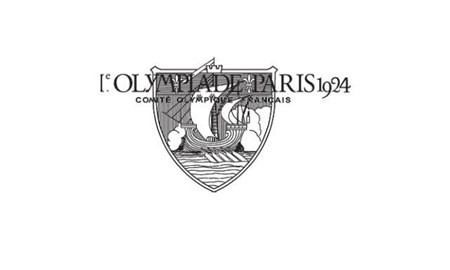
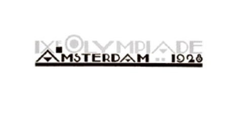
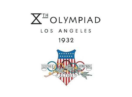
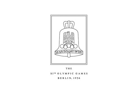
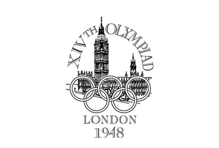
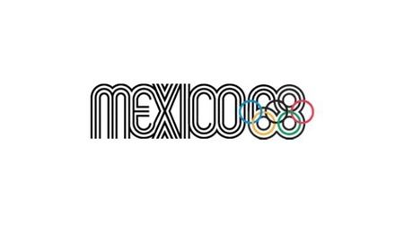
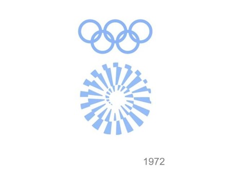


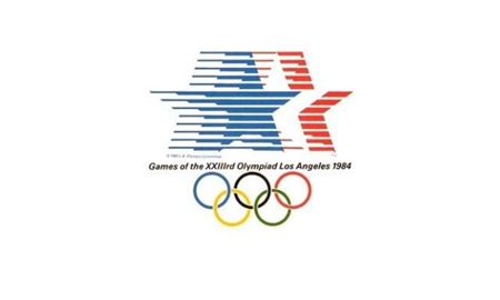
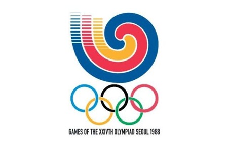
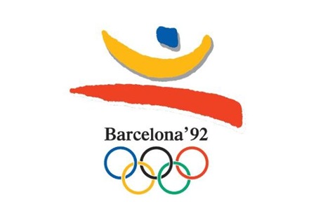
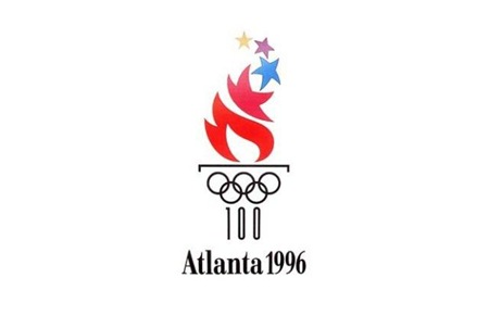
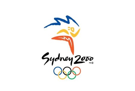
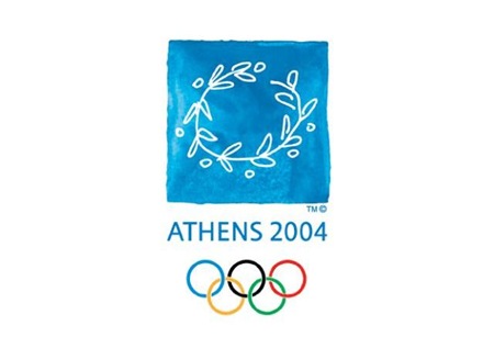
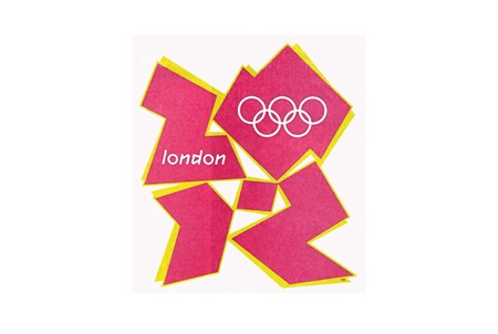
And it wouldn’t be completely without a peek into not-so-distant, yet oh-so-hideous future (London 2012). To tell the truth, something about this is starting to appeal to me. At the very least I can say I prefer the 2012 logo to some of it’s more boring ancestors (i.e. 1988-2008).
Most images via Sachin Tomar
Comment on this post
Meridian Video: Tycho

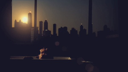

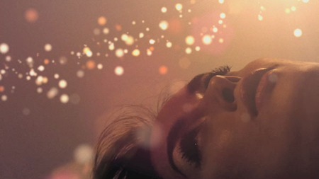
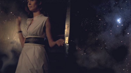


Director Brian Levi Bowman has released a new short film entitled Meridian which features the Tycho track Daydream. I think it came out beautifully, those particle effects are amazing. They simply licensed the track for this so I had no input on the project; in a situation like this it’s always interesting as a musician to see what directors will do with your work. The finished product rarely reflects the meaning you originally had for the song, but it’s always nice to see a different take on things.
There are a few viewing options below, I recommend the Quicktime if you got it, the quality is much higher.
> View Meridian Quicktime
> Download Meridian Quicktime Hi-Res
> View Meridian in Streaming Flash
Flying Lotus+Dabrye+Eliot Lipp+Daedelus
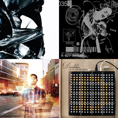
Here are who i think might be the best indie hip hop producers at the moment when it comes down forward thinking, more on the electronic end and catchy. Its great to see that a few went the extra mile and got a proper designer for album covers like Dabrye’s WK Interact artwork and Eliot’s someoddpilot artwork.
[audio:lotus2.mp3] [audio:dabrye.mp3] [audio:lipp.mp3] [audio:daedelus.mp3]Mike Oldfield – Ommadawn (1975)
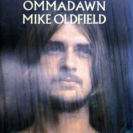
So I’ve been really getting into Mike Oldfield lately. This album is his second follow up to the wildly successful Tubular Bells, but has a slightly more “world” sound.
Since each of the two tracks is almost 20 minutes long, I pulled a 2:00 excerpt.
[audio:mike_oldfield-ommadawn.mp3]PDP-8/I/S
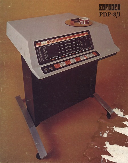
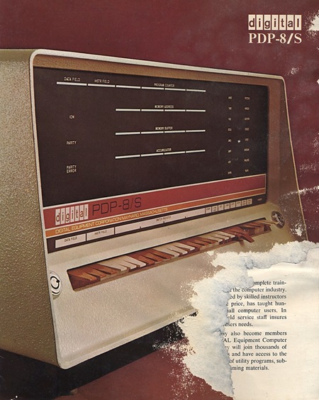
Here are a couple old DEC ads, one for the PDP-8/I and one for the PDP-8/S. The 8/I would make a wonderful piece of furniture or a nice synthesizer stand. Unfortunately you rarely see these in good shape; here’s a banged up 8e on the bay.
Frozen Grand Central
I know, I know, flash mobs are so last year. But I hadn’t seen this one yet and thought it was a good example of the concept as art. This must have been a pretty surreal scene to randomly stumble into, although I would have to think that most New Yorkers are pretty jaded to these sorts of stunts by now. The real trick would have been to do this in the 1930’s or 40’s. It would have caused a city-wide panic, people would think it was the rapture or something.
I’ve never seen one of these in person, but here in San Francisco I’ve witnessed Critical Mass a few times. It’s a pretty amazing sight to behold except for the part where I can’t walk across Valencia to get a falafel.