Studio Work

STUDIO5003
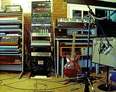
I’ve been locked in the studio for a while preparing to record some new tracks for the upcoming Tycho album. I reconfigured my whole setup and it’s finally all coming together. I’ve finally added a true analog mixing console and it’s really changed the workflow, been saving a lot of time. Above is a partial shot of the studio in it’s current form, still a ways to go with the acoustics, but I’ve been making do. 

On a side note, I temporarily moved back to Windows XP32 since they don’t make the software I use to record (Sonar) for Mac. I installed Photoshop and it’s been running so bad, crashing all the time. Meanwhile, on the Mac side, solid as a rock. I really wish I could just work inside of OS X full time, but Logic and Pro Tools just can’t hang with Sonar in my book. Oh well, here’s hoping for a solid Windows 9.
It Pays To Have a Designer In The Band

cwk-splash
Matt Maust is the Bassist for Cold War Kids and a great designer as well. Their album Robbers & Cowards has really been a sleeper hit for me. I first became aware of them a while back but sort of thought Hospital Beds was cool and left it at that. But lately I’ve been working to the record and really enjoying it as a whole.

Today I checked on their site to see what they were all about and was greeted by the lovely image you see above. Once inside it just gets better. I’m always a sucker for the big-gothic-type-on-photographs motif, and here it’s done very well. Even with the most talented designers, a lot of the time you can see through to the fact that the artwork for a band was project / money driven. In the case of an outfit like Cold War Kids, I think the (literally) DIY design ethic shines through to great effect. But at the end of the day, it’s not how you look as a band, it’s how you sound.

Cold War Kids – Hang Me Out To Dry

[audio:dry.mp3]

SIFR Titles Work!

tg3
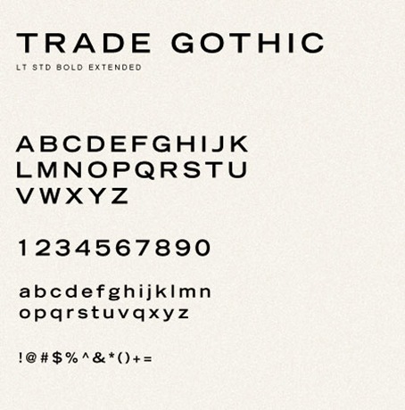
For those of you that view this blog with a Flash-Enabled browser you may have noticed that the post titles are laid out in Trade Gothic LT Std Extended. This is done using a ridiculously complicated method of swapping out the HTML text and rendering it in Flash. The system that does this is called sIFR, it’s a huge jumble of Javascript and Flash that I really couldn’t make heads or tails of for a long time. As a result, the titles were not clickable, meaning you couldn’t actually click them to get through to the permanent home of the given post. Well after my recent plea for web help, Karl Peterson stepped up and answered the challenge. He made short work of the sIFR problem and so now, as you can see (or click), the titles are finally working flawlessly. Thanks Karl!

Karl Peterson is a designer / developer out of Bellingham, WA. You can view his portfolio at sidearmdesign.com.

Gas: Nah Und Fern

Gas - Pop
Kompakt Records just re-released Gas – Nah Und Fern earlier this month which is a collection of all 4 CD’s he released in the late 90’s on the legendary ambient Mille Plateaux imprint. All 4 releases became available this month as a beautiful box set collection. This cover art is from one of my favorite later releases called “Pop” which is on both LP and CD version of the release. The way i always visualized Wolfgang Voigt’s music is if you sat in a flat plain with tall dry grass and watched an old locomotive chug along about a half mile away, each track on this album has a similar feel to this, maybe its the soft kick drum in the background or the constant dull bell. If you don’t mind repetition and can sit and enjoy the small additions and changes in these tracks while you let the song play all the way thru as you do something else(work) than you will get alot out of this kind of music.

Gas – Untitled (Pop 4)

[audio:pop4.mp3]

The Bank Job

the-bank-job-poster-large
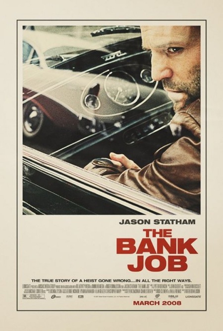
I saw this poster plastered all over a construction site by my house a while back and was really struck by how well executed it was for a modern movie poster. I had been meaning to post it but had totally forgotten until Joris commented on it in the 100 Greatest Movie Posters post. You really don’t see design of this caliber and style in the movie industry anymore. I am assuming this was an early version of the poster. I read somewhere that the big studios will commission an early, more subdued / subversive version of movie posters far in advance of the release and then they come with the tried and true (and boring as hell) final version replete with giant heads and random quasi-illustrative open space backdrops. It’s so formulaic, but I suppose they’ve done their homework and that’s what moves the masses. Sad. Thanks Joris for the reminder on this one!

Extra Credit: This seems to be a similar still to the one used for the poster, give you an idea of the sort of photo manipulation that went into the poster version, very nice. Also, here’s another, infinitely worse, version of the poster.

Sigur Ros: Gobbledigook

Sigur Ros
One band that i might say is one of my favorites but i probably don’t listen to enough unless i’m in the right mood is Sigur Ros. This is the new single off their new record called Með suð í eyrum við spilum endalaust (English translation: with a buzz in our ears we play endlessly) which is out next Tuesday June 23rd. Personally, i love this song it reminds me of some great tracks off Animal Collective – Sung Tongs.

Sigur Ros: Gobbledigook

[audio:gobbledigook.mp3]

I couldn’t find a good quality version of the Gobbledigook video but this gives me a chance to post one of my favorite videos by them which is off the last record, the song is called: Glósóli.

Room Without A Key (Studio version)

Studio
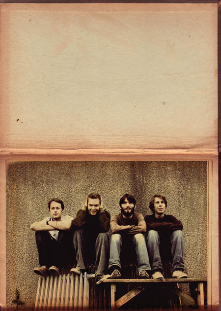
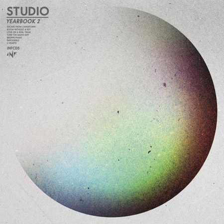
Studio has a CD coming out in two weeks which includes all the remixes they’ve done. This Swedish duo we’re played to me by my close friends and this Rubies remix has been stuck in my head. I’m also impressed by some of their quality press photos, they’re not over stylized but more classic and clean with just that right amount of that extra something that makes them special and looking good amongst others.

Rubies: Room Without A Key (Studio version)

[audio:rubies.mp3]

100 Greatest Movie Posters

vertigo1
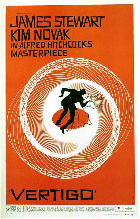
Over at Tccandler there’s a post on "The 100 Greatest Movie Posters". It’s a nice collection and while most are not aesthetically quite my style, they are all successful in one way or another. I’ve included one of the few I would actually hang on my wall above, Saul Bass’ poster for Alfred Hitchcock’s Vertigo. Link

Luigi Colani

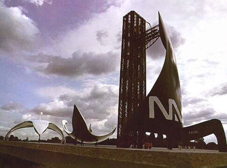
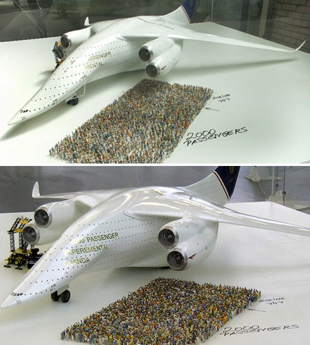
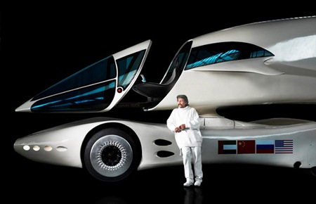
wertertdfcol071KONICA MINOLTA DIGITAL CAMERA Colani_truck_3
Some amazing designs by German Industrial Designer Luigi Colani. I particularly enjoy the aerospace stuff, reminiscent of the Soviet Ekranoplan. I can distinctly remember seeing that truck design when I was younger; funny how things like this make their way back to you. Via Dark Roasted Blend

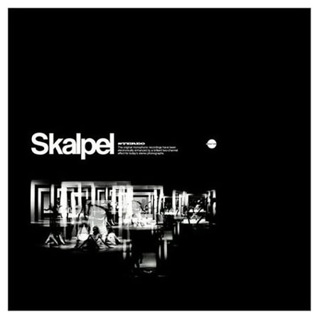
Skalpel: Sculpture

Skalpel: Sculpture
Skalpel are a jazz duo from Poland on Ninja Tunes, they sample 50s-70s Polish Jazz and piece together tracks. I always liked the video for this song and the raw lo-fi recording did it for me everytime. It reminds me of The Avalanches alil but not as uptempo, i’ll post something from them soon.

Skalpel – Sculpture

[audio:sculpture.mp3]