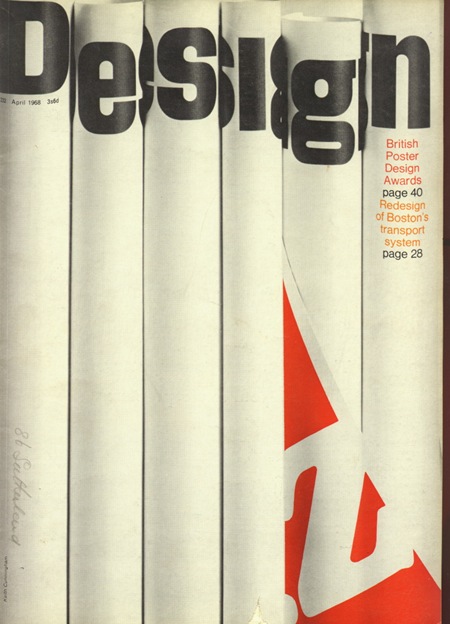
Cover of Design Magazine 232; pretty damned clever. I’ve been planning on experimenting with printing then photographing certain elements for projects then recompositing them back into an image. This makes me realize I need to start working on that sooner than later.
Design 232
Reconfiguring…
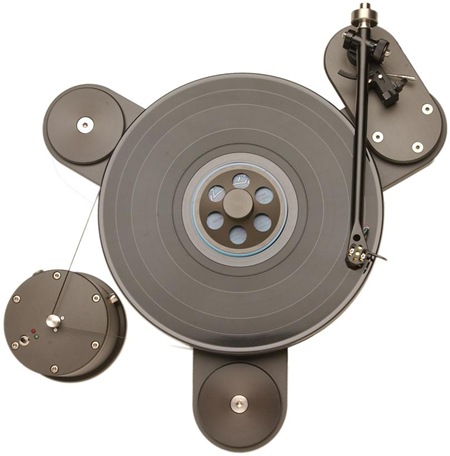
My last computer just wasn’t cutting it anymore performance-wise so I’ve spent the weekend building a new one. As a result, not much bloggery going down, but I’ll be back on it tomorrow. So for now, here’s a random picture of some sort of bad-ass record player. I’ll do a post on Photoshop / Media Production performance as it relates to hardware configurations once I’m done with the new machine.
Der Prophet
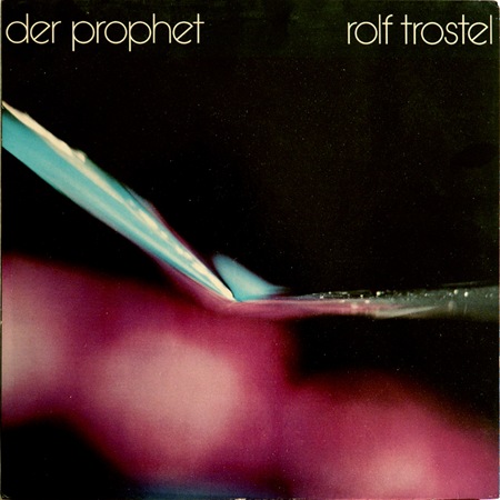
Another one from the Dream Chimney "Sleevery" archive. Loving the type, I would call that Avant Garde if it weren’t for the rotated ‘e’. Can anyone identify this or is it a custom job? Let us all know…
Not sure what’s going on in this photo, but it’s incredible and the colors are just about perfect. Wish I had some more background on this piece but perhaps someone can fill in the blanks.
J. Casey: Coffee Hour
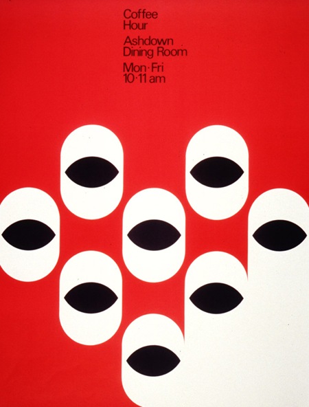
Creator: Casey, Jacqueline S
Title: Coffee hour
Description: 1 poster : b&w, red ; 55 cm. x 42 cm
Poster Number: 3041
Poster Location:
Archives and Special Collections.
Wallace Library, 3rd floor
Via RIT Libraries
We Have a Map of the Piano
Charles Harper: Biology
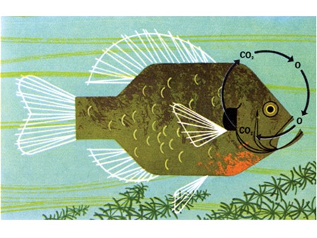
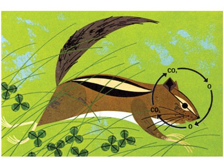
Some interesting images at Grain Edit’s Charles Harper Flickr Gallery.
Via FFFFOUND
Dusty Brown Elliott Smith Tribute
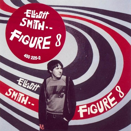
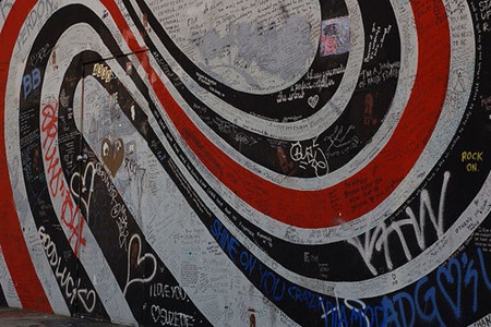
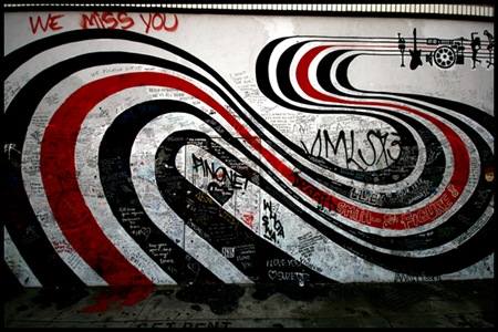 My friend and yours, Dusty Brown, recently covered Elliott Smith’s "Can’t Make a Sound" for a tribute album and it turned out incredible, dare I say, better than the original. You be the judge, have a listen below.
Dusty Brown – Can’t Make a Sound (Elliott Smith Cover)
Available on the album Hope You’re Happy
Incidentally, the last two images above are of the wall in Los Angeles that was used by photographer Autumn de Wilde as the backdrop for the Figure 8 album cover. Since Smith’s death it has become a sort of memorial for fans.
100 Percent Chocolate
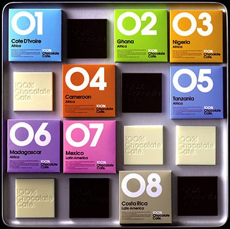
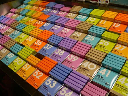 At least someone is getting packaging design right these days. These shots are from the 100% Chocolate Cafe in Tokyo. I somehow missed this while I was there, would have been nice to bring some home.
Via Dieline
Sarah France: Method
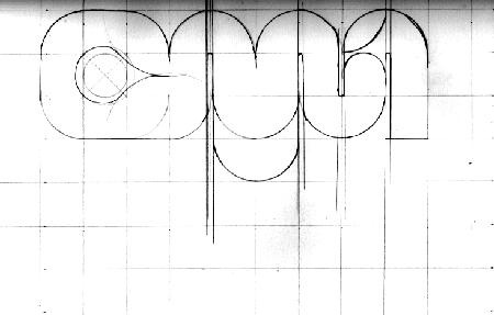
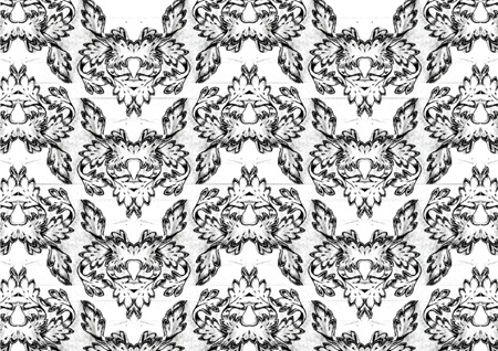
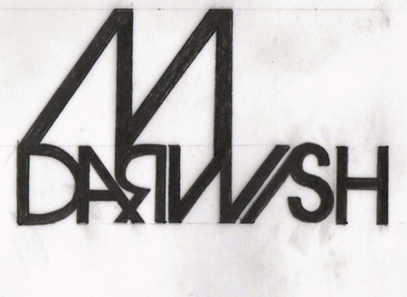
Came across the blog of Sarah France today, really liking how she keeps it old school with the hand drawn concepts. Long live Pen & Ink! She also has some cool photos along with a really clean page layout.
I really wish I spent more time with the pencil, I have become pretty lazy over the years. It’s come to the point where writing a full page of text makes my hand hurt so bad that I have to stop. Pretty sad, but I guess with computers there’s less and less need for handwriting.
J. Casey: Three Exhibitions
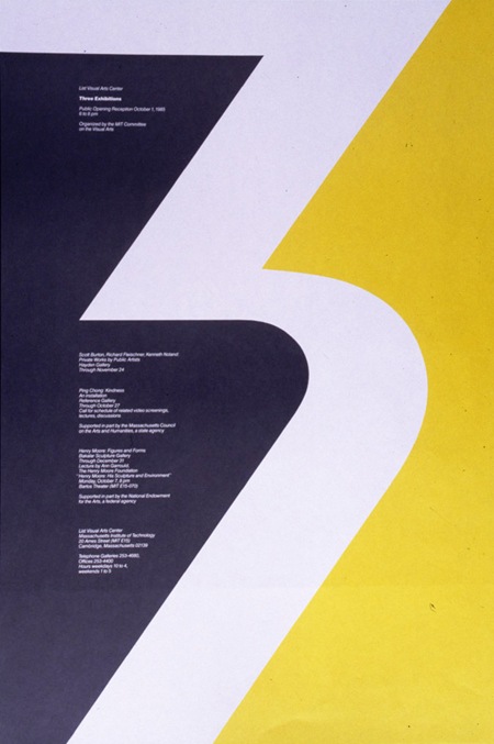
File this one under "Things I’d never seen until now but somehow influenced everything I’ve ever done". I suddenly want to move to Massachusetts and work at MIT. This is the sort of design that makes me lament the fact I did not study design in school. How could I have gone all these years practicing design and never been aware of such an amazing talent? Sadly Casey passed away in 1992.
Creator: Casey, Jacqueline S
Title: Three exhibitions
Description: 1 poster : col. ; 78 cm. x 53 cm
Via: Rit Library
"Jacqueline Casey worked as a graphic designer for the Massachusetts Institute of Technology during those years and the posters promote activities and events on campus. In 1992, the MIT Museum donated the posters to RIT Library, RIT, in accordance with Ms. Casey’s wishes."
