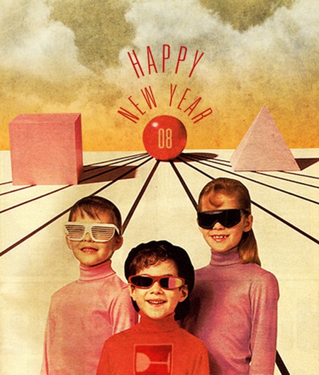
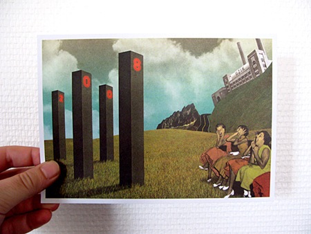
Been seeing Julien Pacaud’s work around a lot lately, It’s hot. Check him out here. Jakub, you drooling over that top one? I can see it on your wall already.
Julien Pacaud
Meet The World

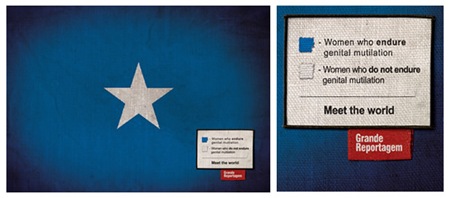
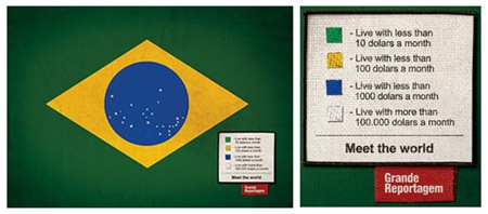
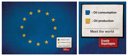
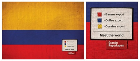
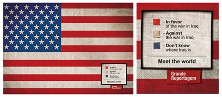
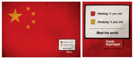
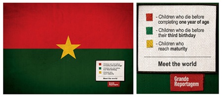
Saw this on FFFFOUND today, really very clever. Loving the vignette on the flag photos and the concept is spot-on. Using the flags as information design in this context is so poignant. Incidentally, I used to be obsessed with flags, had them hanging all over my room as a kid. Guess I’m still a sucker for them.
"Icaro Doria is Brazilian, 25 and has been working for the magazine Grande Reportagem, in Lisbon, Portugal, for the last 3 years. He was the author of the flags campaign "Meet the World" that has been circulating the earth in chain letters via e-mail…"
– Quoted From Brazilian Artists.net
Dream Chimney: Sleevery
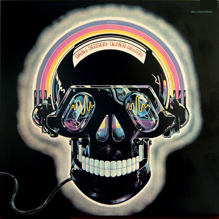
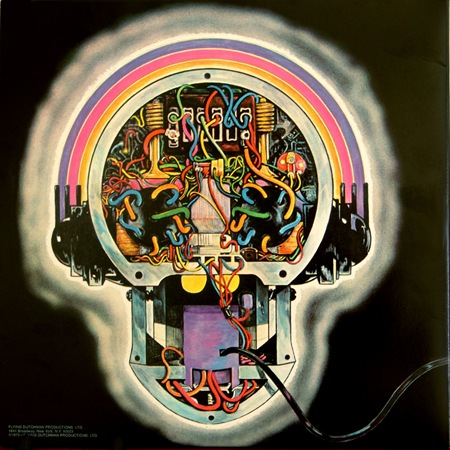
You may remember Broker / Dealer from this post. Along with some friends, they maintain a site called Dream Chimney which has recently launched a new section called "Sleevery", featuring all manner of cool record sleeve design. Have a look around, some interesting stuff in there.
The D’s Have It…
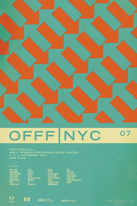
So after going through all the comments on the contest post for the OFFF NYC 07 print, it looks like the general consensus has swung in favor of version D (pictured above). After all of that, I’m still not 100% convinced which I like best. So I will be eventually printing a few versions, but the first to go out will be version D.
As for the winner of the contest; there were a lot of great analysis and it was hard to pick just one that said it best, so I picked two. And the winners are…..
Jacob Rubin (hrubinj)
Stephen Lynch
They will each receive a signed edition of the print along with some other stuff from the shop. I’ve also picked a few runners up who will be getting some Tycho MP3s for their efforts. Thanks to everyone who weighed in on this, so many great comments and good advice. This was definitely a good learning experience.
Back To Work
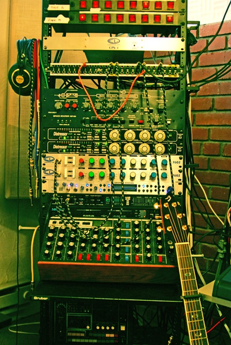
After spacing out for the couple weeks since I got home I’ve finally mustered the energy / motivation to get back to work. Been staring at the mess pictured above for the past few days finishing up a couple new songs. One of them is the next single for Ghostly which should be out in the next couple months. I will of course post some stuff up as soon as it’s cleared. I’ll be getting under way on the full album next month.
Also, if you were able to get tickets to the MOMI show in Chicago this weekend, see you out there. I’ll be playing with Jonah Sharp and apparently projecting visuals onto a screen that’s frozen in ice. Sounds good on paper, we’ll see.
Dieter Rams: Braun
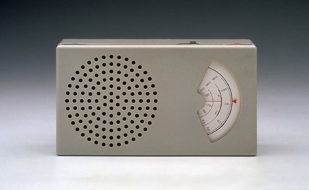
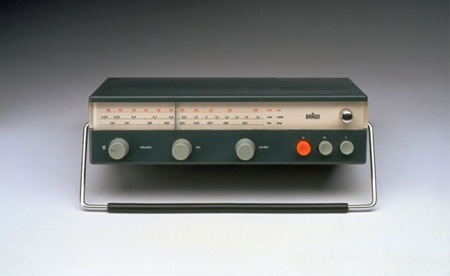
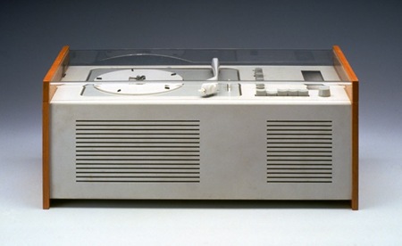
Some vintage Braun goodness from the Dieter Rams Flickr Pool. Rams was the head of design at Braun A.G. during the heyday of industrial design. I think his philosophy is one we can all look to for inspiration:
Rams once explained his design approach in the phrase "Weniger, aber besser" which freely translates as "Less, but better." – Wikipedia
Hallelujah
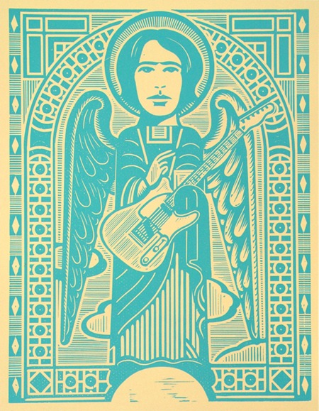
Just a little Sunday theme music in the form of Jeff Buckley’s hauntingly beautiful cover of Leonard Cohen’s classic "Hallelujah". Always sad to think such a talent is no longer with us.
The image above is a woodcut by Stephen and Sabina Alcorn entitled "Jeff Buckley, Gregorian Punk".
Jeff Buckley – "Hallelujah"
[audio:hallelujah.mp3]
Espacios Publicitarios
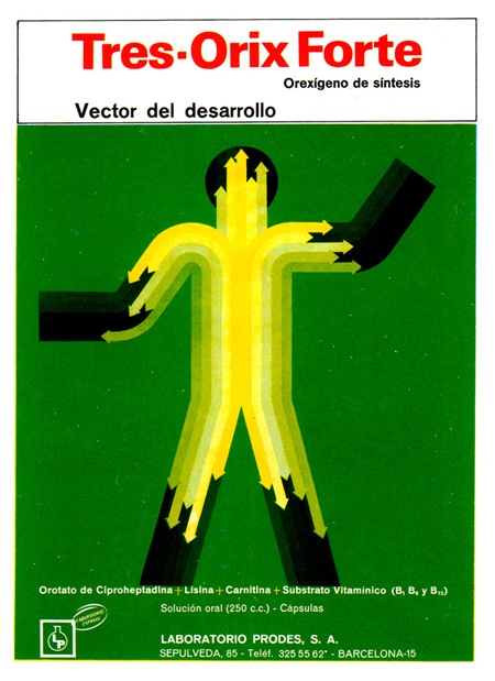
 I’m always amazed by the number of pharmacies in Spain (they’re everywhere) and also by the package design of the products in the pharmacies. They aren’t quite as good as these examples anymore, but still a whole lot better than we have in the states.
These images, from ex.novo’s "Espacios Publicitarios" Flickr set featuring 60’s and 70’s Spanish ads, were sent my way via Andrew Standfield. I absolutely love the illustrations. Would love to do a redesign or incorporate then into a poster.
Piazza, New York Catcher
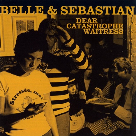
In keeping with the holiday (does this count as a holiday?) I thought I’d post a song from Belle & Sebastian (everyone’s favorite Scottish indie-folk outfit and perhaps my favorite band). I’ve always loved their album covers, usually very simple duotone photos depicting something to do with the album title. Always classic and fitting for the style of the music. I’ll be posting more from them in the coming weeks.
Belle & Sebastian – "Piazza, New York Catcher"
[audio:piazza.mp3]
Holga Mods
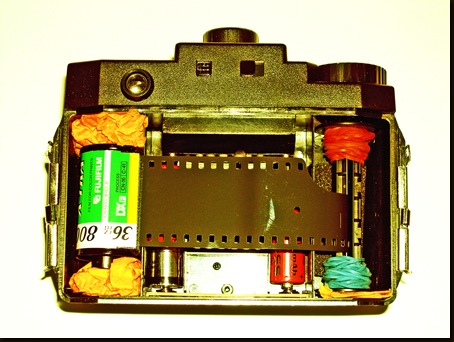
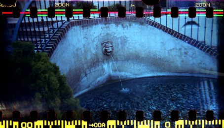
This post is from my friend Forrest who does a lot of lofi photography stuff. On top is his modified Holga and the bottom is a shot taken with it. I love how the exposure extends all the way to the edges.
"We all know the Holga can create some amazing 6×6 images, but did you know it can also use 35mm film? With a bit of ingenuity, foam, and tape, a Holga can be outfitted with 35mm film to create some spectacular photos. After developing, you can scan your negatives to catch the full effect of the Holga 35mm frame."
The Lomography site has a page about the Holga 35mm mod process which can be found here.