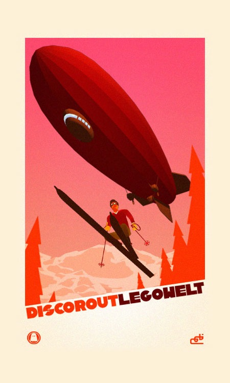
Nice promo poster for the Legowelt Disco Rout video.
Disco Rout Poster
Progress

Was so wrapped up in design related projects over the past 6 months that I didn’t get much work done on the new album / singles. But I finally got back on track and have been down in the studio for the past week finishing up a new song. This new single will be the second in a series of three to be released over the coming months. The first in the series comes out Dec. 11th. This latest one I am finishing should come out about 2 months after that.
In Rainbows

Just some ridiculously large portrait of Thom Yorke which seems to be the one Jimmy Turrell based this illustration on (click image for full size). If you haven’t heard In Rainbows yet, please try harder. Hands down my favorite album of 2007.
Jimmy Turrell
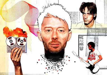
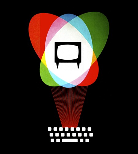
Illustrator Jimmy Turrell has updated his portfolio, really like his style. You may remember the lower image from this post, Jimmy was kind enough to send in the illustration by itself.
General Dynamics
Snoop Dogg
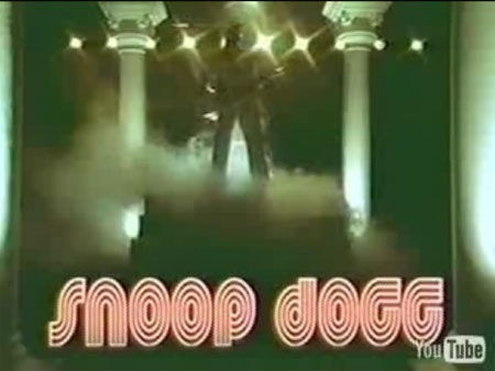
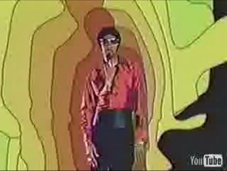
I know this isn’t exactly the subject matter that’s normally discussed here, but I saw this today and just had to post it. Really cool 80’s video vibe here, complete with old school video effects and VHS "PLAY" text overlay at the beginning. Really cool how the VHS tracking is off at the beginning like it’s an old tape, they really did a great job making this feel authentic. The whole thing is an interesting departure for this guy and shows that along with a whole lot of style he has a great sense of humor. The video was directed by someone called "Melina", not sure who that is, but good work. Snoop Dogg – Sensual Seduction Video >
Nitsche
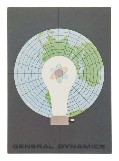
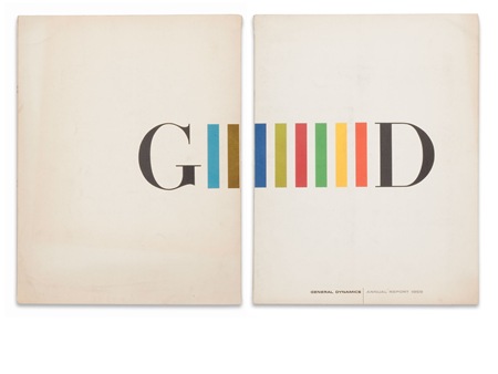
John Coulter sent me a bunch of wonderful Erik Nitsche images. This is the first of many to come, so amazing. I think this sort of illustrative design style is something that our generation has lost. You rarely see anything quite like this anymore. Most of the true illustrators these days stick to the sort of fanciful, handmade-looking things that you would expect and most pure designers stick with the computer producing things that sometimes feel a little too perfect. This is an example of how great things can be when you create graphic design by hand, in the real world. I know it’s not really practical in most commercial settings, you would hardly be competitive with other designers if you were trying to make everything by hand. But still, it would be nice to see a little bit more of this around. What’s really amazing is that this work of art was commissioned by a defense contractor, my how times have changed. I wonder if companies are just placing less emphasis on the printed form as they migrate to newer media, or if people simply don’t see the value in quality design like this anymore. Either way, it’s images like this that make me lament the passing of the golden age of design and the fact that I was born too late to be a part of it. I suppose that’s why I’ve always put so much emphasis on selling my work directly, by circumventing the world of client-driven design it’s still possible to create images with these ethics intact.
Kalle Gustafsson

Words can’t really touch this… The photo on the left may be the most beautiful image I’ve ever laid eyes on. Kalle Gustafsson is a photographer from Stockholm >
Legowelt Disco Rout
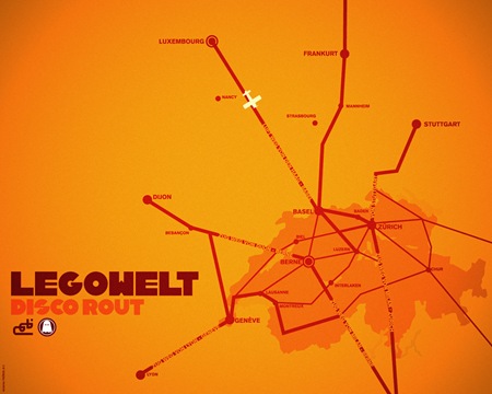
While discussing some plans for a future Tycho video with Ghostly, the Legowelt "Disco Rout" video by Brazilian firm Lobo.cx came up. This was an incredible video at the time (2002, Ghostly International), and still is. It’s like a bunch of European travel posters coming to life. Lobo did a great job making it all feel authentic while lending a modern edge with the 3D work. The song itself is amazing as well; the video fits it perfectly. Listening to this track always makes me think of driving an ’84 BMW down the Autobahn at speed with perforated driving gloves and Ray Ban Pilots. Jakub probably did that already, or at least mocked it up for a photo-op. See the video here >
Vuela Print
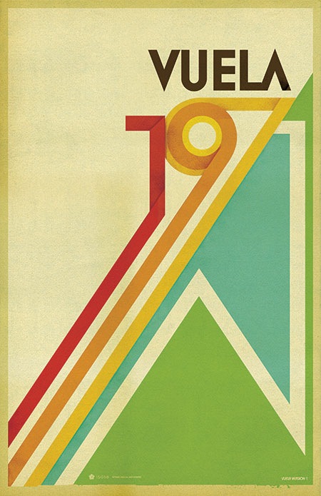
People often ask about the origins or significance of my posters so I’ll be posting the stories behind them from time to time. Pictured above is the "Vuela" print, a variation of the "1971" print. I created this after I first visited Spain; Vuela in Spanish means "Flight". I saw this word everywhere in the airports and it stuck with me. I spent most of my time on that trip in the city of Barcelona which is filled with design and art, it truly is one of the most beautiful places I’ve ever seen. This poster was meant to evoke the same sort of feelings I got from the people and places I encountered on that trip.
ISO50 Vuela Print >
