Photoshop Tip #001 – 2GB+

pstip01
I’ve added a new category to the blog: "Photoshop Techniques".  I’ll be posting random tips and techniques I have found to be useful when working with Adobe Photoshop.  To kick it off I’ll start with a pretty simple one that a lot of you may already be aware of. When working with large files in Photoshop the file size can become so big that Windows (yes, I use Windows, not mac!) cannot write the file, this limit is 2GB in the case of Windows XP (x86).  I’ve found that the PSD file format is rather wasteful and does very little (if no) compression.  You can simply save the file as a layered TIFF with the lossless "LZW" or "ZIP" compression enabled and shave the file size down by over 50% while still maintaining complete editability.  

I have been working through the process of recreating my prints in the 24"x36" @ 300DPI size so I have run into this problem a lot more recently (I originally design everything around the 12"x18" format). If you’re on a Mac, you no doubt have a 64bit OS and so don’t have to deal with file size limitations like this and you also have a really cool looking aluminum sculpture in your workspace, but this tip is still useful if not just to save a bit of disk space.  I would love to make the switch for design purposes, but I use the same machine for making music and design and in my opinion the Mac just can’t hang with the PC when it comes to recording and music.

Next week I’ll be covering hardware setups for large format stuff.

UPDATE: After reading about it in the comments of this post, I tried using the PSB format on a very large document last night. Saved after 5 hours of work, woke up this morning to find the file was highly corrupted with errors in a lot of the complex gradient masking. The errors were all isolated to masks on layers and layer groups. I have seen corruption like this before, but only when the computer crashed while trying to save a file. This time, the PSB saved fine and everything seemed to be going as planned, but the file was still corrupted. The file in question was 2.2GB with about 350 layers and 60 or so masks on various layers and groups. Anyways, this could obviously be an isolated incident and no testing was done to reproduce the error. Whatever the case may be, I won’t be using the PSB format again, I’ll stick to the TIFFs.
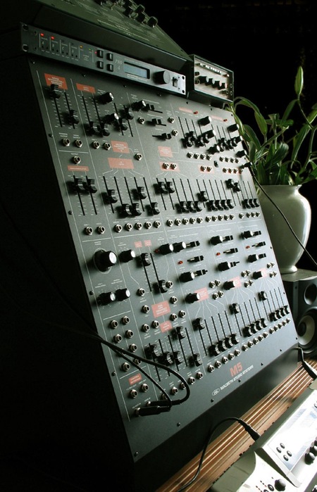
Macbeth M5

M5-Side-On-2-ba
I use a lot of analog synthesizers in my music so I thought it was time to start posting some nice examples of musical instrument design. I have always been obsessed with vintage analog synthesizer interfaces and although the Macbeth M5 is a modern analog synthesizer, it adheres to the design ethics of and pays homage to the modular synthesizers of the 60’s and 70’s.   The color scheme and layout is evocative of the classic Arp 2600.  There is something so raw and utilitarian about the construction and layout of these that’s just beautiful. If you look at the interfaces of modern digital synthesizers it’s all plastic eye candy and blinking lights. I must admit, I have never played an M5, but it looks so good I think I can give it a pass sound unheard.  Photo Via Macbeth. I will start posting some examples from my studio soon.

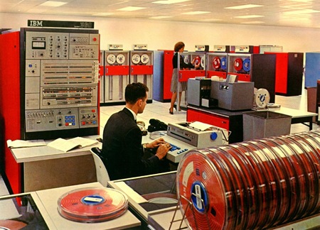
IBM 360

IBM_360
Some ye olde number crunching for a Monday morning.   With all that color coordination going on you’d think those people would be required to wear matching jumpsuits. Via The-Adam

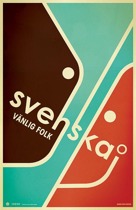
SVENSKA 2 ALT

svenska2b
Alternate version of Svenska 2. All you Danes out there please correct my grammar!

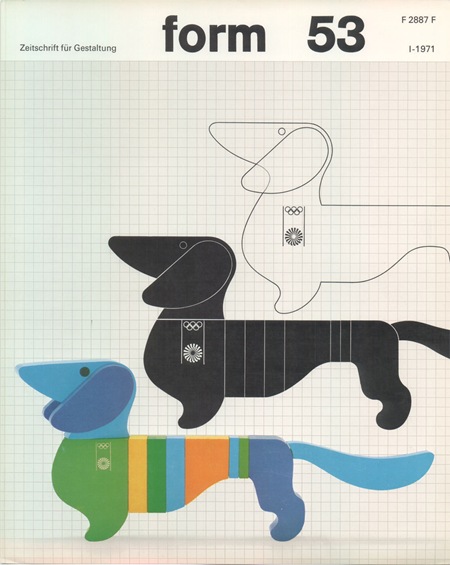
Otl Aicher – Munich ’72

575561156_3d913dbd09_o
Another image by German Designer Otl Aicher who was responsible for the branding of the ’72 Munich Games.  All of this stuff is amazing.  I am not a huge fan of the Dachsund mascot, but this is about as good a treatment you could give to such a concept. 
Simply do a Flickr Search for "Otl Aicher" and your head will explode.  Incredible stuff, some really nice shots of the London Aicher exhibition. I just can’t get over how contemporary these colors and forms are.  None of it feels dated, could have been from a pitch for 2012, if the people who oversee those sorts of things still had any taste that is.  Seems like all the stuff now days is targeted at the lowest common denominator. All of the recent stuff I have seen for 2012 is throw-away, middle of the road with compromise written all over it. Aicher’s campaign is thought provoking and timeless, obviously a good argument against the design by committee ethics I have to imagine produced this sort of output.

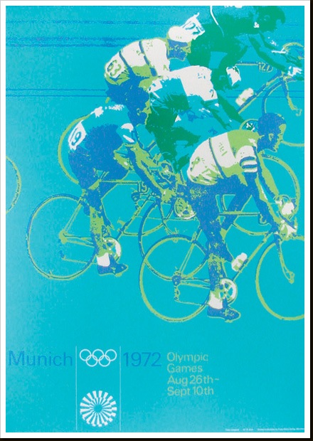
Munich 1972

397746271_9df4456b1d_o
Part of a series of posters from ’72 Munich games by Otl Aicher. I’ll post some more examples in the coming weeks. These must have had a very modern feel when they came out, the colors certainly contrast the prevailing palettes of the time.

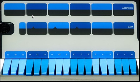
DIGITAL PDP PT.2

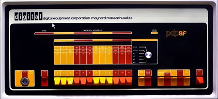
iso50_6 iso50_7 More Digital love….This time from the Core Memory book. That blue is on a whole new level, I need those switches all over the place, controlling all functions at all times. 

1971 – Reprinted

iso50-1971c.jpg
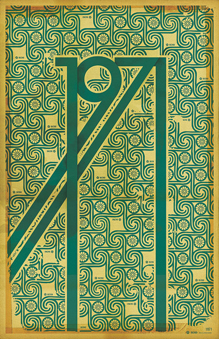
The 1971 Print has been reprinted and is now in stock at the ISO50 Shop.
A lot of people have asked me what the significance of the year 1971 is (no, it’s not the year I was born). Hunter S. Thompson’s “Fear and Loathing in Las Vegas” first appeared as a two part series in Rolling Stone magazine that year. Wikipedia sums up the main theme of the book which was based on these articles:

“It explores the idea that 1971 was a turning point in hippie and drug culture in America, when the countercultural movement no longer had momentum and its innocence and optimism of the late 1960s turned to cynicism.”

This print sort of juxtaposes the design ideals of the 60’s: the earth-tones and swirling, psychedelic, patterns; with the harsh, solid forms of the gothic lettering.
Oh, and also 1971 just looks badass all stretched out like that.

1972 NY Transit Map

1972ny_subway_map.jpg
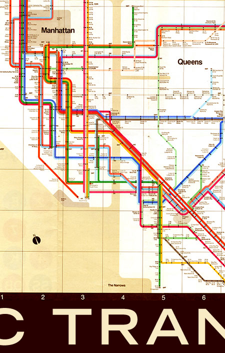
A 1972 map of the New York Subway system. Going to be using this a lot in a couple weeks so thought I would post it up. This is of course based on English graphic designer Harry Beck’s original topographic map of the London Underground (as Paul Mison pointed out in the comments, this is a later version of the map, not Beck’s original). This style of map was revolutionary at the time (1933) since it eschewed the geographically correct maps of the age for topographic representations of systems.

A schematic diagram rather than a map, it represents not geography but relations. It considerably distorts the actual relative positions of stations, but accurately represents their sequential and connective relations with each other along the lines and their placement within fare zones.
– From Wikipedia “Tube Map” Article

This must have been a very big logical departure for a lot of people and a lot of credit is due to Beck for having the intuition to draw the map in this new way. Of course all this is beside the fact that it’s just plain beautiful to look at and a great work of graphic art in it’s own right. To this day, Beck’s map still influences the way networked systems are represented, the above image being a great example. I don’t think many designers can claim such a revolutionary concept as their own.

October ISO50 Newsletter


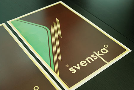
The October issue of the ISO50 Newsletter is out now and among other things, announces the release of the “Svenska 1B” print (pictured above). This third and final version in the Svenska series is available now at the ISO50 Shop.
The newsletter also covers details on the upcoming New York OFFF festival and the upcoming Tycho single release date. You can read the newsletter here or sign up here to get the latest delivered straight to your inbox monthly.