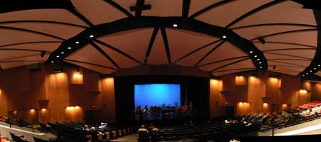
As stated in the previous post, I’ll be hosting a workshop entitled “ISO50: Blending Analogue and Digital” at this year’s OFFF festival in New York. The festival runs Nov. 2-4. The workshop will be held Saturday, November 3rd, 2007 at the BMCC Tribeca Performing Arts Center in “Theater 2”. Things will get started at 11:30am and it goes through to 1:30pm. I’ll be focusing mainly on process and theory, with specific examples and PSD deconstructions.
Space is limited to 230 people and entry will be first come, first served at the door. The workshop is included in with an OFFF pass, available here.
ISO50 Workshop – 11/03/07
OFFF NYC 07 CATALOGUE

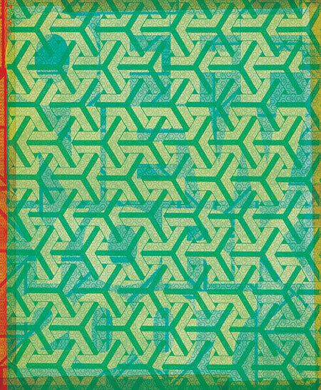
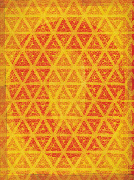
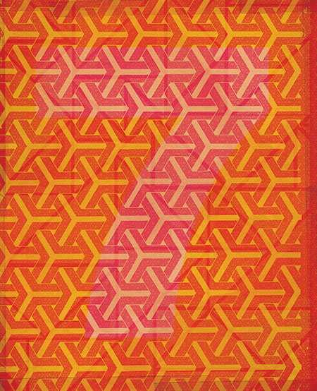
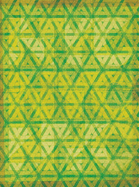
Just finished the cover for the NYC OFFF festival (New York – Nov. 2-4, 2007). This is the book that’s given out to all attendees and features work by many of the speakers and presenters at the festival (might have to squint a little to read the titles better). I’ll be hosting a workshop / lecture, all the details are here. It will be a similar workshop to the one I did in Barcelona this summer and will be focusing on technique with a lot of deconstructions and hands on examples of my process and theory. As with Barcelona, space is limited (230 people per workshop this time), but unlike Barcelona the workshop is included in the cost of the festival pass, there’s no additional registration required, it’s just first come, first serve. You can snag tickets to the Festival here, as of this posting they are nearly sold out so get on it! As stated in an earlier post, there will be an ISO50 booth for all three days of the festival with shirts, prints, and music. See you in New York!
Mexico 68 Stamps & Tickets
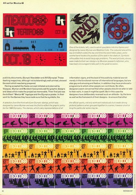
A page from Design #237 featuring various logos, tickets and stamps from the games.
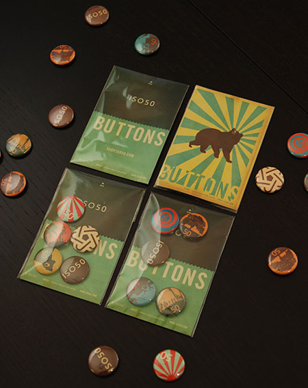
ISO50 Buttons
Aptera
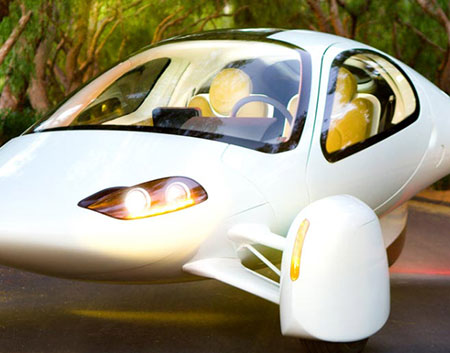

The aptera car is one big step closer to production. You can actually reserve one of these 300mpg dream machines now for $500 ($26,900-$29,900 full price). I love this color scheme, the mustard on white feels classy and the lines are reminiscent of light aircraft. This is where good design truly becomes important, if you can build enough wow factor into alternative/hybrid energy cars you might just win over some of the SUV crowd. Engadget has more info here or you can visit the Aptera Website. This thing makes me want to trade in the Prius, although the lack of trunk space would be an issue.
Update via Bill Gross himself in the comments:
“Actually, I have a Prius, and I like it a lot. It seats 4, and the Aptera only seats 2.5, but believe it or not, the trunk space in the Aptera is quite generous. The car is pretty long, and there is a lot of space for stuff back there. But I would leave that for you to judge.”
Now that I look at it closer, there’s actually a fair bit of room back there.
B&O Beogram – 1974
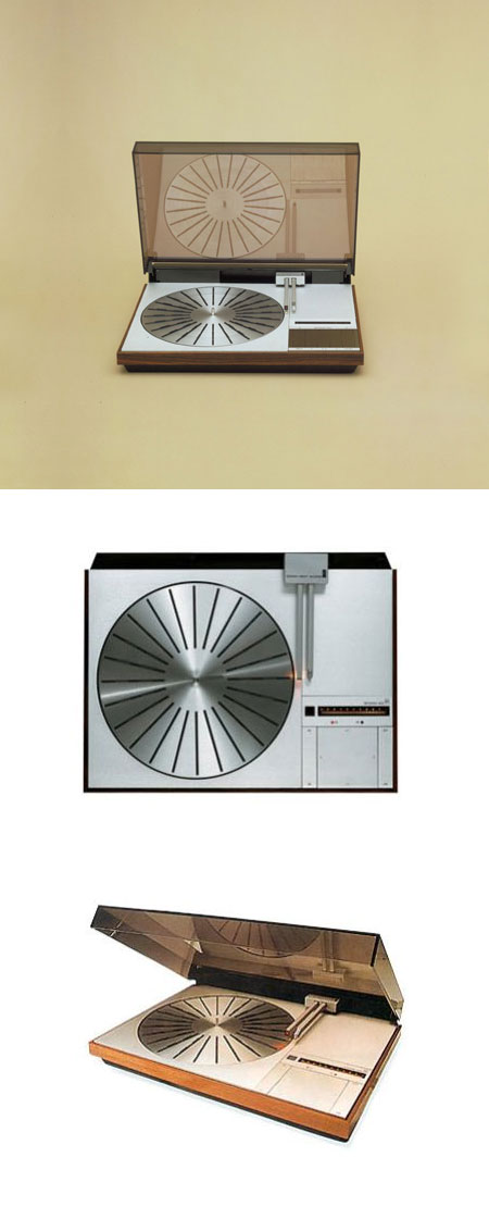
Bang & Olufsen are masters of industrial design and Jakob Jensen’s Beogram 6000 is one of their greatest achievements. The lines on this are as close to perfect as you’ll find and you can’t lose mixing wood grain with stainless steel.
I really can’t say I am as impressed with their work in recent years. It seems as if industrial designers are always trying to “evolve”, which is fine as long as your idea of evolution is turning into an alien. When I look at a classic example of design like this I really see a human element missing from a lot of it’s modern counterparts. Objects like the Beogram 6000 seem to be begging humans to touch them, whereas objects like this seem cold and foreboding.
Air Canada
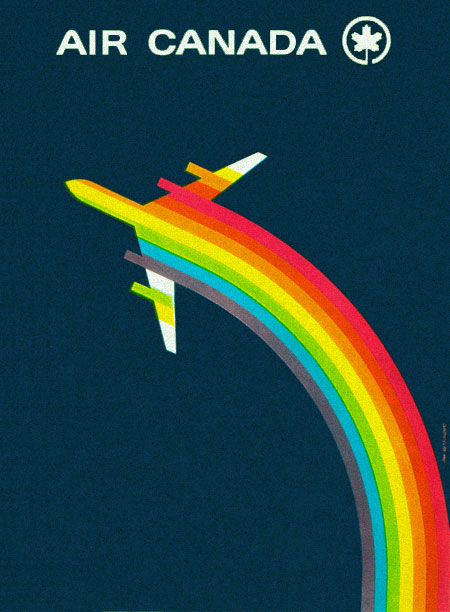
The Canadian goodness just keeps coming.
Update via Joe Kral:
“This was designed by Dan Reisinger. Featured in an old issue of Graphis magazine.”
OFFF Festival NYC
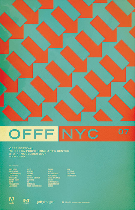
I will be speaking / giving workshops at this year’s OFFF in New York, November 2-4. In case you aren’t familiar with OFFF, it is a festival focusing on the “post-digital creation culture”. Translation: A lot of great people and great designers in one place talking about the things they do and how they do them. There are all sorts of people who attend and present at the OFFF: interactive designers, print designers, ad agencies, experimental artists; it really is an incredible experience and every year I am amazed at the things I see there. I have been involved for the past couple years, both of which were in Barcelona. This will be the first year the OFFF has come to the states, held at the BMCC Tribecca Performing Arts Center in New York, NY. There will be an ISO50 booth at the event with prints, shirts, and music. Stop by and say hello. Tickets and information are here.
The poster (above) is based on a pattern I saw painted on an old, crumbling wall in Barcelona (the city where OFFF began). I always wanted to incorporate it into a print and thought this was the perfect time. I think they sort of play on the energy of New York, lot’s of people and things moving in different directions and they tie the concept back to the origin of the festival itself. I played with having the arrows running up and down (as the original painting I saw had) but the 45 degree angle seemed to translate the dynamic, energetic vibe I was going for a bit better. The colors are meant to confuse the eye a bit and enhance the double arrow effect going on. I chose classic, practical typography to balance the piece and hopefully give it a more timeless feel.
Incidentally, after posting this I was looking at it on the front page of the blog. I scrolled down and saw the recent post on the NFB and realized how similar the two images are. Perhaps a case of subliminal inspiration? Funny how things like that can happen as I definitely didn’t have that NFB poster on my mind as I was designing this, but the similarities and time frame seem to rule out coincidence. And on another aside; this is one of the, if not the first posters I’ve ever done without a border. As I look back at my collective works it’s sometimes surprising to see these common themes and elements crop up here and there. Some are intentional, but others, like the borders, just seem to be these dogmatic devices which aren’t always necessarily the best choice for the given project. Ha, I feel like going back and turning on and off the borders of all my older works to see which looks better.
Undercurrent
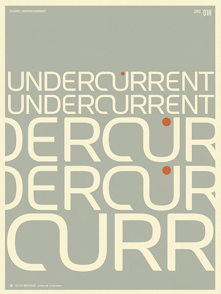
Branding I did for Undercurrent this summer. Just an example of how I typically present concepts to clients.
NFB 76/77
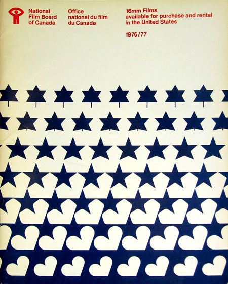
Sent via Jason Bustin:
“I’m in the process of moving and I came across an old National Film Board of Canada catalogue that was made available for American residents wishing to order 16mm films from the NFB in 1976/77.”
These evolving, MC Escher style designs are great. Especially love the motion metaphor tie in with the NFB. The bowed text at the top is an artifact of correcting for the angle at which the photo of this piece was taken.
I never realized it until I started posting all this stuff, but Canada seems to have a very strong legacy of graphic design, something for which I am not quite sure they are getting their due credit. I didn’t study design in school, is Canadian design a part of the curriculum of most design programs? If not, it should be. Just scroll through the recent entries here and you’ll see lot’s of great examples. I have a lot more coming too.
