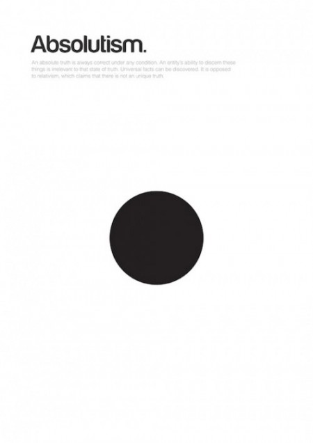
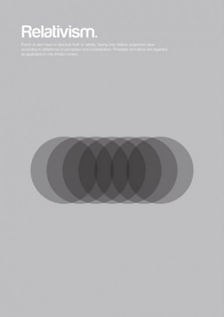
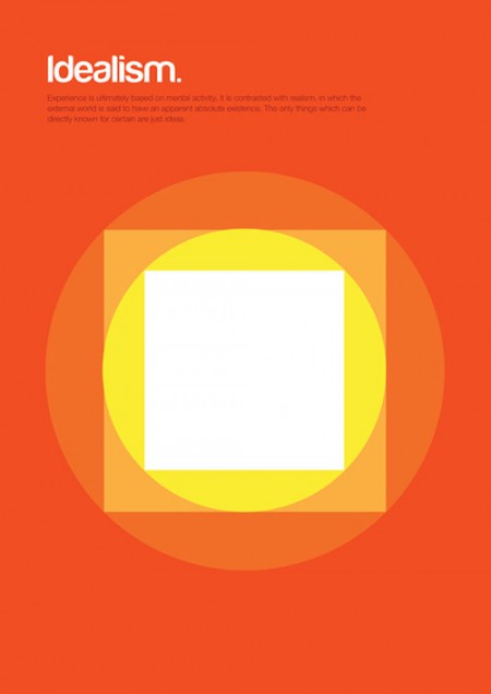

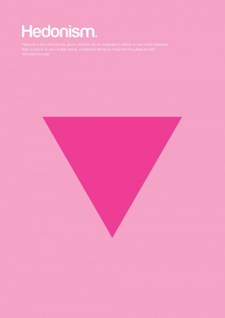
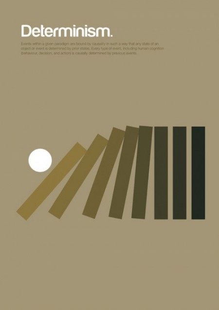
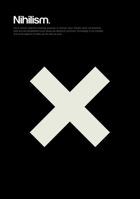
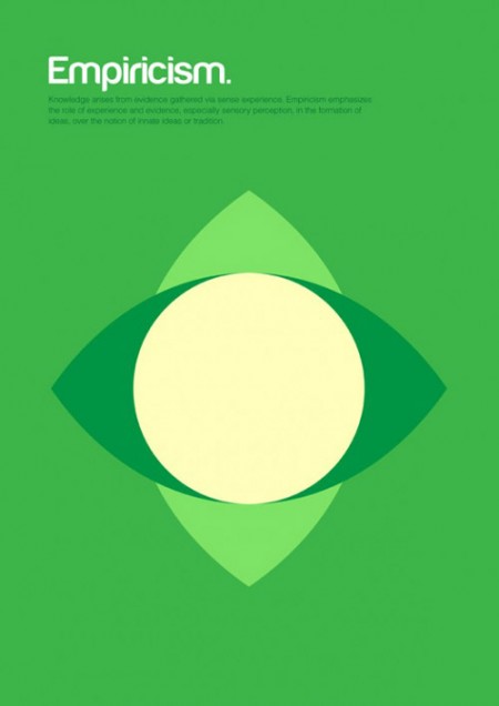
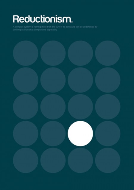
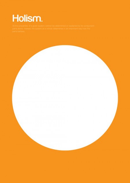


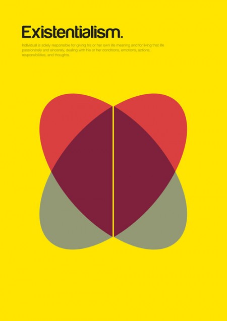
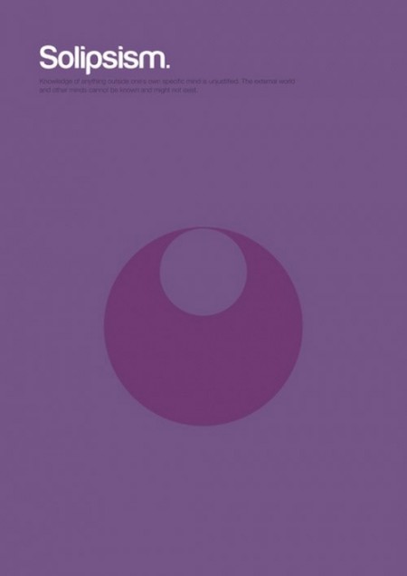
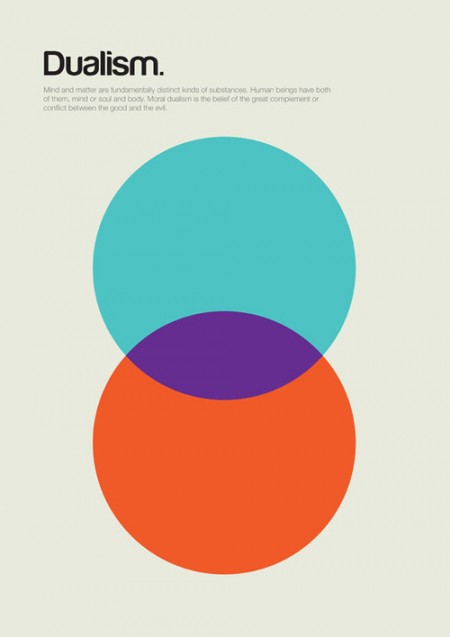
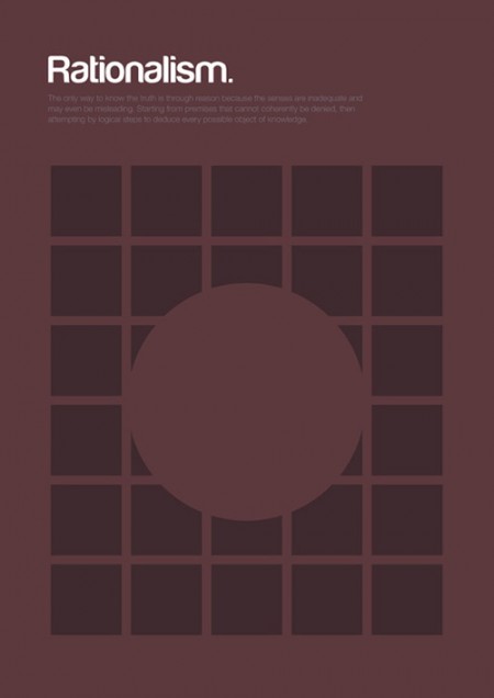
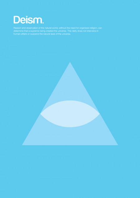


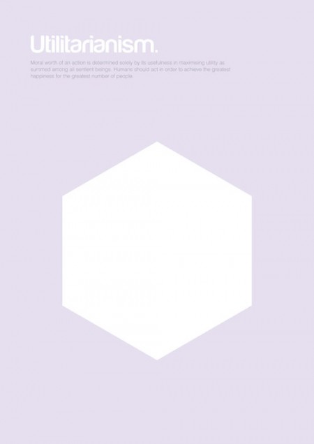
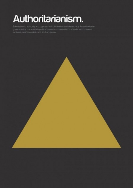
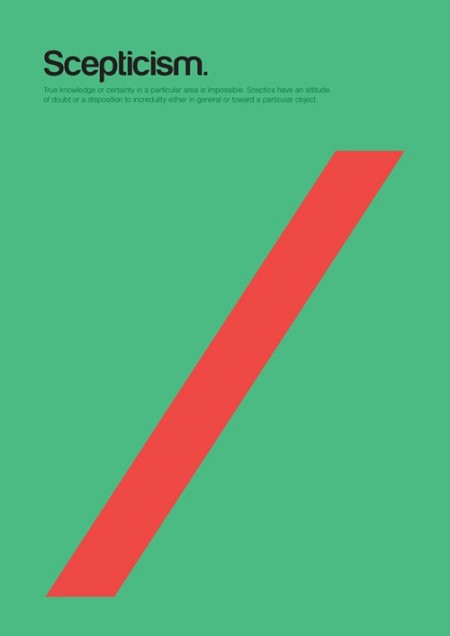
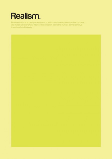
Poster series explaining complex philosophical theories through basic shapes, by London based designer Genis Carreras.
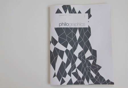
Aside from the posters, there is also a journal from the same series by the name of Philographics (Click on image below).
Posted by B3PO

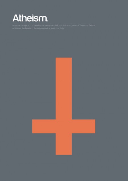
The use of the inverted cross as the symbol for atheism is a complete design failure.
Firstly, atheist traditions predate Christianity, and have emerged elsewhere in the world independently of the influence of Christianity (for example, secular strains of Hinduist philosophy). So to portray atheism as the mere negation of Christianity is both anachronistic and Eurocentric.
Secondly, the inverted cross has been adopted historically as a Christian symbol. According to Catholic tradition, Peter requested to be crucified on such a cross, not believing himself worthy to be crucified in the same manner as Jesus. Consequently, many Christians went on to use it to pay homage to Peter.
I really love the way the minimalist design of the posters, yet the only observation U have is that I would have loved to read what it says and I certainly couldn’t because the size of the typography is too small.
@ANDREW FOLTZ-MORRISON: I’m sorry if this post, in particular the Atheism print mentioned in your comment, has offend yours or anyone’s religious views, as the intent of the post was to merely showcase someone’s work, but I have to disagree with you to a certain extent on it being a “complete design failure”.
For better or for worse, there are symbols and/or images that carry with them certain stigmas that have been assigned at times, specific connotations or meanings by “today’s” society. Wether made popular by media, certain demographics or groups in our populations, tragic historic events or just plain mass ignorance, these meanings have been somewhat “widely” accepted. A classic example of this would be the Swastika.
This also brings to mind an exercise given to me in class once, where we had to illustrate phycological and sociological themes similar to the ones above using only basic shapes and I can assure that if given the word Atheism, a lot in my class would have probably come up with a similar “design solution”.
I really appreciate your comment and perspective.
B3PO
@COLLECTIVE: It would still be a stretch to call the inverted cross a symbol of atheism, as the popular media portrayal is more inclined to satanism.
I also found the inverted cross to be immediately and obviously wrong. The tenets of atheism are not based in “turning Christianity on its head”. If this were the case the same symbol could easily have been used for Humanism. Regardless, the symbol of an inverted cross is a very poor choice of imagery to depict the belief system of atheists. Atheists do not believe in gods, how is that depicted in the imagery of an inverted cross?
Depicting atheism with an inverted cross is just ignorant and unimaginative. It IS a design failure because it COMMUNICATES nothing about atheism and only reflects the personal prejudices of the designer. To begin with, atheism isn’t a philosophy or a worldview. It’s only an absence of belief. To try and define it with a symbol or a shape is naive. For example, what symbol or shape can the concept of someone not believing in astrology be reduced to? Using one wide gap of empty, negative space would have been much more insightful as a design solution. Just the word “Atheism” with its definition over white, empty space. That’s all it is.
These are quite nice, but it’s unfortunate that while some are expressed structurally (and creatively), by describing the idea through the forms of the graphics, others are just easy icons. That’s where the atheism one (and a couple of others) goes wrong. Nice idea though.
I see Collective’s point, but since this is an attempt to describe philosophical ideas, an inverted cross is overly simplified, even for an assignment of this sort. It might not be a “design failure,” but to me, it’s certainly seems lazy.
On another note, I would have liked to have seen nihilism represented by the absence of a shape. Granted, the goal was to use simple shapes, but as with the Atheism poster, there is a way to infuse the artwork with more meaning by going beyond the most immediate answer. And isn’t that what we as designers should strive for?
Thanks for the post. The minimalism concept is sometimes hit and miss. Overall, this was a good series.
Stop the hate. I would like to know his concept behind some of these, particularly the existentialism piece.
To me it isn’t lazy. To me it is simple and simple is beautiful. I believe you guys are over thinking it.
Umm It’s not the typography but the size of the image, I think you should upload images of greater size so we can read what is written, at least after downloading them (:
Gj btw (:
No theism? Very cool and simple.
I’m glad someone pointed out the atheism issue. That poster should be blank.
Call me crazy, but I’m not sure atheism counts as a philosophy – it’s a theistic concept. The designs are great, but as mentioned above, atheism could be blank, but then so could nihlism – they shouldn’t be part of the same series.
I am a big fan of these posters–so much so that I have returned to view them a number of times. I can find the intended philosophical meaning in nearly all the designs. I agree with Collective’s argument about socially ascribed meanings to certain images. Even in the field of public speaking, it is often best to use a word or phrase that carries a meaning which is easily understood by the audience, even in spite of the fact that the usage of the term may not be the most technical one. But we demand rigor on the ISO50 blog, don’t we! 🙂 This was a great post, as each poster is a heady image of contemplation.
For those of you having trouble reading the small text
http://www.behance.net/gallery/Philographics/1964649
🙂
I’ve just made a test with 7 people in the room to tell me what does a symbol of an inverted cross stands for and they all answered either satanism or st. Peter’s cross. Not a single one answered atheism.
Atheism and nihilism have no discernable symbols and nor should they. An X or a null symbol are better solutions though$.
The rest have some good solutions to represent the ideas behind them. Only one I didnt quite get was existensialism.
where can I buy prints of these?
Yeah, the Atheism shape blew the entire series for me. The inverted cross would work nicely for the philosophy of Black Metal or Satanism, but it doesn’t have anything to do with Atheism, which makes me suspicious of the rest of the set. But, I’m too lazy to scrutinize them all. The inverted cross was just blindingly ignorant.
Всъщност отдолу имало каре-summary: Is Evolution a fact or a thorey? The thorey of evolution explains how life on earth has changed. In scientific terms, thorey does not mean guess or hunch as it does in everyday usage. Scientific theories are explanations of natural phenomena built up logically from testable observations and hypotheses. Biological evolution is the best scientific explanation we have for the enormous range of observations about the living world. Scientists most often use the word fact to describe an observation. But scientists can also use fact to mean something that has been tested or observed so many times that there is no longer a compelling reason to keep testing or looking for examples. The occurrence of evolution in this sense is a fact. Scientists no longer question whether descent with modification occurred because the evidence supporting the idea is so strong. Why isn’t evolution called a law? Laws are generalizations that describe phenomena, whereas theories explain phenomena. For example, the laws of thermodynamics describe what will happen under certain circumstances; thermodynamics theories explain why these events occur. Laws, like facts and theories, can change with better data. But theories do not develop into laws with the accumulation of evidence. Rather, theories are the goal of science.
I have just sat back in my chair and physically applauded these – and Im by myself haha. I love it. Just love it. Cant understand the negativity from some but its subjective I guess.
Hi,
You can find a new interview of Genís Carreras on this link http://a-graphic-life.blogspot.com/2012/07/genis-carreras-graphic-designer-and.html
I hope you will enjoy. Thank you.
http://www.feeder.kharkov.ua/news/u_komandy_kharkova_po_fideru_teper_est_generalnyj_sponsor/2012-07-09-62|Tayota
The “inspiration” was better:
PRINT-PROCESS
http://print-process.com/Artist/Albert_Exergian
ICONIC TV POSTER SERIES
http://www.exergian.com/
These posters are fabulous, but I am decidedly uneasy about the pink triangle being used for hedonism, and I’m wondering if the reference to homosexuality was a purposeful one (http://en.wikipedia.org/wiki/Pink_triangle). I do hope it was a coincidence, and not a purposeful attempt to equate homosexuality in particular with pleasure seeking, thus perpetuating that stereotype about the “gay lifestyle”.
Maybe if we get really angry about the “design flaws” of the posters, they’ll go away.
We should try vocalizing our disagreement on a completely unrelated blog instead of actually contacting the artist that designed these posters.
Maybe that’ll fix it.
/sarcasm
I think like Andrew Foltz-Morrison, and i want to add that the inverted cross doesn’t have a meaning if you are a muslim or jew, even hinduist, buddhist, etc.
First you have to know about the issues to treat and the differents views.
Could you tell me the number for ?
A few months