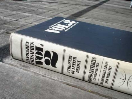
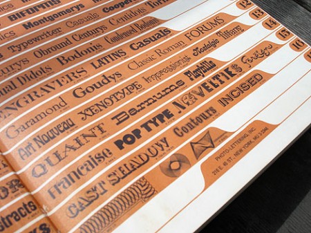
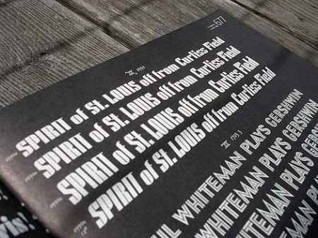
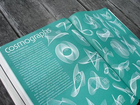
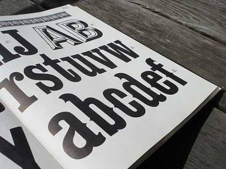
Grain Edit has a great post on the upcoming Photo Lettering Site from House Industries. When I first saw the headline for the original post I was half hoping for some sort of digital way to achieve that awesome blurred edge style from old movie titles and magazines. Sadly, that wasn’t the case. But the reality was just about as good, a bunch of great until now defunct vintage typefaces. The Photo Lettering Site is not fully operational yet, but you can check out some posters featuring some of the fonts here.
Photo Lettering
09.29.2009


I’ve actually been beta-testing House’s Photo-Lettering site, and personally I think it’s going to be an unbelievably useful tool for designers once it’s launched. Not only will we get access to revivals of some never-before-digitized faces, but to an entirely new business model for typography. Can’t wait to see what you’ll do with it, Scott!
Since getting involved with the beta, I’ve also become a bit obsessed with Photo-Lettering: http://blog.threestepsahead.com/tag/photo-lettering/
Since learning about photo lettering when they announced the launch of this service, I’ve been watching those alphabet thesaurus books on ebay. Ouch! I don’t know if it’s the renewed interest because of blog posts like these or if they’ve always been collectible but damn those things are pricey!
Can’t wait to see the service up and running though.
As for blurred edges, what’s wrong with just adding blur?