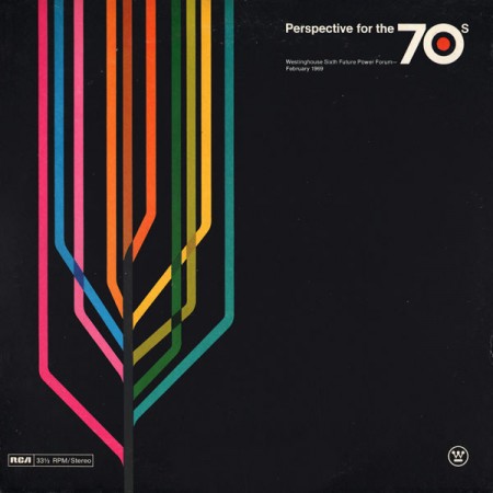
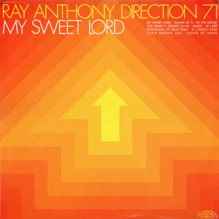
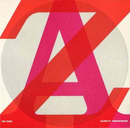
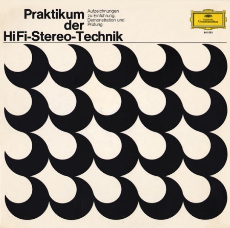
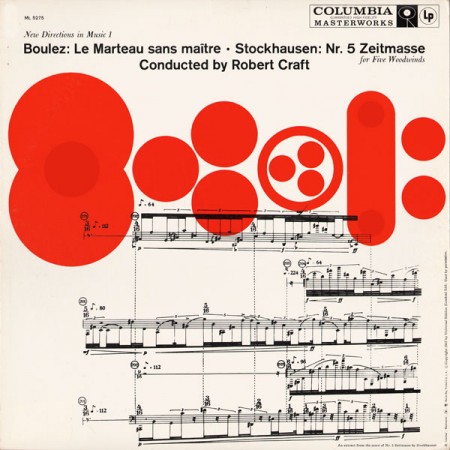
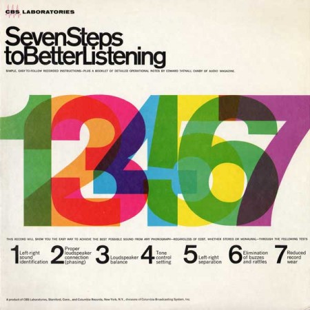
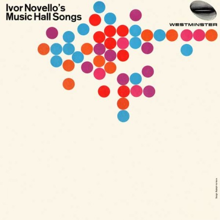
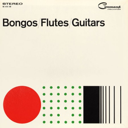
Project Thirty-Three has a great collection of vintage record sleeves up. This kind of minimalist approach to record jacket design is about as close as it gets to perfection for me. I’ve always loved the Blue Note style stuff but this is just a little more what I’m looking for. The simplicity is what really gets me, so much with so little. Wish I had prints of all these, but as a consolation, they make great iPhone backgrounds after a little editing.
Source Project Thirty-Three Via Wanken Blog

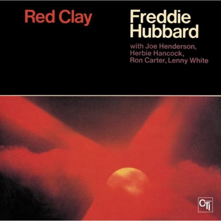
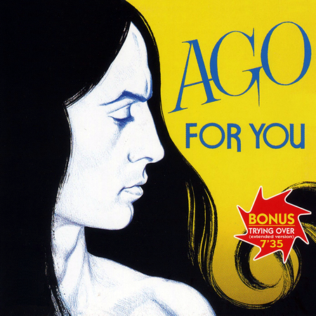
beuty design
Really interesting things!
In the spirit of ISO50, I think you should do an article about this great idea:
http://dvice.com/archives/2010/06/macintosh-ipad.php
Amazing cover art. You always seem to find great vintage design.
Simplicity can be boldly efficacious no matter how incongruous it may seem. These are great designs!
Yep. Love this site…been a constant inspiration for me. Keep an Evernote file full of the images I pull form this site.
These are very very very Swiss in their design nature.. Awesome.
Loving the 7 steps and bongos, flute and guitar covers in particular.
Simple and great.
love love love that top one!
Perspective for the 70’s = buttery
I find the last cover to be smart.
i like, first one is very contemporary
I am not able to see this web site correctly on my phone 🙁