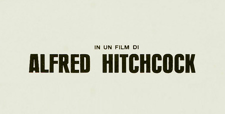
Italian poster top detail. So good!
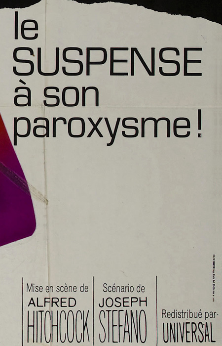
French Poster (detail)
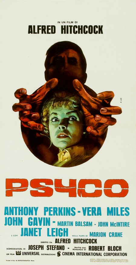
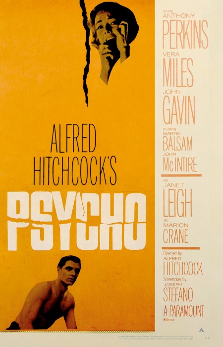
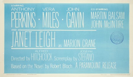
Flickr user “Advertising Hitchcock” has a large collection of beautiful high-res scans of — as the name implies — original advertising from Hitchcock films. Of particular interest is the Psycho (1960) set, which includes international versions of the release poster. The Italian version is definitely my favorite; considering that the file is generously offered at such a high resolution (1352×2674 @ 300dpi), I’m going to have to fire up the Epson. For some reason made me think of the classic sci-fi covers stuff from Eric Carl. Also be sure to check out the type on the lobby cards; great layout.
Sorry, no information on the designers. Please let me know if you have any names.
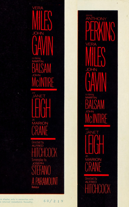
Scans via Advertising Hitchcock


Fantastic post ! i wouls love to know the font’s name if it’s exists ,D
Fantastic post ! i would love to know the font’s name if it’s exists ,D
Looks similar to the new Jamba Juice Energy drink font they use in their ads.. although I suspect this is custom.
http://4.bp.blogspot.com/-0DqdOY-auyQ/TeWtMt6-tYI/AAAAAAAAAj0/9jejKntP7-E/s1600/mail.jpg
Dan-
yeah been seeing that everywhere over the past few years, I think I really started noticing it when all those indie film titles started using this style around 6 years ago. This is far more handwritten feeling, but same vibe http://movies.popcrunch.com/wp-content/uploads/2009/10/where-the-wild-things-are-movie-poster.jpg
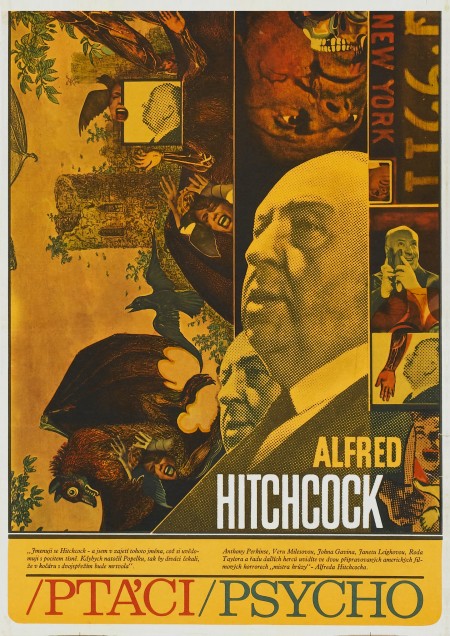
SUCH a good find, Scott. I’m feelin’ that Czech style. I feel like I shouldn’t like it, but that’s what makes it so fun to love it 🙂
this kind of (no?) handwriting have been used also here for one of my records
http://3.bp.blogspot.com/_7_1Ig9WMaRw/SbYT1X7BMjI/AAAAAAAAAi8/-i4QDath3Lw/s1600-h/Oleg+Poliakov+Rainy+Days.jpg
and i love it !
the Czech (Czechoslovak) version was designed by Zdeněk Ziegler http://www.terry-posters.com/plakat/8759-ptaci–psycho
Czechoslovak posters are great, look at Karel Teige, one of my favourite http://www.terry-posters.com/plakaty/parametr-1-autori/41-teissig-karel
Love this post! So interesting to see all these different approaches.
Wonderful post! This is my first time seeing any of these posters and I love them. Thanks for showing the Italian poster detail! All of this makes me want to do more analog typography and just design in general.
snake eyes tattoo meaning, american greetings, vszk, downloadable cell phone wallpapers, 7597, cool tree house, 594840, hollywood film wallpapers, 8[, gaelic symbol tattoos, 415849, wallabies, 8PPP,
I think I agree with Scott, the Italian version is my favourite too
That Italian one is gorgeous. That’s one’s definitely my favorite too, though you have to appreciate the minimalistic style of the other ones.
There’s something seriously missing these days when you compare movie posters today to versions like these and Star Wars and Clockwork Orange posters as an example. Those have iconic themes, shapes and designs and I just don’t see the same kind of creativity thees days.