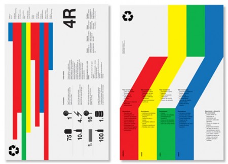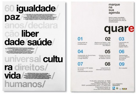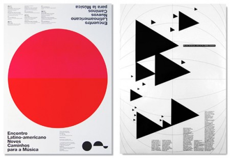


I’m definitely getting way into this style right now; what can I say, people are doing some amazing things with type and shapes. These posters are by Quadradao out of Brazil. There is something familiar about the look of course, but I think it’s still fresh in its own way. What I find interesting about it is how much harder it is to design effectively in this style than it looks like. Sure it’s just type and shapes, but try and work something equally refined and see if you don’t go completely nuts.
Couldn’t find too much information on the studio, but from what I can deduce they’re chilling down in Brazil pumping out crazy good posters like these. If I had to guess I would have said these were straight out of the Netherlands.


josef muller-brockmann’s work still owns this style ,even 30 years later nothing is as good. this is not bad. but it offers little exspantion on this style.
that style is over rated. And because everyone use it, most of the people can’t see the difference between good & bad.
You should try your own style… because this style is far too boring.
And who cares about boring stuff?
maybe idiots…
–
You’ve done a great work with the playboy rebrand. Don’t throw that away 😉
If it helps, ‘Quadradão’ means either ‘big square’ or ‘very square’ in portuguese.
I didn’t get to see much info on their website, but apparently they’re a trio, and are located in São Paulo.
I sure hope they’re chilling because the weather there is horrible right now, it’s been raining forever!
Nic,
How is this “style” overrated? Its use of white space and grid is beautiful and its rhythmic quality through basic shape and color is atheistically pleasing. While I’m not familiar with the language, Im sure the message is as articulate as the design – it would be interesting to have these translated. I have to disagree with you that it’s boring and overrated. I happen to love these. I guess this makes me an idiot?
rise of the triangles. cant stop looking at those
These are all people from my university (school of architecture of the university of sao paulo). There´s still a strong modernist tradition there (in style and mentality) and the students have a hard time getting past it (even me). Its a pretty deep (boring) discution so I´m not gonne get into it…
But sao paulo did produce some of the best construtivist influenced architecture and art in the world IMHO
some other references if you wish to understand where it all comes from:
Artigas: Architect of our school building and omnipresent overseer (although long dead):
http://www.flickr.com/search/?w=all&q=vilanova+artigas&m=text
PMR – worshiped in these parts:
http://www.flickr.com/search/?q=paulo+mendes+da+rocha
Vicente Gil – Arguably our most import design theacher now:
http://www.vicentegil.com.br/
A link to josef muller-brockmann’s work. He did this in the 50s.
http://www.flickr.com/photos/blankaposters/sets/72157605199393277/
The website is delux though.
i must be boring too
because i also love it 🙂
@Rudolph Pokorny
Thanks!
I’m pretty sure this not seems a “style”, but a way of think and plan the design pratice. The studio apparently pursue this method as a foundation element, a work line who privilege the constructive lines of design. And, despite the rawness, they are very promising.
Amazing! I’ve been browsing yahoo and google all night for this and that i as a final point thought it was the following!