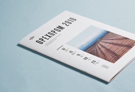
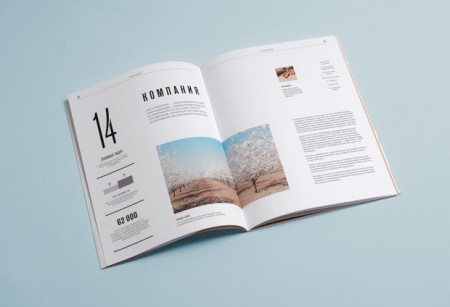
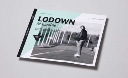
Qus Qus is the design studio of Dima Kuzmichev. This work is super clean — I feel like if I ran a corporation of any kind, I would have Dima do my annual report. Especially if we were based in Iceland and wanted to make our wind power turbines seem sexy. There is a cold perfectionism at work here. Great grid work, some beautiful type, pretty much everything you need. I was also really impressed with the logowork. The one for Artisanale was my favorite (and the name sounds awesome to boot).
Qus Qus
07.20.2010

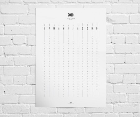
Indeed, looking at his great work you can easily get this “cold perfectionism” (like in the Artisanale logotype, Pen and Paper project or the Calendar 2010) but at the same time, there are some other projects like the one for the Show Off mag where he beautifully manages to create a different and warmer aesthetic, again heavily based on typo and grids. I guess this is what it makes you a successful art director.
Very nice calendar. Traditional calendars offer no perspective as to where you are with respect to the rest of the year…
I love the layout of the mag. The condensed type looks so good.
Can anyone offer a guess as to what font(s) he used in the calendar…