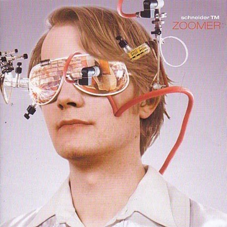
Was at the beach today listening to Schneider TM’s "Zoomer". It was a beautifully sunny day here in San Francisco, made it a little easier to cope with the reality of being home. The cover of this album is pretty interesting, well designed overall, the collage works to good effect, but I think a bit more time could have been spent on the type treatment.
Schneider TM – "Reality Check"
[audio:reality.mp3]

Interesting? Weird! Haha.
It does fit the music though (haven’t heard before). I also agree that the some more interesting use of typography should have been done.
(Notes in parenthesis for graphic nerds)
I like how the vocals go up and down so much in pitch (hue/saturation). When merged (flatten image) with the rest it still almost sounds subtle but not a ‘boring’ part of the song (nice levels). Well balanced (good colour balancing).
(music is really the same as visual design =P)
The video is pretty surreal =)
http://www.dailymotion.com/video/x3c7hw_schneider-tm-reality-check_music
I like how it all ties in with the song title at the last moment.
you would be a really cool person if you emailed me a copy of this album.., (apparently this album is not for sale anymores…)
🙂
heh schneider TM is rather cute music. First track I heard was “pac man/shopping cart”
I think you might like Badun, they sound a bit like Schneider TM, but without any vocals. http://www.badun.dk/
also the album art is very eye catching
Wow, cool man, big thanks! http://vxyremjqlmwv.com