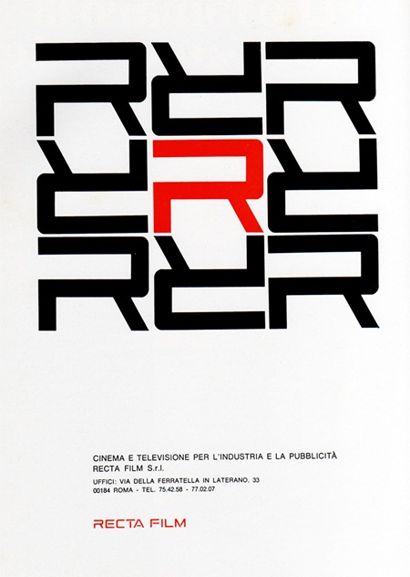
1969 Magazine Advertisement
Recta Film
"Cinema e televisione per l’industria e la pubblicitá"
Italy
Via Pink Ponk

1969 Magazine Advertisement
Recta Film
"Cinema e televisione per l’industria e la pubblicitá"
Italy
Via Pink Ponk
Comments are closed.
It’s sufficiently conception with simply pattern.
Logo RECTA FILM is more effective and it was keys element in that advertising.
i had a little problem with the upside down R’s but then i saw the bottoms match up and a whole new element of enjoying the negative space shape came into effect which i really loved.
wow now we know where the rebirth logo came from. the softsynth witch now is called reason.