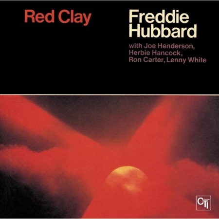
Really amazing layout here. Love the photography, reminiscent of the Der Prophet cover. I’ve got to figure out a way to replicate this photographic style, it’s so distinct and warm. Via Philip Pupa
Red Clay
03.13.2008

Really amazing layout here. Love the photography, reminiscent of the Der Prophet cover. I’ve got to figure out a way to replicate this photographic style, it’s so distinct and warm. Via Philip Pupa
Comments are closed.
It’s the original “Sensual Seduction”.
Ok so probably not the exact technique that is used on that image, but this technique is quite similar and has a very warm tone overall. You could also choose to shoot the image with a slow speed film and push the speed up by two to boost the grain of the picture.
I’ve found a couple of examples that are very similar to this picture, but are using the redscale technique:
First
Second
the color is so vibrating here, reminds me a bit of “total recall”‘s image of mars and overall design.
hey scott – for more vintage sweetness (israeli designs) – check out “savta” –
http://www.flickr.com/photos/safta