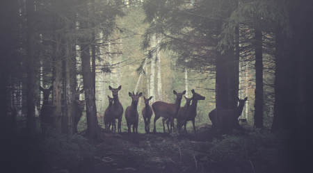
This is the video for Matta’s “Release the Freq“. The incredible cinematography and design is by Kim Holm. I really like how the visual complexity builds subtly over the course of the video. And of course it maps to the music nicely, though I’m not really a huge fan of the song. The color grading on this is terrific — I’m tempted to go off into the woods searching for domesticated deers to photograph.
Release the Freq
03.14.2011


I love the visuals and the music. Just not together.
so cool man
I turned off the music, so much better 🙂
deers, vintage photo, infographics, few triangles…every possible cliche of current design trends is in it (however, well executed). audio is a bit irritating and too repetative
i saw this video a couple of days ago, watched it, and thought it was pretty cool. I think i’d be really proud if would’ve made it, the editing is insane, and the motion tracking works like a glove. And i actually like the music too. Listen to some more dubstep and you might end up liking it more.
however, i think this video is on such a level that i personally think it can receive some strong criticism, which i havent seen much.
first of: i think the grading is way over the top. I’m a big fan of what he is doing to the curves, but i think he goes too far.
Also: i think it gets pretty boring after a minute, after you’ve seen all the grading, motion tracking, editing and heard the music. I like Alex’ point of complexity building, but i’m not seeing a story at all, and even though everything looks really cool, all the coolness doesnt tell me anything.
What could cloud my judgement is me having seen videos like this (effects, style), which story-wise are better executed: http://vimeo.com/7199178 for example.
Also, Kanye’s short film featured on his website also deals with pretty awesome slowmo images of deer in the woods (who i feel dó serve a purpose) plus also goes crazy on the curves, except i feel they did a more balanced act.
All this doesnt take away that i really like the filmwork, and i cant even imagen how much time the editing and tracking was, but i thought it did fall flat after 1 minute.
so. had to get that off my chest.
@Jefta, good call on this one: http://vimeo.com/7199178
Very similar in a lot of ways but with a more engaging story.
this is seriously funny. weird combination
“…I think this video is on such a level that i personally think it can receive some strong criticism” – Jefta
Good point, never really thought of it that way.
This is beautiful :3 Very well done! Can’t wait fore more bro 😀
Don’t hate on the dubstep. Audio and Visuals are top notch.
As a fan of dubstep and music videos, I gotta say I don’t know about this one. Visuals are definitely stunning though I agree with Jefta that there’s not much of a story to this, and it can get boring over time. It’d say if fits under the really neat category. Nothing wrong with that!
As a fan of dubstep and music videos, I gotta say I don’t know about this one. Not the biggest fan of the track, though the visuals are definitely stunning. But I agree with Jefta that there’s not much of a story to this, and it can get boring over time. It’d say it fits under the “really neat” category of stuff. Nothing wrong with that!
I think the video and track are both dope. The dubstep sound is funky as hell and the video is sweet. The story is about struttin’ your stuff in front of the ladies. We see the does acting like girlies, and then the Top-Dog shows up, and they’re all like, “DAMN! He’s the man; how’s my hair look?” The buck is BAMF on the scene, and he steps it out like he knows it. We see the same game we play right in Nature. And the video shows it with deer and dirty, funky dubstep.
Loved the part where they come creeping into the clearing in the woods – they have an alien look to them.
The music and the video together makes it weird and funny. They don’t fit.
But overall, it’s beautiful!
Hi!
First of, thank you very much for posting this Alex! I’m very thankful for that.
I really appreciate you comments and I would like to leave a reply on some of them.
Captcha: Thanks! I would actually agree with you on your point of design clichés, though that was also one of the goals I had with this. Bringing technical geometric shapes into context with majestic animals in a slightly depressing atmosphere.
Jefta: Thanks for your kind words there, as well as taking the time to analyze and make a comment with some criticism to it. I also think I went a little over the top with the grading, and I’m glad someone actually thought so too. I strive to reach a certain sense of atmosphere and end up overstating it a little. As far as the story goes I totally see your point, it’s not engaging in the long run, and I’m sure I could have made it a lot clearer if I spent more time planning the actual shoot on this piece. I will definitely focus more on that part in the future, which to me is one of my main challenges. I feel it works more like a statement of how beautiful and weird deer are in contrast to how we make use of them, and not very clever or rich when it comes to story.
I absolutely love the video you’re referring to (Spheres of Fury), and I must say I’ve been deeply inspired by Christopher Hewitt and Tim Brown’s work, as well as Rob Chiu’s work for a long time. I wouldn’t dare comparing my work to their work. I would agree with you in the similarities in grade and the idea of opposing forces as a concept, but it was really not intended to be similar in the way you think it is. I will definitely take that with me and try to make it better next time.
You’re mentioning a short film by Kanye, could you post the link to that? Would love to see. Again, thanks a lot for taking the time to comment on it, it’s a real helper for me.
Thanks to all of you for your kind words and thoughts. 😉
agreed, not too fond of the song, but the visuals are stellar
In all honesty, I think this is an all round well executed video. The color grading and geometrical shapes make for a unique video. If you were to reserve your editing style this would’ve been a Planet Earth segment focusing dear. It fits perfectly with the song which is what it was meant for. It is important to be critical of your work but I enjoyed this entire clip very much and I really dig the finished product. On a side note dubstep isn’t bad in short doses. But I am a little bias considering I use to help manage a music venue and most of the nights when we were cleaning up we would crank dubstep and goof off. It’s just fun to be a child and groove to it. =]
The music was off track, more towards urban landscape. Should have selected a dream like mood track, Boards Of Canada or something. I off the music too.
I must say, that is an excellent acceptance of criticism Mr. Holm.
Kim Holm & Jefta
Six Degrees.
The info/motion tracking reminds me of Prologue works such as the
-‘MTV Video Music Awards 2009’
http://motionographer.com/theater/prologue-mtv-video-music-awards-2009/
…Which HECQ happend to worked on…but then I saw that VMA 09′ project was linked to the
‘OFFF 2007 New York Open Titles’
…Which Rob Chiu and Chris Hewitt did in 2007.
– http://vimeo.com/1904363
That was unexpected for me.
Runaway – http://jenndkstevens.blogspot.com/2010/10/kanye-wests-full-length-movie-runaway.html
D||: Six Degrees for sure 🙂 Absolutely, I definitely can see the similarities here. Both the references you’re mentioning have been a great inspiration to me in the past. To me it’s a good indicator that it’s soon time to shake things up, get rid of old habits and work harder.
Thanks for the link to “Runaway” btw. Epic piece of work there, fantastic shots.
I love the video. Though as much as I love dubstep, this doesn’t really do it for me. I’m more a fan of the burial side of things.
And I’m not sure the two work together too well. I think it sounds too harsh, a more organic sound would have gone better.
Still, The visuals are beautiful.
@Kim:
Here is the link to the Kanye video: http://www.youtube.com/watch?v=O7W0DMAx8FY and some stills of the deer in the movie: http://yfrog.com/h826cqp http://yfrog.com/h0fv2mp http://yfrog.com/hs433p
I think that because of this video, i was/am a little bit biased when seeing Kim’s video, because if you’ve seen it, its not the first time (the WOW time) you’ve seen deer in some awesome slowmotion and cool grading.
Oh i and second Matt S on his comment on how Kim is taking the criticism. I think his work is so good, he deserves it.
really really nice video! the music ruins it though, good work though!
I love the grain of this film!
loving this video i’ve watched it like 15 times since it premiered. have to say though. turn down the annoying electro dubstep and play your favorite minimal techno instead and it looks even better. I’d like to personally suggest SCSI-9 – Elegia
lol i was totally expicting some kinda ambient song haha not dubstep.. but its a cool visual
i was actually listining to the sight below when i turned the dubstep down… went soo smoooth
Pulls me out of conventional; that I love.
-[E]
i think the music is perfect and if you are into dubstep you’d agree that it’s an excellent track, otherwise you’ll be distracted because dubstep is not a music style that blends into the background.
as far as concept goes, i think the contrasts of glitchy harsh audio, digital composited elements, and saturated organic imagery creates a lot of tension and excitement. a soft, dreamy track would be predictable and dull. sure, it’s not a powerful narrative, but it’s technically very well executed, not to mention quite fresh and fun.
do lightleaks, geometry and motion tracking make everything look better? probably.
http://media.artofthetitle.com/film/2006/stranger_than_fiction/stranger_than_fiction_opening_contact.jpg
so. damn. cool.
This is exactly what i was looking for for ages . Thanks . Pure inspiration as I’m doing illustration. I don’t care about storytelling too much in this case, I think it’s more about visual approachand and aesthetics in this vid which was ,actually, on my mind for a long time untill you managed to implement it the way nobody else did. It’s just IT :)))
nice vid. The track really reminds me of Neil Landstrumsm’s ‘£20 To Get Home’
http://www.vimeo.com/2824870
“Landstrumm” sorry : )