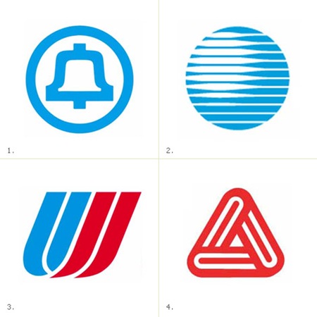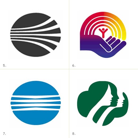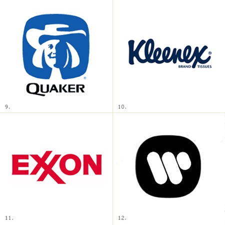


James White has posted a very nice collection of Saul Bass logos at his site, Signalnoise.com (also very nice). Going through this list, I am pretty amazed. I knew Bass did a few of them, but some of those are big surprises. Link
Saul Bass Logos
09.05.2008


Wow – even living in Australia – I was familiar with 8 of them. That’s a very impressive portfolio.
And thanks for posting James’ site… I’m loving his Flickr uploads!
Really amazing work of Saul Bass.
Master of masters
Really enjoyed this post. Love simple forms.
The man is a god.
He did logos for a few recognizable companies i guess.
Amazing work… Also , awesome blog, congrats !
Greetings from mexico!
Great that James steps away from his flash work and posts something superb.
Exxon logo has been designed by Raymond Loewy in 1966…
manuele-
Saul Bass redesigned the Exxon logo in 1981 (although he just sort of evolved it)
That Bass character was pretty good. Some of the style has gotten a bit dated, but the ideas and the execution are still peerless. Thanks for sharing!
The rectangular Exxon logo with the blue strip at the bottom and red lettering with the two “X’s” interlinked together was designed by noted industrial stylist Raymond Loewy in 1966.
It would be interesting dedicate Logo Gallery to this designer. It was the author of some logos such as Spar, Shell, BP, First US Mail Logo, Nabisco, Lu, First United Logo, Lucky Strike, American Oil Brands …