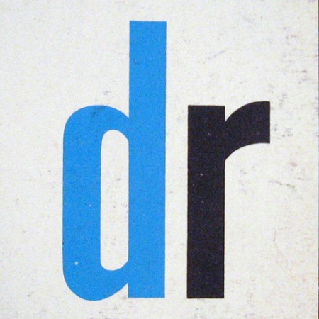
Some very nice scans of 1960’s and 1970’s Scandinavian logos from Oliver Tomas’s Flickr. As great as these logos are, it’s always amazing how much better things look when scanned from a well printed page. The texture and imperfect edges really take it to the next level.
Via Oliver Tomas


These are great, really love the simplicity
These graphics make me think of the smell of old library books from that era. Does anyone else ever sniff old books and album covers from time to time, or is it just me?
cool logos reminds me of north by north west for some reason and the old twp series Nathan Lighto broght out .
Heya Scott,
Love these logos, your completely right about the ‘raw-ness’ giving them that little ‘je ne sais qui!’ Would look awesome as retro tees…
Ben
Woah that first one is pretty nice. It’s like a modification of the Danish flag. My eyes keep changing focus between the positive and negative space…
thanks for the post.
i’m delighted these are getting shared around.
one note: oliver tomas (no ‘h’ in tomas).
cheers!
That AK logo seems to have served as inspiration for the latest HP logo, doesn’t it?
Oliver-
thank you for posting them…sorry about the typo, fixed.
Beautiful stuff!
Mark C.: I totally sniff old books and album covers as well.
hot.
Scott Thanks for the nice collection of logos. Really cool.
Nice work! Agree with you Scott about the scanned textures.
Out of interest, what scanner do you use?
Mark C. – You ain’t alone son. You ain’t alone… Just ask Greg.
Only a true Dane would offer such a post – Tak! I, too, love the and appreciate the simplicity in Scandinavian design.
When in the world are you coming through Colorado?!