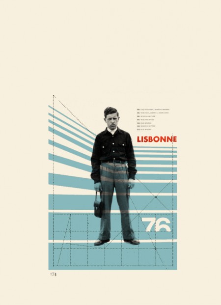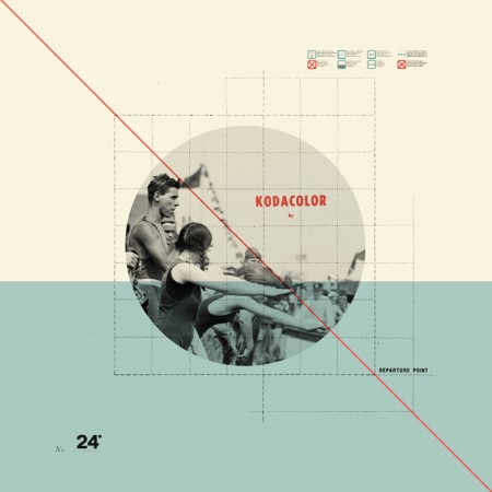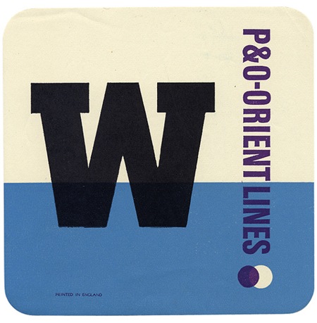


I had seen Cristina Couceiro’s work here and there before but this most recent series really blew me away. What classic style; I really like how she employs found imagery without crossing that fine line into kitsch that so many others seem to stumble over. The typography is spot on as well. You can see more of her design and photography here.
Sete Dias: Cristina Couceiro
03.02.2009


These pieces are great, it’s like pure design geek heaven looking at these things. Her work harkens back to the great European masters of the 20’s/30’s. It’s nice to see someone who isn’t afraid to let a bit of their grid show up in the final piece. Her visible guidelines really help to pull everything together and make the photography really relevant to the composition as a whole.
Wow those are amazing; composition skills off the chart. I’ve been seeing a lot of thin diagonal lines lately as well.. maybe a trend?
I can dig some thin diagonal lines, but no more triangles…
Yeah, I just found her Flickr stream a few weeks ago and instantly fell in love. Fantastic work.
Yes, very refreshing work. The muted colors, typography, and little details are all right on. I really like the small icon/text lockups that give it that mechanical press sheet feel.
I’m so glad I stumbled on this blog, its a straight up visual feast and I could easily spend hours wandering through all the entries.
I understand people can be inspired or influenced by certain designers. But this is a bit much. In my opinion, she is the master of copy and paste. Gather a bunch of source images and copy and paste. Almost all of her current designs use/rip off other designers work. Type treatments, colors, design elements, written notes, etc. And I’m sure all the black & white photos are ripped off from some other site.
Look at her site and look at some of these examples. Go through a few pages of her site.
Business and Society
http://www.flickr.com/photos/joekral/2628911261
Musica Viva Kleiner Tonhallesaal – 1959
http://www.flickr.com/photos/blankaposters/2522908024
1972 Munich Olympics: Official Results 1
http://www.flickr.com/photos/joekral/231669020/
Der Nussknacker – 1969
http://www.flickr.com/photos/blankaposters/2522960288
Tonhalle Quartett – 1958
http://www.flickr.com/photos/blankaposters/2522908964
Wim Crouwel: Kunst + Design
http://www.flickr.com/photos/joekral/3050297934/
Internationale Juni-Festwochen 1963
http://www.flickr.com/photos/blankaposters/2513558581
Self and Others
http://www.flickr.com/photos/wowbrow/837054441
Graphis Annual — 1965/66
http://www.flickr.com/photos/insect54/569689959
Schiff nach Europa –– Markus Kutter/Karl Gerstner 1957
http://www.flickr.com/photos/insect54/2211264245
n+m 37
http://www.flickr.com/photos/ekusupo/384128309
Graphis 115 –– 1964
http://www.flickr.com/photos/insect54/1318841411
The Divided Self / R. D. Laing
http://www.flickr.com/photos/mooski/345967626
Oooh that’s where it’s from. I’ve see it all over ffffound 🙂 I especially like the colors on these – the off white with the light blue / turquise. It’s perfect.
@joe-
I think it goes without saying that all of her work is sourced from the examples you’ve given and more….I think that’s the point, it’s sampled but recontextualized… if you condemn her work in that way, you must also condemn a vast swath of modern musicians from dj shadow to daft punk. perhaps you think they too are merely rip-off artists, but a lot of people would argue to the contrary (myself included).
I do agree that a lot of her earlier work goes a little overboard with the direct use of design elements from famous works, and that’s why I hadn’t posted on her earlier. I posted now because I felt this latest series reflects an artist who is emerging from that more nascent stage and finding herself.
<3