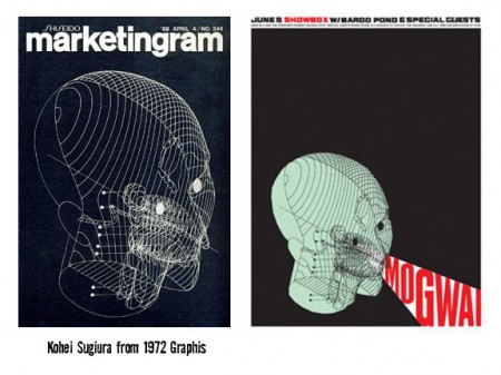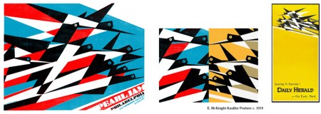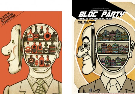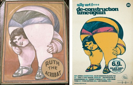


Hot on the heels of our recent, and thoroughly rousing, discussion on the subject, I came across B.Caruther’s gallery of “inspired” designs and their original counterparts. I thought it was an interesting illustration of the the whole concept of “borrowing” artwork. If you’re going to make the argument that someone like Shepard Fairey is stealing (and therefore their work has no merit), you would have to make the exact same argument for each and every one of these and the countless others out there.
Sure, that argument would be pretty easy for a lot of them. Many are sort of tongue-in-cheek riffs on design classics while others are what I would characterize and blatant rip-offs. But some do stand up as something new and engaging for reasons other than the imagery they borrow. The “Clockers” poster is a perfect example. Yes, it borrows heavily from Bass’ original, but it takes the imagery and re contextualizes it in a way that creates something fresh and provocative. Nevertheless, Bass regarded the poster as a “rip-off” while it’s creator, Art Sims, called it an homage [source]. I guess with an issue as subjective as this, people will never reach consensus, but it’s fun to try!


Fair enough if you’re going to go out of your way to use your own images and give them a Saul Bass, Bauhaus or Art Deco treatment, but to blatantly copy and paste and pass it off as your own? The “creators” of the Arab League & Death Cab for Cutie posters, close the door behind you on the way out, thanks.
It’s a tough call with a lot of these, but I’m wondering where the original artists got their ideas from? Did these ideas simply float down because they were smarter and more creative back then? Possible, but I’d be more inclined to say they had to get their inspiration from somewhere too. Maybe nowadays it’s easier because it’s digital and the imagery is so readily available.
It doesn’t absolve the artist either, I’m not saying that, as some of these are pretty close to the originals. The artists should be well-aware of the line they walk when they do something like the above, I don’t think there’s one answer as to whether it’s acceptable, I’d think it’s up to the viewer.
I always try to avoid straight copying of designs, if they inspire me, I try to think it through to how the inspiration might manifest itself in my own work. Maybe some of these guys just didn’t take the time to push their idea another step forward, or maybe they just had a tight deadline and needed a quick fix.
Great flickr page, very interesting. Some of them are a bit of a stretch though.
For me this type of thing is much more excusable if:
1: the reference piece is widely known
2: Uncopyrightable elements of the design are stolen (layout, colors, fonts) but the imagery (photos illustrations) is replaced or redone
3: There is some kind of commentary or parodic quality that adds some meaning to the reference, rather than just swiping ideas.
For example, I think the London Calling cover fulfills all 3 of these points and therefore rises to the level of an homage or reference rather than mere thievery.
The Clockers poster almost gets there but is a little too similar and doesn’t really play with the original in a humorous enough way to feel like a parody.
I’m also more inclined to give a pass when the derivative work is pretty obscure. Quickly ripping off some old Polish movie poster for a concert poster or flyer that will be used one week only in one town feels less sleazy than doing the same for an album cover or movie poster that will potentially reach a broader audience and have a longer lifespan.
Also, I know a lot of people complain about our copyright laws but I think they are pretty fair and on the mark. Layouts, colors, and fonts aren’t copyrightable and shouldn’t be. Illustrations and photographs are rightfully protected. Very old work that has fallen into the public domain is fair game.
Here’s the rub with the whole Fairey/fair use argument – it’s exactly how Scott put it, it’s a matter of putting the image into another context. Fairey’s Obama poster was basically just an overlay of the photo, other than reducing the color levels and adding “hope” nothing was really changed about the photo itself – therefore no value was added and it is basically a rip-off.
I’ve run into this dilemma with a lot of work that I have produced using images of well known figures and have made a practice of creating a benchmark for whether or not I’ve actually added to the image or just ripped it off. Putting Lenin’s head on a model’s body and turning it into a parody of Coca-Cola advertising is not the same as just tracing a photograph you grabbed from the net.
Art is not created in a vacuum, but there IS a difference between theft and re-appropriation.
I have to say it’s an interesting time for fair use in regards to visual art. We have so much available to us for inspiration right now and it’s all very public. Meaning that the ability to rip work off is much easier, intentionally and otherwise, but the ability to get caught for it is much easier to. Sadly though it’s subjective, as the images and comments above show, so there really can be no standard except what is accepted by ones peers as acceptable usage. I think this convo is pretty interesting especially with the Orphan bill stuff and I can’t help but draw parallels to the music industry with rap and techno. In 80ty’s sampling started to take off, with the cheep methods of reproduction and wider availability of recording equipment. People were sued, fair use was cited and lawyers made a lot of money. In the end I think that settle out with a bit of a mutual respect understanding from artist to artist, in that credit is given, in most cases as a general rule, for the source of the samples and in the end, if required, license fees are paid. Personally as a visual artist I have to say I’m torn. If my work inspires something amazing that I couldn’t have made with it, then I guess I would be happy, but my ego and wallet tell me that I would still want credit for the inspiration, at least verbally, and I would fear the loss of the validity of the copyright on my original work.
those are pretty intresting. if you haven’t seen it before take a look at youthoughtwewouldntnotice.com
http://youthoughtwewouldntnotice.com/blog3/?p=1288#comments
Is not about where you take things from but about where do you take them.
Jean-Luc Godard
What you apparently forget is that you would not have made your “re-contextualised” (or what ever) work if you had not seen the original creator’s work.
in grad school, I did a whole project in which I totally ripped people off:
http://flickr.com/photos/fish2000/sets/72157600009708153/
http://flickr.com/photos/fish2000/sets/72157603507079810/
… from which I learned quite a lot. to rip someone off, in many cases, you have to get into their head a bit — or rather what you think their head would be like, were you to be in it — to reverse-engineer their design work.
I understand that most pre-Bauhaus arts pedagogy involved copying ad nauseum the works of masters, presumably for the same reason.
But yeah, still, it’s hard to say when the act of ripping someone off crosses the line to become exploitative or plagiaristic. I feel like most people these days (desigers and otherwise) are too tightass about it, but that fact shouldn’t justify transgressive off-ripping.
-fish