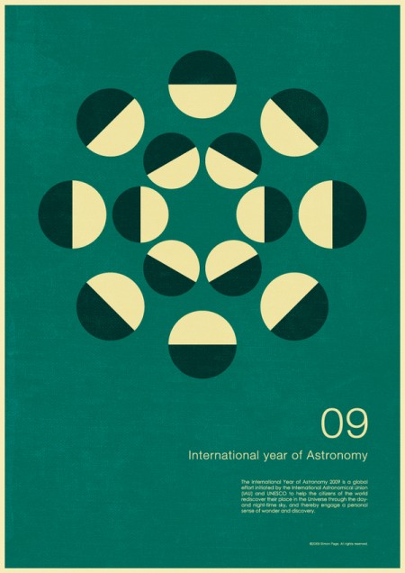
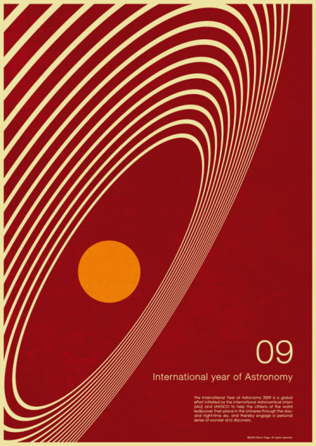
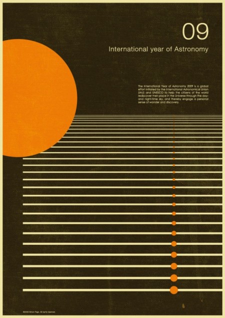
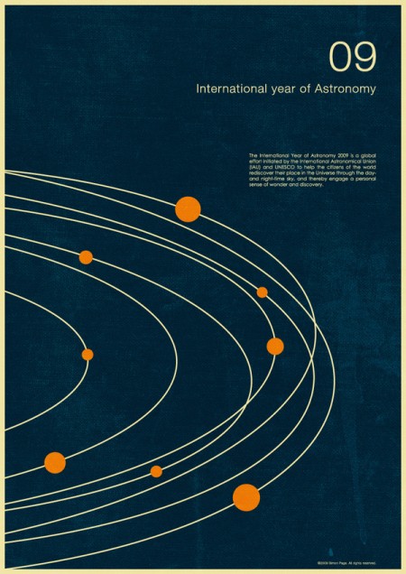
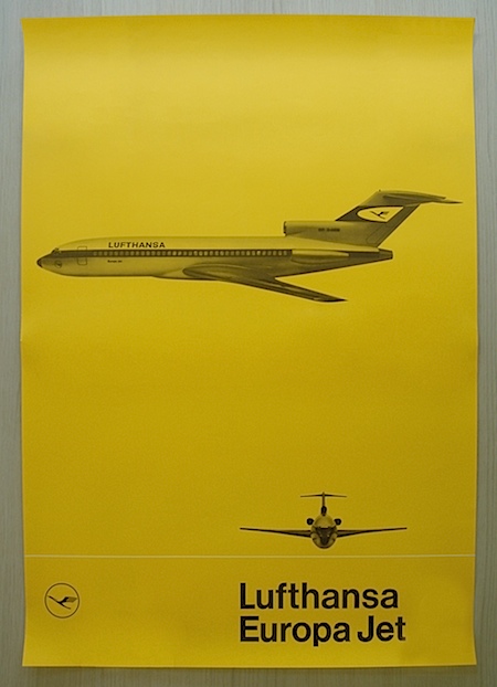
This series by Simon Page is great. I’m always a fan of this retro minimalist look. I think he does a great job making it feel aged without going overboard. The color and texture is spot on and the vintage feel is skillfully conjured. Sounded like what started as a personal project turned into a successful client job after they saw the work. Got to love when that happens!
Simon Page
11.02.2009


Wow those are brilliant, thanks for introducing me to his work.
You’re right on him not going overboard, all of the ‘aging’ was done quite right. Nice.
Those are fantastic, what a great series. And I love that it turned into a paying project. Even better! Thanks for sharing
Love that brown and orange one! great find!
amazing!
Thanks for the comments and posting my posters.
If you drop me a line or leave a comment on my website will be sure to let people know when prints are available to buy in the next few weeks.
Could stare at that second one for a looong time.
Ah wait I just did! Darn those hypnotic circles, love how it seems to make the orange circle appear to be in a 3D space. Great work.
These are great. Please let me know when the prints are available to buy!!
very nice. he’s done a great job with the weathered look too.
Definitely some top notch work! I’d be curious to see how he replicates this look in his prints, it was a big challenge for me with a project I did a couple months back. As if trying to design for the monitor and make it look authentic wasn’t challenging enough (in a good way), trying to achieve similar results in printed form is another beast entirely.
Prints now available from my website and here:
http://simoncpage.inprnt.com/