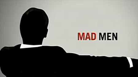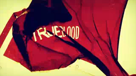


While they’re not quite as good as their big screen counterparts, some TV title sequences are starting to look a lot like what you’d expect from a feature film. Smashing Magazine has an article entitled “20 Brilliant TV Show Titles” featuring some of the better examples out there. My personal favorite has to be TrueBlood; the colors are incredible. Although none of them come close to beating Catch Me If you Can (although Mad Men tries valiantly), there certainly are some nice ones in the list. Link
Small Screen Titles
02.24.2009


Oh man, I’m all about the LOST titles. Super minimal obviously, but I love that. Mysterious and haunting. And if you listen, there is a little tiny electronic disturbance at the end. I always thought that was pretty cool.
I also like the House titles for the Massive Attack song. Can’t make it through the show though, always think I’m going to get sick
Yeah, dude, House’s intro all the way. I get goosebumps when I watch it. The pacing and timing with Massive Attacks – Teardrop is awesome.
Love Massive Attack, especially Danny the Dog.
Where is the “Skins” one?
http://tinyurl.com/b9njux
I wasn’t really that into the house one, I mean really, anything seems cool when you set it to teardrop with the slo-mo on.
there is none better than six feet under.
They have one listed for the Adult Swim show Samurai Champloo, I love that intro sequence, mixes hip-hop with feudal Japan, and they make such wonderful use of color and traditional imagery.
More: http://www.artofthetitle.com/
They also have the True Blood title sequence in 720p: http://www.artofthetitle.com/2008/11/21/true-blood/
Dexter has an amazing title sequence, so sinister, and really does personify the actual character of Dexter. I’m pretty sure it also won an Emmy.
Six feet under is the best. So perfect!
The last one is really hot and inspiration…
I have to give my vote to Dexter. I can barely sit through those images of the ham frying. Something about the relish with which those butcher’s scissors get used is quite disturbing. The show itself doesn’t gross me out, but after watching that intro, it doesn’t need to.
I would say that my favourite at the moment is from Fringe. The colours look like they are right out of this blog.
I heartily agree with your opinion.
But… I quite like Six Feet Under.
Great picks! True Blood’s sequence is so squirmy, I love it.
Six Feet Under and Carnivàle have the best…contextual title sequences, although I think Carnivàle’s got the edge over SFU on this one. A52 does a fantastic job reflecting the tone of the series and sort of giving you a reference point to get you back into the universe of the series each episode.
http://www.artofthetitle.com/2008/04/21/carnivale/
True Blood Main Title Sequence
Client: HBO
URL: http://www.d-kitchen.com/project.php?p=128
DK Credits:
Creative Directors: Matt Mulder, Rama Allen. Live Action Direction: Rama Allen, Morgan Henry, Matthew Mulder, Matt Clark, Tevor Fife; Designers: Rama Allen, Shawn Fedorchuck, Ryan Gagnier, Matthew Mulder, Camm Rowland, Ryan Rothermel, Jacques Broquard; Compositor: Ryan Gagnier; Editor: Shawn Fedorchuck; Producers: Morgan Henry, Kipp Christiansen, Keir Moreano; ECD Paul Mattheaus; EP: Mark Bayshore