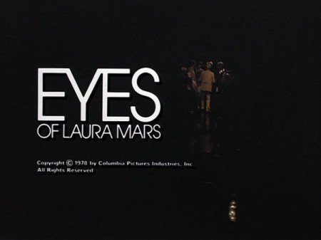
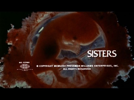
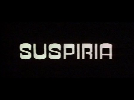
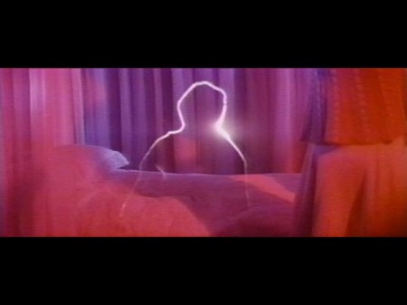
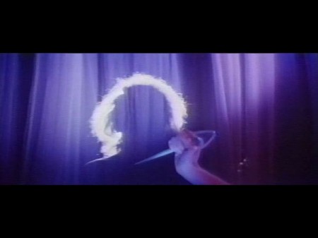
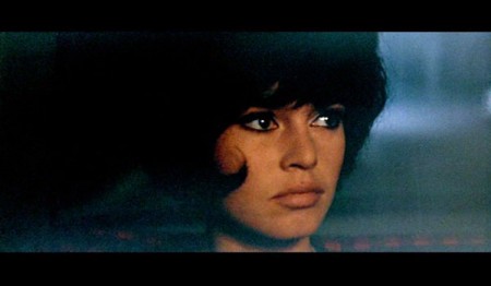
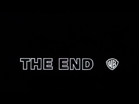
Came across this today via @grainedit’s Twitter. The I <3 Hot Dogs Blog has some great stills from classic films up. I love how type renders when it’s hand set and transferred to celluloid. If someone could make a filter that lent that perfect edging effect to type in Photoshop I’d be the first in line for it. I once met a guy who printed out all his type first, then photocopied it with an old Xerox, then scanned it back in. He got great results, I need to find a way to do that with film.
Some Vintage Film Titles
04.23.2009


your xerox guy reminds me of when i was once in a class where we were instructed to use a typewriter typeface.
my friends and i used our typewriters ((olivetti lettera 32) !), then scanned. others just used the font. i think that moment alone for me sums up the reason that anyone that considers themselves a design student needs a scanner. the computer is great, but to get analog textures, you need to be a bit analog. at least to me…. heres an example of my scribe unit from my mother who is a cartographer…. http://www.andrasklang.com/disc2art5.jpg
p.s. i check your blog wayyy too much…thanks!
I like that effect too! I might know how to achieve that in PS… I would need to study a high res version of those stills. Could you post other examples, Scott? And describe what you mean by perfect edging effect.. the type seems very smooth in those examples.
Suspiria is classic, I can hardly get tired of any Argento. I’ve been experimenting with this exactly for some short films and the best thought I had was getting analog (scanning) and maybe even affecting a little bit of shake in After Effects…
You know you love when the picture and the overlayed text never quite line up in every frame of the film and the titles bounce around…
I have a habit of applying a bit of wiggle to text in After Effects, making it a solid comp, throwing a super high threshold on it and rendering it out. Then I import the render and use it as an adjustment layer for the original text. Sounds convoluted, but it really helps get the old celluloid jitter effect you’re talking about.
Big collection of movie title screens here:
http://www.shillpages.com/movies/index2.shtml
Some real gems in there, requires a bit of sifting.
How would you render text like that to celluloid in the first place? I have always appreciated handset type, and I can’t seem to find information about this subject.
I’ve been known to put the type up on the screen, shoot the screen with a handheld canon, then bring it back into photoshop. gets a little closer to what you are looking for – especially with small type, it blurs together and you can start to feel the pixels.
One suggestion I will be trying is to print out your type and the take a polaroid of it, then scan the polaroid.
Thanks for the link. Great inspiration and reference.
Thanks for the link too. Seems really nice inspiring reference and thanks for this nice post to sharing.
These are so reminiscent of the actual films they are based on. Dario Argento’s preoccupation with bright primary hues is aptly reflected in the artwork inspired by his film Suspiria. Nice work.
awesome, awesome. artofthetitle.com has some great posts too.
cheers!