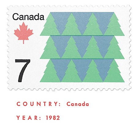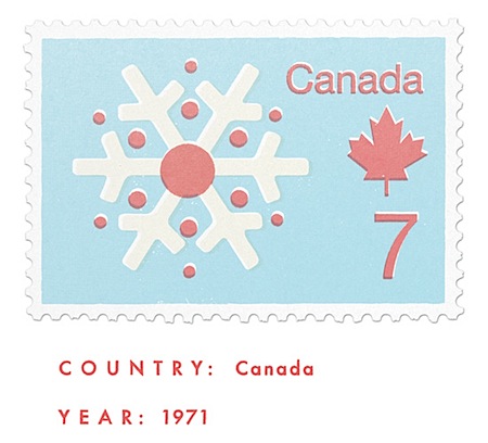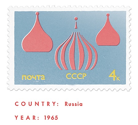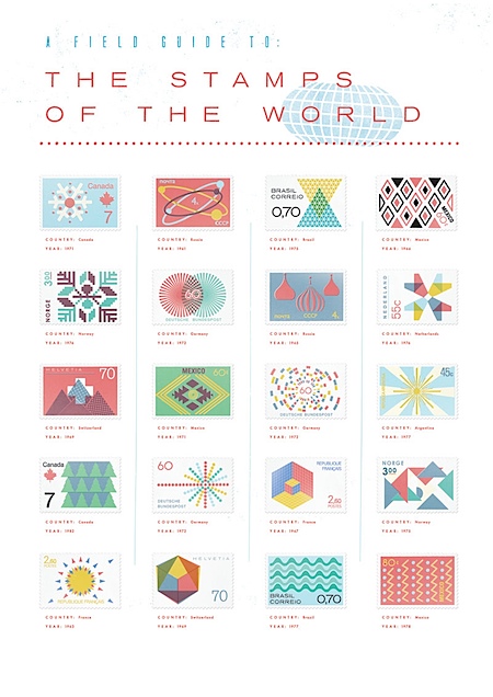


 Gavin Potenza is back with more incredibly authentic stamp designs. You may remember Gavin from his German stamp series I posted on a while back, this time he brings us stamps from all over the world. Loving these, particularly Canada and Brazil. More images and info are over at Gavin’s site.
Stamps Of The World: A Field Guide
11.26.2008


Thanks for posting more of Gavin’s stamp designs. Another great set. I think I’m still in love with the original German stamps.
http://roupanovaral.wordpress.com/2008/11/08/honda-biz-com-tudo-ela-combina-e-com-plagio-combina/
😉
regards from brazil!
your art is amazing.
I still can’t believe that these aren’t real stamps… absolutely stunning. I love the duality of the pine trees on the top one there. Great stuff.
Wow, these are incredible.
Scott, you should do a post on great ‘duality’ designs. Everything from the pine trees above to Escher’s illusions to stuff like the OS X Directory icon: http://images.apple.com/br/server/macosx/features/images/directory_hero20071009.png
I’ve always been fascinated with things like that. A strong pattern is the basis of a good design (as proven by your 1971 poster). Anyways, enough of me telling you what to do, you seem to be good enough finding great things to post by yourself 🙂
Scott, or anyone who can help, I need some help please and Im getting kinda desperate. There is very little options in my town for professional prints. Im trying to print a tabloid poster I made (CMYK FOGRA27 profile). My monitor was profiled using a Spyder Pro 3. The colors in the screen appears as nice shades of red, but every printshop I have visited is giving me very dark prints, like burned. I already tried to compensate by producing a “clearer” version, but guess what, the resulting print looked THE SAME as before. Any tips or ideas?
Thanks in advance.