Alex Cornell is a student at the Academy of Art Graduate Design MFA program here in San Francisco and he also helps me out around the studio with various design and music related things (in addition to being a designer he’s also a ridiculously talented guitarist and a knowledgeable sound engineer).
Recently he brought over a project he was working on to get some critique. Since I never went to school for design it was great to get a glimpse inside the classroom through his project and also very interesting to hear what his professor thought of my input. I had a great time working with him trying to refine the project so I thought it would be nice to have him do a process piece for the blog. I think this serves an apt companion to the Making of Obama post; a good counterpoint written from the student perspective. I am sure many of you were/are design students yourselves so you can relate, seems to me like the professor does a pretty good job of impersonating a client. The following article is his account of the process of creating the piece and working with his professor to complete the project.
By: Alex Cornell
Academy of Art Graduate Graphic Design MFA
Project: Pantone Product Poster
Assignment
My assignment, as weird as it sounds, was to imagine what it would look like if the color experts at Pantone were to all of a sudden start selling tongue scrapers. Everyone in class was randomly assigned an equally strange combination of company/product, with the idea being that we step inside the shoes of the company and imagine what we might do if tasked with selling a new, slightly odd product. The assignment was not simply to copy the existing visual style and identity, but rather to predict how to brand might evolve to incorporate the new product line as part of a brand extension. We weren’t to stray too far conceptually from the brand, but we were relatively free to explore a range of visual directions. The final deliverable was to be a large format poster (30" x 44") with an accompanying set of postcards and a CD. The timeframe was approximately six weeks, with in-class critiques twice a week to make sure we were on the right track.
Early Stages
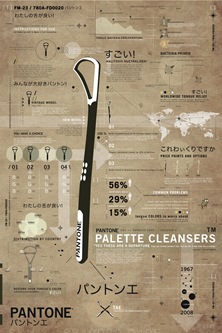
After doing some visual research, I thought it might be cool to make it look like an old combat manual, with lots of diagrams and a very serious vibe. I wanted the overall look to be very straight edge, and the copy to be completely juxtaposed and silly. I couldn’t really take tongue scrapers too seriously, so I wanted to make sure to inject a little humor somewhere, even if it was buried. I brought in a rough mock up [fig1.jpg] of what I thought it could look like and it was shot down immediately. The issue was that it didn’t conjure Pantone at all, and was too far of a stretch visually. It lacked an effective grid and was really just a bunch of elements thrown onto the page. I thought it had some potential, but it was neglecting the main component of Pantone: color.
Not all was lost on this first attempt as some of the elements and copy I developed at this stage made it through to the final poster. I really liked a lot of the little paragraphs I had written and I wanted to keep pushing that serious/silly juxtaposition. [fig2] I dropped the name "tongue scraper" at this phase because I thought it sounded too abrasive and might make it difficult to explain later. (I was having a hard enough time explaining to people outside the field what Pantone did!) I decided to call them "Palette Cleansers" to play off the fact that Pantone was now involved in both color palettes and oral palettes. For all of these versions I spent a lot of time working with the small details, most of which don’t quite come across on screen. Ideally, my finished version would be visually interesting enough to draw people in from a distance, and then really win them over when they got right up close and read it to themselves.
I experimented with a few more visual directions, but kept running into the same problems. I had a lot of my elements in order, most of the copy written, but was having real trouble finding a successful layout for the poster. Usually, the layout is the first thing I lock down and I bring in all of the text, images etc after the structure and flow of the page is determined. In this case, I was essentially working backwards and was having trouble getting used to that process. It had been about two weeks and I really felt like I had not made any progress. It’s normal for me to start out with lots of ideas that end up getting thrown out, and as disheartening as it can be, it tends to help clear my mind and establish a clear set of priorities for the next set of ideas.
Conceptualizing
The main issue my teacher had with my first attempts was that Pantone, the brand, was really not present in any of my solutions. I needed to conjure, even if it was just conceptual, a poster that said "Pantone". I really had to walk the a thin line between conveying that this was still a Pantone product, but somehow managed to not look anything like one.
I decided to go to the source, something I should have done way earlier, and started looking at Pantone’s color swatch booklets, old and new. I gravitated towards the older versions immediately and started thinking what it might look like to use them as a blueprint for a layout. (I guess I am too young to remember, but apparently the Pantone colors used to come in booklets with little detachable swatches inside, as opposed to the newer ones that come as fan booklets on a key-ring.) I thought that using the layout of the original booklets might be a good way to conceptually evoke the brand, but still allow me space inside the structure to include all the information about the "Palette Cleaners".
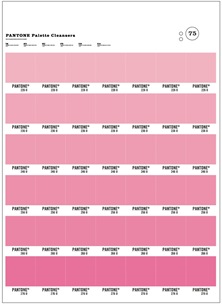
To make things easier on myself, I drew up a story in my head that would help center my imagination on what this poster should end up looking like. I imagined that Pantone had tried to extend their brand into oral hygiene, sometime in the 60’s, and that my poster was all that remained from an old, discarded catalogue they had put out. I worked up a rough layout, based on their old version, which you can see in fig. 3. I used their fonts (Claredon and Trade Gothic Bold No. 2), layout, and overall vibe, which was sufficient to get the green light from my teacher to continue with the new direction. I had a lot of work ahead of me, but I was happy to have finally nailed down a layout.
I chose the color pink mainly because it was unexpected. Everything I had been bringing in previously was very drab, dark and muted. I was using a lot of earth tones and all of my work was far from colorful. I really wanted to keep the combat manual look, with the greens and browns etc, but finally decided to break away from it in the loudest way possible. I tried a few different colors, but pink always felt the best. (It’s also the color of your tongue, just to keep things consistent)
Content
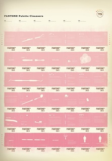
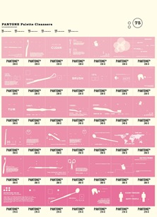
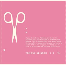
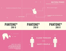
I was able to bring over some things from my initial drafts, but I found that I didn’t have nearly enough images or copy to fill out all of the squares on the new layout. I began writing more copy and sketching many more dental tools. Since I had repositioned the product as "palette cleansers" I was able to get away with including all sorts of mouth related objects. I am getting better with the pen tool, but the process of vectorizing all of the dental tools was frustrating. As you can see in fig 4. I was able to fill up most of the squares with some kind of information. It was all over the place, had no structure whatsoever, but at least it was on there. It helped to see it, just to know what the overall poster might eventually look like, but still didn’t feel anywhere near done. [fig5]
One of the main issues was the font I was using for the headlines and copy. For some reason, I had chosen Helvetica Rounded for all of my titles and it was giving the piece a very friendly look. I guess normally, for products relating to mouths this might be a good thing, but it didn’t fit with my overall serious look. I pictured my fictional Pantone Oral Hygiene Department to be a bunch of very methodical and precise people, so it didn’t make sense to be using such a carefree font. Scott suggested I use Trade Gothic Bold Extended and that really helped to give it the older, more mechanical look. You can see the comparison in fig. 6.
With the font in line it was time to address the grid, or lack thereof. When I formatted the content initially, I just placed it all around semi-randomly, with no regard for any sort of alignment. [fig7] Scott pointed out that this was inconsistent with the overall theme of the poster and might look better if there was some sort of structural relationship between squares. Unexpectedly, my teacher was constantly excited about the random aspects of the piece, and didn’t want me to change it when I mentioned I might tighten things up. I wasn’t sure what to do at this point because I knew it would look better if I got in there and really tightened it up, but my teacher (essentially the client) wanted it to stay as it was. I decided to implement the grid, and to phase out the old version during my in class critiques. [fig8] I hoped that this slow transition to the new version might assuage any lingering concerns my teacher had for the new way.
Distressing
With the content, grid, and layout all in place, it was time to put the finishing touches on the poster. Up to this point, I had been working only in Illustrator, since I was working almost exclusively with type, but I needed to bring everything over to Photoshop for the final steps. I had presented two versions in class of what I thought might be the final poster; one clean, done completely in Illustrator, and one all roughed up in Photoshop with lots of distressed elements. I assumed that my teacher might prefer the clean version, but again to my surprise, she preferred the banged up one.
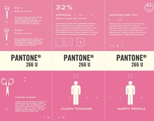
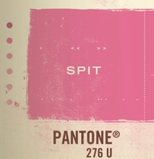
I didn’t have to do too much to make it look old, given that I was already using the vintage layout, but I did want to make it look like the page had been through a lot and was recovered from a vault somewhere. The first thing I did was darken the edges, especially on one side, to try and make it look like the page had been scanned in. (mainly trying to recreate the shadows that are sometimes present on poor scans) To do this I used a large fuzzy brush on a new layer around the outside edges with a 10% opacity. That gave it just the right amount of tint so it looked like it had actually aged or been scanned. [fig9] To accentuate this I also did a similar technique with a slightly yellow tinted brush to artificially stain the sides of the poster in some places. If you look at old magazines or books, you see this happening naturally, usually from the sides inwards. I also overlaid a light brown layer, with a color burn at 7% opacity to give the paper that nice cream color. I did a couple versions in bright white, but they weren’t consistent with the vintage feel. (and, as you know, white
Final Product
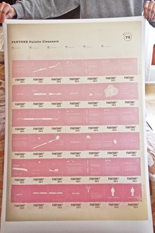
The finished version is one giant compromise between what I had in mind, and what my teacher was pushing. [fig11] I am very happy with how it all turned out in the end, and it was a valuable learning process to try and balance my visual tendencies with the requirements of the assignment and client. The hardest part was probably continuing to stay motivated and keep churning out new ideas when so many of the early ones were being rejected. I’m not sure if six weeks is a long time to work on one poster, but it sure felt like it. It took many failed attempts to arrive at this eventual conclusion, but I think the project was that much more successful because of them. I get it back from the printer this week and can’t wait to see how it comes out. I won’t be using pink for a while.
You can learn more about Alex Cornell’s various projects at his website.

alex is so lucky.
I think this is a very very cool poster! Can I buy one, seriously?
This kid has talent with the ol’ vocal box – and i love this poster, executed well! You should hook up some more designers you know with post’s on the ol’ blog like this. Always fun to dive into the minds of other designers.
—PT
Really like the type treatment and composition. Nice one. I’m a huge fan of the science, lab, icon aesthetic.
i’d definitely buy one too
it looks great
hi scott, have you thought about going back to school to study graphic design in depth?
Great post! I really enjoyed the read. I am an undergrad design student, so it was nice to go through the process work involved in this very nicely developed piece.
Hi Scott,
Its a wonderful post and thumbs up to Alex for nice work. I liked the distressed edges on the poster done up in photoshop, its looks almost similar to some of your works. I agree with few comments about alex being lucky to work with you and of course he is talented too… very lethal and rare combination to have natural talent coupled with hands on experience with master himself.
please post few tutorials on photoshop scott… please.
Scoot and Alex, that was awesome. It’s always great to see the process other designers go through to get to the final piece. Very well-executed.
Thanks!
Nice work Alex. I think you did a great job on the poster.
Great insight, especially for an aspiring-to-be design student! Thanks guys, love the final product.
Instead of putting the product silhouette inside the swatch, I think it would be better if the exact opposite, i.e., putting the swatch inside the silhouette was done.
I tried the concept out and you can see my attempt here: I have used the same elements as in the poster here. http://www.new.facebook.com/photo.php?pid=825773&l=93c71&id=674212917
With some more time, it can be made to look really kick ass IMO.
That’s my 2 pixels on this. :p
i disagree with that last comment. i think the process and execution achieved are concise. I think it would be sweet to see the poster in a series with some other colors, if the other pieces in the project didn’t already explore that.
Hey Alex,
Nice work. Good to see you on this blog too.
Seriously sweet poster, Alex! I really enjoyed seeing its progression and your thought process associated with it. I think the decision to use call them “palette cleansers” is ridiculously smart – bravo! In my opinion, this poster strikes the perfect balance between classic “Pantone design” and satirical presentation of the product. I can’t wait too see more of your work! What talent!
what is the “PANTONE pallete” font in fig9?
i love the poster
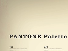
jigaboo: The font in fig.9 is Clarendon Bold. The old Pantone layouts had “PANTONE Color Specifier” written at the top of each page in this font.
Matt: I actually did do a few other versions using different colors. My favorite was army green, and it meshed really well with the pink version when they were side by side. The problem was that I didn’t have enough time to develop enough copy/images for a second poster. I chose to do one big poster, but it definitely could have been interesting to have done a series of three in different colors, given enough time.
Thanks for all the nice comments!
awesome design. I would definately buy one if you decide to sell them.
awesome, great job alex. i actually did something kinda similar just for fun a couple of years ago, but it was an old layout thingy for my son about whales, presented in large format and modeled after a 60’s informational poster. lots of halftone experimenting and playing with cool old type layouts and discoloration techniques. it was a blast and i’d love to get the opportunity to rock something similar for a real client.
my only critique of the final product is even though i quite like it degraded, i find it’s a little overdone in a few spots. it’s a tricky balance i’ve found. i don’t think it’s too bad though, getting close to the real thing is pretty tough.
ps-by the way, i absolutely love those fonts. such classics and you executed them perfectly.
Task was to make a poster for brand new product from pantone line. Especially, that product was not familiar with other pantone products. Therefore I don’t think this is the best way to sell new product. It’s not visible at all. How many time do I have to spend in front of poster to realize what is all about. After all isn’t it all about communication – bold simple massage and everything… first proposal was on that way but without pantone memorable elements. Second one has those pantone elements but it just not communicate that there is a new product on line. It’s not visible
yes thats the problem i think, style is getting in the way of communication
visually i think this is a beautiful piece, but as a poster thats trying to sell a “new” product, in my opinion it doesnt work
pantone isnt that laid back a company thats gonna like their product faded and aged….
as a matter of fact, they recommend you throw away their chip books within a certain amount of time or the minute the chip book has been faded…due to sunlight exposure.
just my 6 cents 🙂
an academy of art student, huh? I literally just got back from a 6 week summer program there. :]
and the poster is sick.
Great work! It looks nice and I’m sure you’ll get a good grade. But I have to agree with some of the other comments here that this poster doesn’t really sell the product well and it really doesn’t read well as a poster that would be hanging around town to advertise a product launch. The tiny detailing would make more sense on a CD cover or product packaging, but not a poster.
An interesting idea might have been to depict the product itself (as in version one) and have it scraping down the center of the grid of pantone swatches. The dirty swatches could be off white, greyish pinks, even hints of green, and then the “cleaned” swatches down the center, in the path of the scraper would be the nice warm, tongue-pink colors. Then each swatch could be labeled with it’s proper pantone number. For detailing within the swatches you could have done something like little flowers in the clean, pink area and onions, coffee, beer, etc in the dirty, smelly swatches.
This white/cream issue is also messing with my head once again. I totally understand mimicing print artifacts for an on-screen design but there’s something strange about printing it out that way. It always drives me crazy when I see a poorly reproduced movie poster that’s obviously printed from a blurry photo of another print rather than the original plates. This kind of style reminds me of that. I think your original illustrator work (as in fig3), printed on some nice, subtly off white paper would have been beautiful.
The poster looks cool and interesting line of thought. It is fairly consistent with PMS as a product, but what about Pantone as a company? And would it sell the product as per the original brief?
Everyone wants to buy the poster, not the ‘palette cleansers’?
Scott, great post! Thank you.
Alex, love your work! Very clever, from the “palette cleansers” play on words, to using the old school Pantone layout coupled with an aged look , as if this poster had been around for years. Great overall aesthetic too!
Thank you so much for going into detail about every aspect of your process. I especially enjoyed reading about how you aged the paper in Photoshop. I have always wanted to know how to do that. Do you think you could explain a little more in-depth how you went about distressing the pink boxes? You made it look very authentic, which I have never been able to achieve…
Great work!
I would definetely buy this poster; looks so cool!! When will we see a tutorial?
I am a current Academy of Art student Online in the Computer Arts: New Media program. I also have this constant pressure from our instructors in pushing us further in what they expect from us. I think it’s great to have that in any education institute. I think without that pressure and critique from them we may or may not get the same end result with big impact.
I am really impressed with Alex’s project and how Scott put this all together. It’s great when we are able to relate in this creative progression in our art.
Interesting work.A bit fervor, a bit nostalgia that it is necessary!
seriously, this blog is splendid . I think im gonna stick around and read about 5 of your posts. Yours sincerely