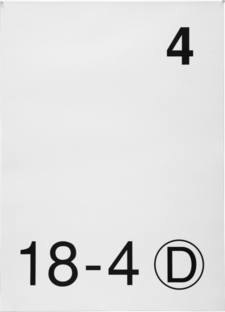
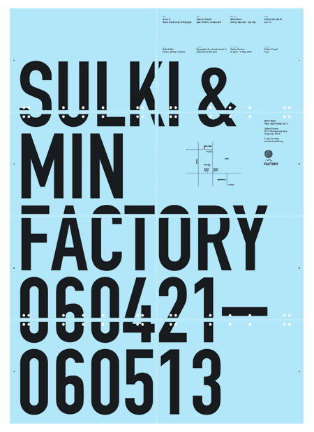
I am very excited about the work of Sulki & Min. I saw these on but does it float this morning and they jump-started my mind. I’ve been in a bit of a creative funk recently and these posters were just what I needed to get excited about design again. I’m not exactly sure what specifically it was, though I suspect the type lockup in the top right quadrant of the 2nd poster down may have had something to do with it.
I also love the subtle details in the first poster — the line weight of the circle around the D, the differences between the two fours — simple yes, but boring no. (I’m sure some may disagree with me on this, but I can’t help but admire the restraint/confidence it takes to call a poster like this finished.)
Sulki and Min are Korean designers who both got their MFA in design from Yale. They have an astonishing body of work and have been exhibited many times. I am also a big fan of a few of their typefaces designs.


I feel you on the first poster(haha).
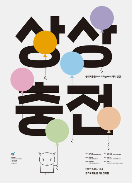
The third poster is beautiful. In all it simplicity – it’s so bold and vibrant.
However, the little character tie in…not so much.
I saw them about a month ago, the graduate department where I go to school (Pratt) had them come for a lecture. They were way jet lagged but still had some great work to show and things to say.
A bit unrelated, but I am going to see Experimental Jetset do a lecture at the same space tomorrow, and we had Paul Sahre last week.
I also love that 2nd poster, those little dots on the lettering are awesome. Also, the first poster I really like just because it says absolutely nothing to me; I feel like someone ran up to me on the street and screamed in my face, “FOUR! EIGHTEEN, FOUR D!” and walked off.
Also, I think they need a new website. Since my alarm clock failed to go off and my room mate has what I need for class, I will use the rest of the morning designing a mock up for them just for fun. =P
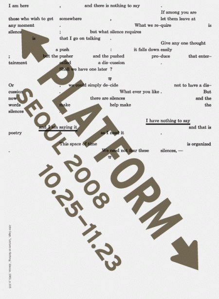
Love the last one because of the pointing arrow (kinda) highlighting “I am here” but also how all the punctuation is lined up.