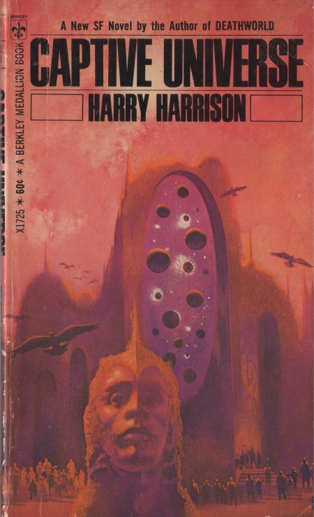
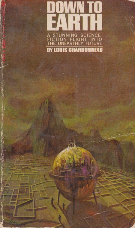
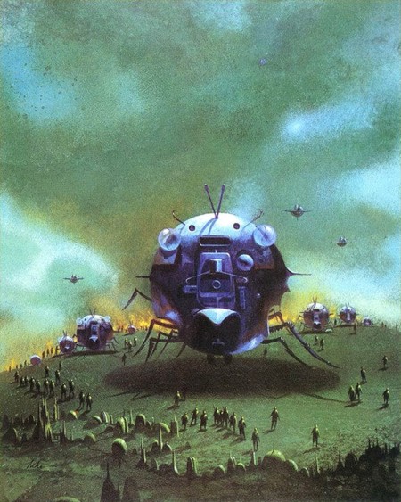
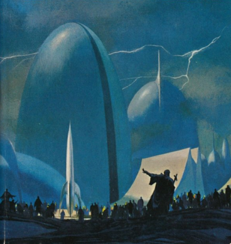
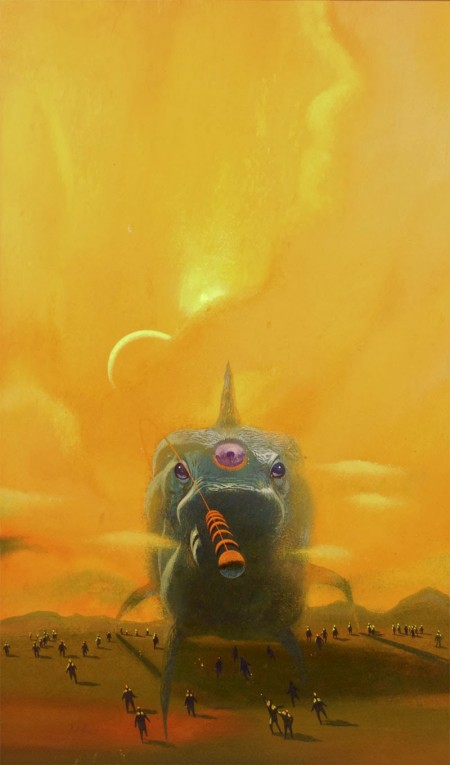
Paul Lehr illustrated a ton of work for sci-fi kings like Robert Heinlein, Isaac Asimov, and H.G. Wells. While last week we saw John Berkey’s scientific and technical approach to space craft and space flight, Lehr’s work is certainly more organic in both his subjects and technique. He leans more towards fantasy-like creatures, life forms, and orbs. There is also a recurring scene of numerous people all surrounding an object or life form. I find it interesting when artists have a heavy overarching presence of certain themes in their art; links between separate bodies of work. I was thinking while posting this week’s covers how different one artist’s view of the future can be from the others’. I think that seeing each artist’s different take on the future will be an interesting part of this series.
I’m curious–does anyone has any favorite images from this week or a preference between the styles seen this week or last?
Posted by Smyjewski



Definitely prefer Berkey’s work — pure genius. I think his skills are on a different level altogether from Lehr. Just floored by almost everything space-related that Berkey did.
Both a great, but (obviously) different. They both make me want to read the books behind those covers, so from that point of view they’ve succeeded!
I am very much looking forward to when you feature Chris Foss (is that too presumptuous?). As well as the sci-fi that Foss is better know for, his work was also on war fiction paperbacks published by Fontana in the ’70s. My parents have a few on their shelves if you want scans…
@DK – I agree, I tend to lean more towards the technical side. I am completely fascinated with ships so Berkey’s work really draws me in.
@Escdotdot – Thats a good point. Thats one thing that carries through all this work is all of it makes you want to crack that cover open and dig in.
Ahh yeah Chris Foss, some of his Asimov covers are REALLY good. Im sure I will be posting his stuff in this series. Which ones do you own? You should throw some pictures up on instagram with the #sundayscifi tag so I can check them out.
will do!
Looking through all this amazing art while listening to BOC. Damn.
All of these look like covers of books my dad may have had.
Lehr’s work is on a different scale, let alone a different level. Lehr shows the humans as an ant-like creature amid a bubbly shape, except for the first one. The first picture is excellent in my eyes, I like the trippy bubbled humans.
Berkey’s work is incredible, the ships are beautiful and the low res planets in the background are, well, done with a certain tact that background planets rightly so deserve.
@Collective, this is an awesome series. Please continue. You just may spark a resurgence of 70’s sci-fi readership.
I like the first one in the second volume. The Gods of Foxcroft.
Love this series, I didn’t know this artist. Thank you!
I liked last weeks’ better.
I prefer Berkey’s myself. I love the contrast of the fine detail of the ships against the muddy renderings of planets. The painting of the ship’s interior is especially cool with the light reflecting off of the instruments and panels.
I like Lehr’s as well, especially “Captive Universe” in all its purple glory, and the greenish one with the spherical insectoid ship which looks a bit comical but still sinister.
This is my favorite new column on the Internet. Great finds! I’ll have to post a few more from my small collection.
@Tre – Haha glad you are enjoying the posts!
@Paul Anthony – You should go dig some up! Get some shots of them.
@Kyle – I agree Kyle, Berkey’s stuff is SO much more detailed and intricate. Its sort of hard to compare the two since they are such different styles.
@Sean – Thanks Sean Im really glad you are into it. Im hoping that will happen!
@Robert- Same here, I think thats my favorite.
@Jake- Great point Jake. I love the lighting on Berkey’s work. Its funny you mention the Captive Universe that has been a favorite of a few people I have spoken to, it seems to be that one and the Foxcroft cover are the fan favorites. I appreciate the kind words I hope you continue to enjoy it.
@Ben – Thanks for the input Ben! Love to get your thoughts on the week 3 post.
@Robert- I agree Robert that one is my favorite as well.