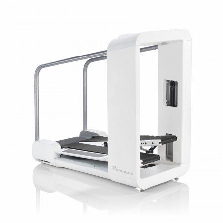
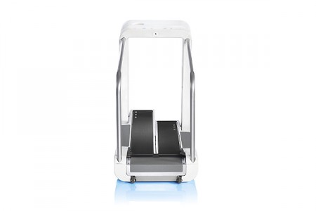
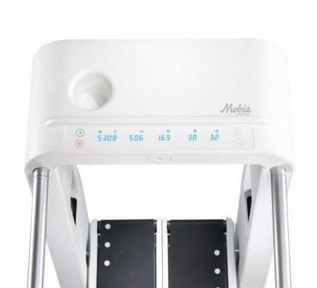
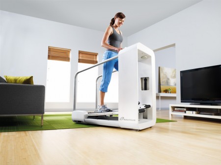
I saw a commercial for the new Nautilus Mobia today and was pretty impressed. Considering the fact that it comes from an industry not exactly known for aesthetics, the Mobia sports some nice lines and an overall iPod-esque (the designer’s own words) vibe that’s pretty attractive. Designed by famed ID firm Frog Design, the elliptical/treadmill hybrid even scores in the interface department with a clean, no nonsense display.
Unfortunately, the Mobia branding falls flat on it’s face. Perhaps another firm designed the logo and Frog was forced to apply it to their creation, I don’t know. I do know that it just about ruins the entire experience. The logo — which appears to have been designed by a marketing team years before the unit itself and completely independent of any input from the product design team — fails to align stylistically with any of the machine’s physical characteristics. And what’s with the name? Mobia? It sounds like a new VoIP solution or some sort of dolphin harness. It doesn’t sound athletic or sleek at all. Oh well, I would still take one and just scratch off the logo. Then I really wouldn’t have to leave the studio again.


I think the name came as a result of merging the words “Mobility” and “Force” (Ancient Greek: Βία, English translation: “Force”) which seems to be the main message behind the product “If you can walk, you can work out”
I’m not a fan of the logo or the design. It’s too chunky to look like it fits in the home and the stainless steel rails look very bathroom safety rail or pool ladder-esque. The large race track design on the front is becoming very cliche these days.
Take a look at this workout machine my friend designed, http://www.coroflot.com/public/individual_file.asp?individual_id=104928&portfolio_id=2924798&
This one is on its way to the market and I think is a far more successful design.
pretty cool. the logo really doesnt bother me all that much. has a kind of 60’s kitchen appliance feel to it.
This is not right. People sweat when they exercise. Regardless how much you clean, that thing will grow more and more yellow with time.
Make it GRAY!
That’s a mighty fine lookin’ place to dry a girlfriend’s wool sweaters if I don’t say so myself.
Definitely agree…This is quite a beautiful object. I would love to have this. It would probably motivate me to work out more. But that really sucks about the branding.
Hmmm, got to disagree on this one. Too much plastic. Would rather see something with nice machined parts like pro motocross or mountain bikes. Of course then the price would be outrageous.
Dolphin harness, lol.
Mobia has been out for 4 months now and I have yet to hear one owner’s review of the product. Has no one bought it? What are the pros and cons?
Please let me have reviews by people who own this Mobia. Thanks.
I own the Mobia. The machine is awesome. It is a very hard workout. You can increase the resistance to make it an extremely hard workout if you want. When I get off this machine my thighs and buns BURN. I feel tightening of my abdominals muscles instantly. I have owned the machine since December 2009. The installers set the resistance at 12 (the max), I didn’t realize this and I felt the machine was too hard. I didn’t try it again after that. I felt I was too out of shape to use it. But then silly me realized how to reduce the resistance. I have been using it for 2 weeks now and I am seeing and feeling results already. I go to Jamaica in 4 weeks and I am on a mission to look my best in a short time. I paid $2K for this machine. If you can afford it…get it. TO me it was worth it because I am 40 years old and do not want to destroy my knees with more running. I sweat like a pig after 15 minutes on the machine at 2.5 mph. I love my Mobia. Once again, I feel it in my abs, butt and thighs and I sweat. That is all I ask for.