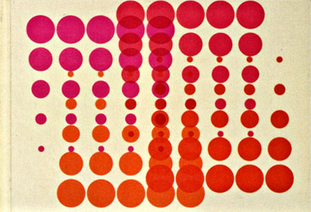
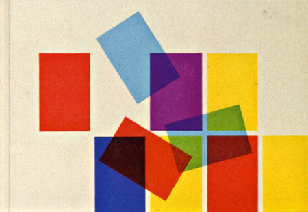
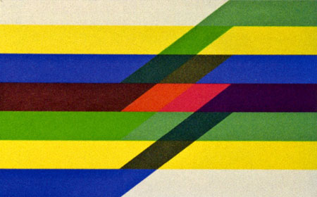
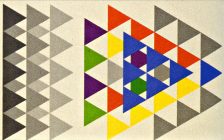
Swiss pharma company Geigy (now Novartis) cranked out tons of drugs and tons of great designs to sell them during their time. The images above are from the book “Corporate Diversity : Swiss Graphic Design and Advertising by Geigy 1940 – 1970” (amazon) which chronicles their best work during that period. There are more images and info over at Things To Look At and Grain Edit.
Images via Things To Look At



also check out some of Steff Geissbuhler’s work from the C&G Partners blog:
http://www.cgpartnersllc.com/2009/03/steff-geigy/
also check out some of Steff Geissbuhler’s work from the C&G Partners blog:
http://www.cgpartnersllc.com/2009/03/steff-geigy/
Yeah, the works are great. At the moment, they’re exhibited in the “Museum für Gestaltung ” in Zurich. some shots here: http://www.flickr.com/photos/philipp75/3411768855/
That top one is great. I would take that drug, whatever it is.
Those are excellent, great play with geometric shapes and overlaying those colors. I want them all. ><
yes i was just in zürich yesterday and saw the exhibition. incredible!
it was absolutely stunning to see the originals. that book is highly recommended.
i think the best work isnt even on here or on any flickr posts ….
http://www.cgpartnersllc.com/wp-content/uploads/2009/03/geigy_book_spread2_med.jpg
&
http://www.cgpartnersllc.com/wp-content/uploads/2009/03/geigy_book_spread3_med.jpg
ha felix!
funny you were there yesterday … I was there thursday.
The exhibit was goodness all over and I came to the conclusion that visiting the museum is a must for everyone studying design. The permanent collection is wonderful.
These remind me of Anni Albers textile designs.