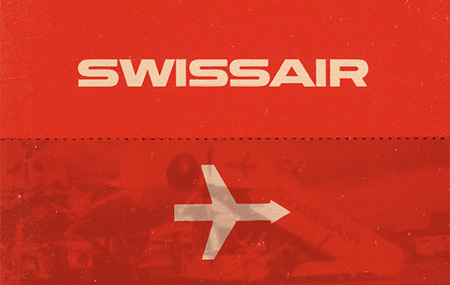
Swiss Airlines has a rich history that has been hidden in the archives for quite some time. On March 26th, 1931 when Swissair formed, I doubt anyone at the time really considered the history that they were going to be making with the company’s design. Balair and Ad Astra were the two companies that merged to form Swissair. Throughout the years they’ve changed logos many times but there was one that was most memorable (above). Quite possibly it was the best logo that the company has ever used.
Thanks to SR692 for collecting this information so that we’re able to walk through past logos used by Swissair. Some great, some not so great and a few that were very, very experimental. Hit the jump to see how the company logo changed throughout the years.
Via Wanken
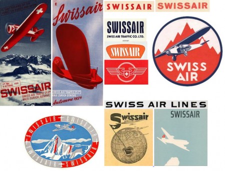
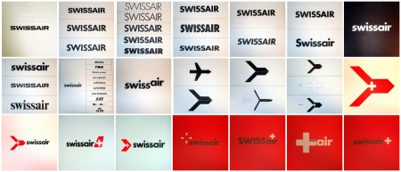
1931: Early Logo Development
The first couple of years were experimental for the company. They didn’t have a standardized logo and in fact they weren’t always called Swissair in print; sometimes they were Swiss Airlines, Switzerland Air.
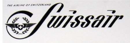
1940s: Classic logo
The 1940s would be the start of the company having a standard logo on the livery of their airplanes. It could be just me but it seems that this logo has the “war” vibe attached with it—from the color to the typeface.
1950s: Swissair Signet and Dynamic Typeface
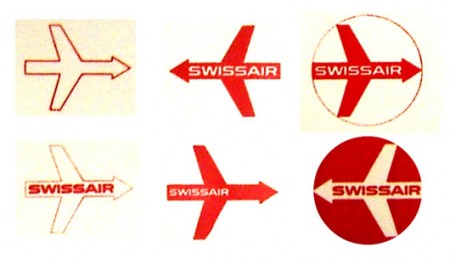
This mark was created by Reudi Bircher for the purpose of providing a literal representation of the line of business that the company was. You can read more about the signet in this article written by Bircher.
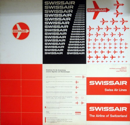
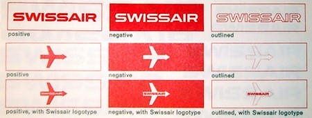
Along with the arrow comes this beautiful typefaces that signifies motion in the same efforts that the signet does. You can see many different versions of each being used. Some the combination of the two and some separated. All around I would have to say this was their strongest rebrand the company has ever seen. Wouldn’t you agree? The newest logo that they are using is very simple, but also very good.
1960s-70s: Swissair Signet
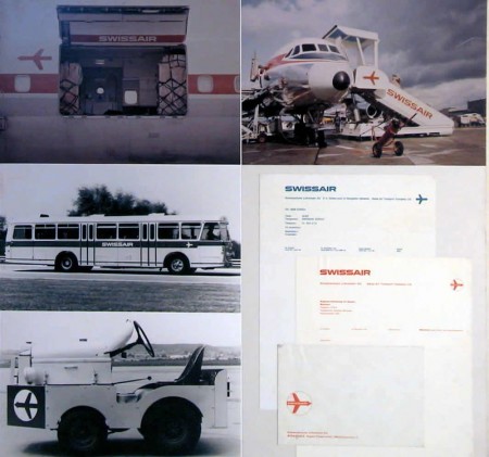
The company seemingly started removing “Swissair” from the inner of the arrow and only used it externally. You can see in the images below where the signet started to live in the wild as a mark by itself. Still the company would retain the great design that I truly still wish were around today.
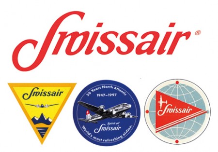
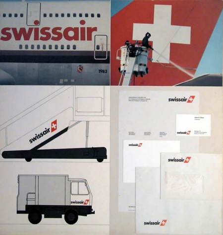
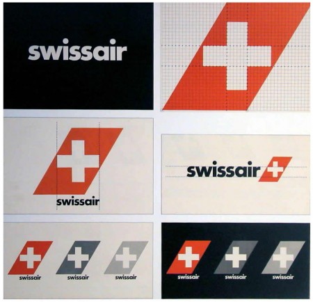
1980-2000: Last Swissair logo
Starting in 1981, Swissair had its 50th anniversary and “modernized” its logo and aircraft livery. Initially they weren’t strict about the logo and there were quite a few versions, leaving the brand somewhat patchy.
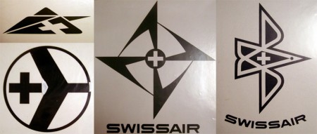
Experimental Logos
It’s always interesting to see logos that weren’t used because they’re often really interesting. Some of the marks here were extremely abstract and you probably couldn’t see this ever being used. The logos I’m guessing were shot down because of how radical they were to airlines or Swissair’s competitor logos.
All images complimentary of the SR692 Archive.





Thanks for sharing this, Shelby. Amazing.
Any idea what font is used in the very first example and in the examples from the 1950-1970?
@Sam
Not entirely sure. I’ve searched for it but came up with no results. I’m led to believe that it was created by hand for this purpose.
I came up with a forum called ‘Airliners.net’ where a poster seems to have identified it as as font called “Handel Gothic.”
I’ve found the font and while it’s not identical, it’s about as close as I think I’m going to find. It’s definitely the font on which this was based, but as you said it looks like it may have been tweaked specifically for this logo.
Handel Gothic was designed in the 1960s so I’m not sure that it was the face used. I read somewhere that Karl Gerstner was the designer for it. But that may have been for the logo to come after the version we’re curious about.
I’ll continue to look for solid info on it.
I see. My apologies for getting my facts incorrect. I’m something of a design newbie.
Slightly off-topic but, I was checking out your blog and was wondering if there was a way for me to contact you with a few questions, chief among them being your background design and how one could get started with something like freelance work?
Until I found this blog, design was something of a “fool around in Photoshop and try to learn to use it by replicating pieces that you see around the web” sort of deal for me, but I think that I may want to become a bit more serious about it.
You can get in touch with me via my contact section on the blog. There is nothing better than being inspired by Swiss design and making you want to become a designer.
Handel Gothic does look similar, but based on the year that Linotype claims it was designed, I don’t think the Swissair logo used it.
Karl Gerstner designed this version.
Wink Media designed the most current version.
Designing a typeface for a logo is quite common in the design world. Adds to the uniqueness of a brand.
SWISS ≠ swissair … you’ve linked the new airline from switzerland ‘SWISS’, but that’s a new body. swissair had (unfortunately) a financial grounding in 2001…all they left was their fantastic grafic design.
cheers from switzerland
GLEN
I do believe that Gerstner discusses his designs for Swissair in his 5×10 book.
Huge fan of him; he turned 80 this summer.
Gotta say I like the 1980-2000 identity best. It says “Switzerland” more than the previous one, which looks more generic Cold War era to me (that signet looks like a missile!).
The combination of the white cross in the red parallelogram, abstractly representing both the Swiss flag and an airplane’s tail, is brilliantly simple. The way that the parallelogram becomes vertically oriented on the plane ramp is genius.
Looks like a wiener with wings.
I’m really into swiss design, especially in the typeface design. so thanks for sharing this.