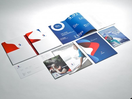
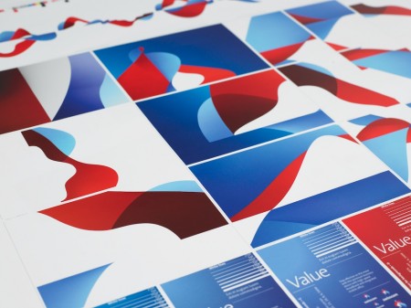
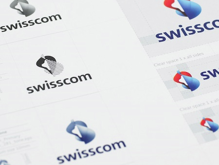
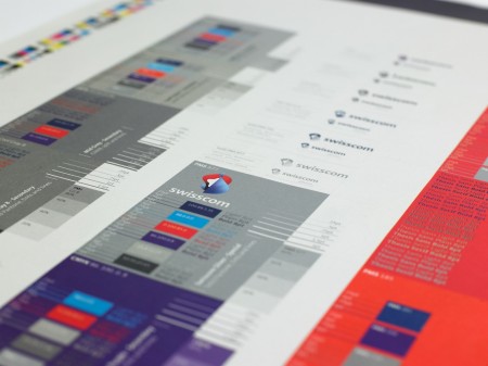

After writing last month’s post on the Swisscom rebrand film I stumbled across this page at Moving Brands’ site containing the images you see above. I have to admit that it cast the project in a whole new light for me. I still can’t say I’m a fan of the core logomark in all it’s gradient-clad glory, but on a large scale across various formats I think the branding system is very strong. I’m really enjoying how the logomark works in 1 color mode, looks sharp and far more focused. At any rate, I just thought these photos were great and really capture a nice aesthetic that I hadn’t fully appreciated the first time around. And of course the hot air balloon seals the deal. There’s something about well designed hot air balloons and sails; that’s about as good as it gets. Swisscom should all pitch in on a yacht and make a badass sail with the logo on it and they could all wear these.
I noticed some people weren’t too keen on the logo when I last posted on it, do these images change your mind? Let us know in the comments


It reminds me of the time of retro logos and posters (which isn’t a good thing to me), but I do actually like the abstract-ness of it, and how I can’t really tell what the shapes should mean at first glance (not at second and third glances either, to be honest!). I think there is a kind of refreshing quality to this mark.
I totally agree with you, I am not a huge fan of the logomark on its own but The brand identity has a true cohesiveness to it and after looking at the design applied to several components of the company I am actually starting to like the logo. If you look at it for the first time you’re like “what the hell is that” but then there is something about the elegance and form of it that grabs your attention. I also agree with you about the logomark in 1 color mode which I think is 20 times more successful than the gradient one. I absolutely love the hot air balloon application too…WOW! I might have to post this on my blog too.
It looks like the cover to a Trapper Keeper.
I would like to see the 1-color gradientless logo animated in the way that the 3d gradient logo was. That would be pretty interesting.
I am still at a loss for what the logo represents. I get the swiss cross but I can’t identify what the seashell swirl is all about. The black logo is a great take on the logo but it still suffers from being meaningless to me. At some point though I have to concede that the logo is immediatly recognisable and well crafted and those things are probably more important than some hidden meaning in the form.
The overall package seems to be complete to me but there are a lot of elements that I don’t understand what they will be used for. I assume they will be used just for graphic “fluff” to cover their boxes and line their mailers.
Maybe this commentary is a bit ignorant of how large companies do business but I would have appreciated a strategy that involved a reduction of non-essential items rather than new wall papers to stretch over them.
I agree totally. After seeing these images I feel a lot more satisfied with their logo overall and how it looks on everything…and as you said, the balloon sealed it.
I thought it was great the first time. These images just sweeten the deal for me.
Despite cohesion with the new peripheral fluff, the campaign core, the logo, remains inefficient; a complexity with no clear meaning; no elegance; a clumsy confusion.
For example, I don’t hate the gradient, but what’s it’s use? Same with the [G.I. Joe] Cobra logo-looking elements in the b&w version. My conviction stands: void for vagueness. Design fail.
This branding is badass, and I feel very much an indication of where we’re headed. A company this massive can get away with a gradient logo, and I disagree. I think it destroys the single color. It’s non-representational, but guaranteed successful. It’s swisscom. It IS totally refreshing, and its versatility is insane.
This is the best example of good collaboration. Olympics branding could learn from these guys.
@slofu: A much more concise version of what I was trying to say. Thank you.
Although I still don’t think it is a complete failure since it is so recognizable and that is the purpose of a logo.
It’s dynamic. It’s hard to swallow at first because of that. I don’t think we’re used to thinking about a company’s identity NOT boiling down to a mark and a palette really neatly and being applied to various media. I kind of dig the idea of the identity kind of having a life of it’s own with all these permutations of shapes.
The simple and important fact is that there’s a common aesthetic thread running through it all which completes the job and leave SO much room for it to take on a new life in 5 years from now and 5 years from that.
One last thought: it doesn’t matter how the forms are given depth, nevermind that it’s based on gradients, nevermind what it “symbolizes” – those are mere tactical details…
This isn’t art, it’s corporate branding. Think of how smart it is for a corporation to base their visual not on an singular mark… but on a PROPRIETARY GESTAULT SYSTEM. It can be refreshed occasionally without entirely breaking consumers’ recognition of the aesthetic link to the brand.
“Scott Lowe Says:
Although I still don’t think it is a complete failure since it is so recognizable and that is the purpose of a logo.”
I don’t think that appreciation is correct. The purpose of a logo is not to be recognizable. A logotype is the minimum element (an yet, the most important) of a corporation. Because represents all the history, concept, ideals, strategies, feelings & future of a corporation. It has to be perfect, to represent perfectly all that things. Because of that, through time it will become recognizable.
Just because a brand is recognizable doesn’t mean it is good, and doesn’t mean that it works. It can be recognize because it’s ugly, or useless. And I don’t think swisscom had that on mind.
We all know the Logitech logo. Anyone think it’s good?
I moved to switzerland in january and i remember the first time i saw this logo on a box of digital tv stuff that had just been delivered to my roommate. The box looked great, yes those gradients are wrapped all over their S#!% and they look slick. But when i saw the actual logo itself nestled above the plain swisscom type, i was shocked.
That said, I think to those of us with some design background, it’s just the fact that it defies a whole lot of our common training that gets us riled up. To the layperson, it’s just confusing looking, but everyone gets used to it. It’s complex and a bit malformed, but after living here for 9 months i can spot a swisscom telephone booth or storefront from a mile away.
So yeah, what Effix said, and what we’re already seeing examples of, it’s probably the future of corporate identity to appropriate an entire aesthetic system or scheme of shapes to slap all over everything that has to do with the brand. In this case, the logo suffers from being wierd looking and vague (especially when printed small) but overall the branding is a success. Maybe someone will figure out a slicker way to pull off the Gestalt System branding scheme and keep a nice crisp logo, or maybe not.
The single color black version on the fourth image down is pretty disappointing. That venetian blind effect is kind of gross. I guess that really shows where the mark starts to fall apart. I hate hate hate gradients in logos but at least if the gradients are just enhancing something that can successfully reduce down to a single color then it can work.
I like the trendy idea of a system that can be modified and let the logo sort of “live” but in this case I feel like all of the modifications and abstractions are actually better than the mark itself. Has there been a really strong example of this approach yet? The Pepsi one is the only other attempt that comes to mind immediately and that is just horrible.
I’m sure it can be done. Of course, it helps to have a strong foundation. These took me ~5 mins. in CorelDRAW: http://www.flickr.com/photos/zkwrl/
First, the old logo was really bad, and it really needed a rebranding.
The new logo in itself is not that good, but as soon as they start to freely spread those red and blue shapes, it’s just perfect.
I have a Swisscom paper bag that I keep jealously 🙂
Just to be clear, I’m not talking about the old old logo (post + telecom), which makes me trip since I’m kid:
http://fr.wikipedia.org/wiki/Postes,_t%C3%A9l%C3%A9phones,_t%C3%A9l%C3%A9graphes_%28Suisse%29
> In this case, the logo suffers from being wierd looking and vague.
How so? You just said that you can spot it from a mile away. Doesn’t sound like the logo suffers anything at all. It’s different, means something to the client, and is distinguishable from other, less creative work.
> I am still at a loss for what the logo represents.
From the creative brief presented on the Moving Brands site: “Our brief was to create an identity that expressed the vision of the company, which was an increased customer orientation and expansion from telecoms and IT to media and entertainment sectors. For a Swiss market leader (with more than 60% market share), it also had to feel distinctly Swiss.”
> This isn’t art, it’s corporate branding. Think of how smart it is for a corporation to base their visual not on an singular mark… but on a PROPRIETARY GESTAULT SYSTEM.
Agreed. Swisscom is going to have a lot of fun over the years playing with this system. And it’s always going to look amazing.
Swisscom logo looks cool. Nice design. Thanks for sharing this post.