I’ve noticed these high end chocolate companies springing up left and right over the past few years. The paper-made thing seems to be the prevailing aesthetic of retail chocolate branding; employing one-color screened ink on kraft paper along with things like wax seals and cardboard hang-tags to give off that organic, handmade vibe I guess. It’s usually done to good effect but it’s nice to see a fresh take every once in a while.
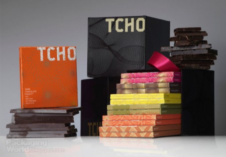
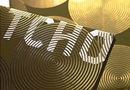
When I first saw San Francisco-based Tcho Chocolate I was struck by the name (no, I didn’t trade my studio for a chocolate factory down by the pier) and then by the design. I regrettably couldn’t find many decent pictures of the actual packaging, but suffice it to say you need to hold it in your hand to really appreciate the finer points. The letterpress and gold leaf inlay are a very nice touch that I don’t think is really captured properly in the above shots.
The video above goes over the concepts that informed the TCHO branding. I particularly like the central idea of chocolate as currency; design firm Edenspiekerman’s implementation of that concept is well executed. The result is a striking design which vaguely conjures the notion of European currency whithout making you forget you’re supposed to eat it. I don’t really enjoy chocolate on it’s own but they still had me wanting some just from the packaging.
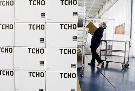
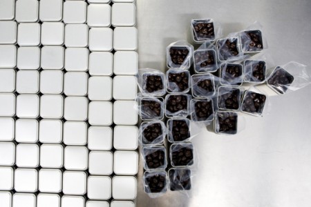
First two images from CNET’s tour of the Tcho factory at Pier 17.


Me like it :9
True, it’s great to see a chocolate brand that doesn’t have script all over it, but maybe this tried too hard to be the opposite? After watching the video, the brand is so considered that it almost comes off as being insincere — or maybe it’s just the music and HAL-esque voiceover that makes the entire project seem overdone.
Remidns me a little of the modern-ish look of Choxie brand chocolates at Target…only better.
@Leslie, I kind of agree with your take. I love the packaging design but on the whole (again, maybe because of the flat voiceover on the vid) the whole thing lacks sensuality.
It’s like the polar opposite of Cadbury’s flake campaign in the UK, which was basically soft porn. Hit youtube.com/watch?v=wEhfxGGCDzY for just one early example. And yes, they get worse (better?)
Seriously though, I think the most successful chocolate branding is one that plays with the idea of sensory indulgence… As much as I like this TCHO styling, it doesn’t make me want to eat chocolate OR have sex.
It makes me want to Spirograph.
Leslie & Ross-
I agree, but I think it’s a bias created by their web assets. I don’t really like the way they shoot the product pics (like I was saying, there isn’t much good stuff to choose from), or the video (you’re right about the voice over, it’s like PBS or something)… But when you see it in person and hold it, it’s really substantial, the gold leaf and letterpress details are very well done.
@Scott – I guess the weight and feel of that packaging might give it more of a sensory appeal. You’re definitely right about those images.. They look almost intentionally stark, which is probably what turned me off.
The third picture looks like a CD box-set of trance music.
There’s a good article (about advertising rather than branding, but hey) at Computer Arts – computerarts.co.uk/in_depth/features/against_the_grain
I personally think the Cadbury’s gorilla ad is phenomonal. I remember seeing that for the first time and just smiling like a maniac when I realised what it was advertising.
So was I the only one that read that as TYCHO at first instead of TCHO?
I’m compelled to eat chocolate AND Spirograph. To spit the truth: I’m down with chocolate. I’m down with rockin a grid. I’m down with money. It seems as though I might be smack in the middle of the demographic.
that Flake link has got me pining for some actual sweets. Good chocolates in the states is scant at best
lmao @Ross: “It makes me want to Spirograph.”
So true.
Thanks for the shout out. “No faux traditionalism” has been a mantra for us at TCHO. For the record, the voice on the video (produced by Edenspiekermann for their own design consultancy and not for us, we just liked it and put it up on our site) is that of Susanna Dulkinys, who designed the packaging. I don’t think she was trying for any particular effect; she is not a professional voice actor, and was trying her best to just say what was on her mind when she was working on the project. Sometimes a voice is just a voice.
@Louis – Makes more sense to me now, especially considering the vid is about the design process and isn’t a commercial. Although I had to find some way to link all this to those Flake ads. Any excuse for simulated oral.
All this is making me hungry. We are blessed in the UK to have some great chocolate. Most American chocolate makers seem to want to cram everything with peanuts. I’m guessing that TCHO is more of a gourmet thing?
So aside from Louis I think I may be the only one here who has actually eaten any TCHO chocolate, and it’s as good as it looks. I’ve been following them since the beginning of their blog buzz and I actually am slightly disappointed I didn’t get to try any of the “beta” chocolate.
The current packaging is pretty and all, but I fell in love with the simple brown paper that the TCHO beta came in. It seemed like they were just letting the candy speak for itself. Anyway, if I ever scrape together enough pennies to justify keeping chocolate on hand for guests, it’ll be TCHO.
Aside from the title of this post, I thought it was CD package design for TCHO. haha
Im currently working on branding a chocolate company for a senior exhibition project, I chose this project because I was thoroughly intrigued with recent brandings, such as TCHO, Vosges, and Bloomsberry. They are absolutely gorgeous.
my favorite was this chocolate shop i stumbled upon in barcelona:
http://www.xocoa-bcn.com/Eng/index_eng.html
mmm and pretty 🙂