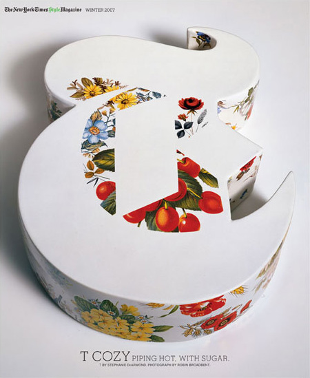
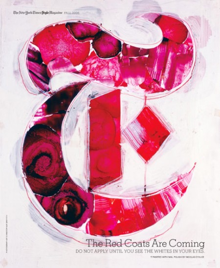
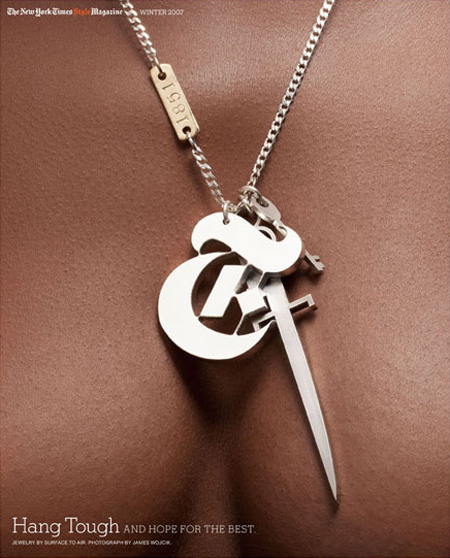
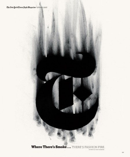
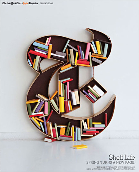
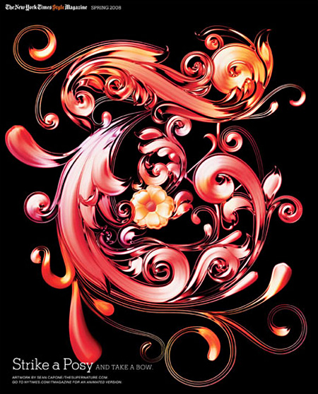
The New York Times’ T Magazine often comissions artists to create their own version of the iconic T that is the magazine’s logo. There’s a great collection of the work over at the T Magazine blog featuring some of the standouts. Interesting to see so many fresh takes on the same theme, they should make a coffee table book out of these if they haven’t already. My personal favorite is that first ceramic one; the negative space is so perfect. Unfortunately, whoever did the type layout decided that neon green in the title would somehow work with the vibe. Clearly it didn’t.
The Best T’s
09.02.2009


well Scott, i’d love to see your version of the T!
and alex’s too
that’s the first thing i noticed…neon green.
The strike a posy one is hot shit.
Lame. You started putting ads on your site. Oh, how even the strong fall…
Blackletter beauty
I like the lime green. I think it works well. Different strokes…