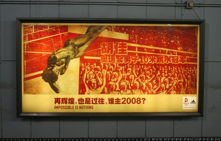
Very nice contemporary propaganda-esque Adidas billboard for the Beijing Games. Not sure who did this campaign, anyone got some info?
Photo via Ack-Online
The New Propaganda
12.20.2007

Very nice contemporary propaganda-esque Adidas billboard for the Beijing Games. Not sure who did this campaign, anyone got some info?
Photo via Ack-Online
Comments are closed.
exactly the tired cliche that China would want to distance itself from for the olympics… isn’t it?
I love this style. The old communist propaganda had such a beautiful illustrative style and wonderful colours.
Dude I was just checking the RSS feed from .DIGG and you got a indirect shout out. It also includes lost of grfx I think you might digg shown rigth next to your work..hope it’s new to you. http://abduzeedo.com/crazy-vintage-inspiration …come on back to NYC and play some more shows please. Harrison from NY-
Actually the commercial is more enticing and better than just what that illustration can put out. Here are some snapshots.
http://www.madisonboom.com/article.asp?id=2513
I think the illustration is far better than those snapshots .. are those from the same designer ?
Link to quicktime of the commercial.
http://motionographermedia.com/psyop/Together_Agency_640.mov
More info on motionographer:
http://motionographer.com/2008/01/07/psyop-adidas-together/