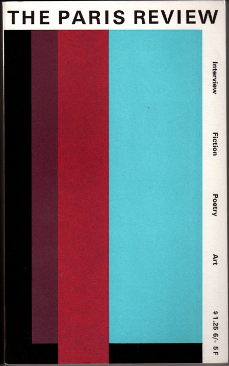
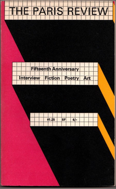
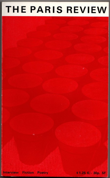
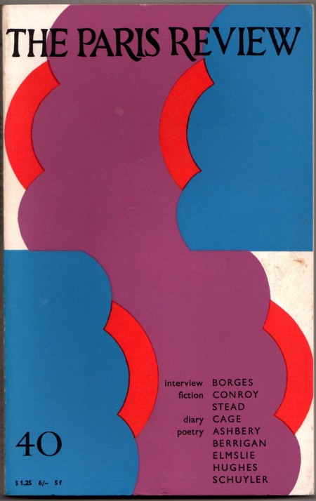
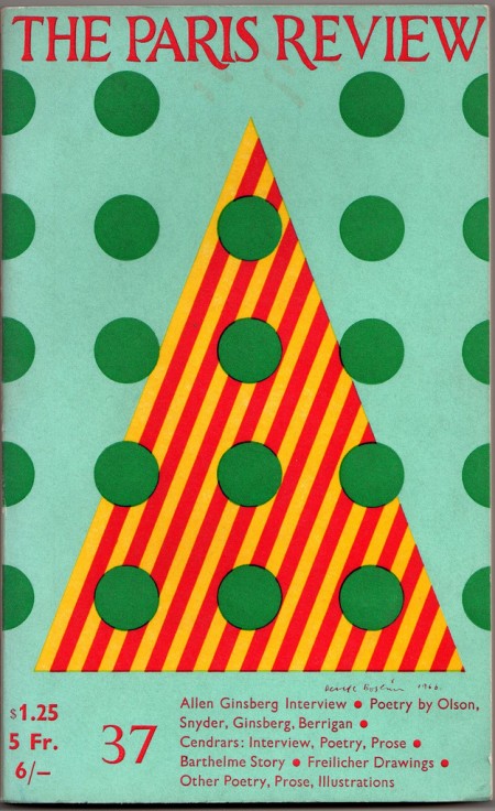
I came across a beautiful set of The Paris Review covers over at Belacquashua’s Flickr today. The Paris Review is still around (see current site here) but apparently they fired their art director around 1970, because this isn’t exactly moving design. Just another casualty of the age of desktop publishing I guess. I have two theories relating to this sort of phenomenon: either quality design has just become too expensive for smaller publications to employ or the owner’s son downloaded Photoshop and he decided to “do everything himself because those designers never listened to me anyways”.
What’s most interesting is that the modern covers seem to be sort of cheap ripoffs of their own 50’s era covers. Another culprit in this mess might be digital photography. You’ll notice that a lot of the newer ones (example) aren’t bad at all design-wise but they have a completely raw, coldly digital photo where the beautiful, hand-drawn illustrations used to be. I guess illustrators are pretty expensive these days too.
Has anybody here studied this phenomenon in depth? I know this is a somewhat isolated case, but from my own subjective observations, the decline of quality design in magazines and books seems to be a constant across the board. Please let us know in the comments if you have any thoughts on this trend. I’d love to know what’s driving this.
Images via Belacquashua
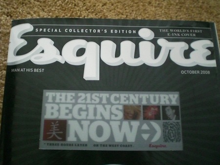


I guess for the most part it all comes down to personal choice. I’m looking at National Geographic’s from the last 40 years compared to from the last 10. Huge difference. Again, the only difference I can see is the shift to purely digital.
Is digital lesser quality or just less warm feeling than the old film/hand-drawn covers? As a follower of this blog, I think it is quite clear that I prefer more of a retro-style.
I am sure there are many people that will find the clear image of the man hanging from the crane to be much more quality than a hand drawn cover of triangles and circles.
I would like to know the position of readers not designers. Cause for designers old covers looks warmer and better. But maybe for target audience funny, clever digital photos more suitable?
It seems that in a few cases, the designers of magazines have forgotten the primary purpose of the medium, which is to tell the story. I think that some magazines have too many distractions and competing elements and I find that the story can be lost amongst all the junk. You can throw in all the graphical elements you want to make the design look interesting but if you can’t follow the story then the design has lost its purpose.
I don’t know what everyone else thinks, but my opinion is that not enough time is spent on understanding and employing good typography and basic design principles and I think this plays some part in the lack of quality in magazine design.
I am guessing that many people dislike the non-digitally produced art because it can seem like an inaccurate representation of reality or of what was intended. Also because people are so used to seeing high quality digital images that its distracting to them when they don’t see just that.
That being said I would have to say it is really up to the artist to insure that his/her work utilizes the strengths and weaknesses of the medium.
I recently saw a traveling exhibit of Vanity Fair covers which compared 1930s covers (all illustrated save for one photo-collage) of the original magazine with its 1980s re-invention which prominently feature some stunning Annie Leibovitz photography. The real shift seemed not so much from illustration to photography, or analog to digital but from editorial to celebrity. The modern magazine has shifted to a) having celebrities on the cover and b) printing all those blockquotes/contents on the cover. Design has been abandoned or forsaken by marketing. The New Yorker still stands out as the only publication of record I know that effectively uses a stable of illustrators for the cover and interior. I particularly cherish the covers by my favorite artists and its something they’ve commoditized so apparently there is a demand by their readers who wish to buy prints of memorable covers.
You got it. I think the suffering economy has driven this increasing mass of poor design. Small businesses are either no longer employing people to handle creative tasks or no longer outsourcing for the creative tasks, leaving “Bob or Barbara the Owner” – or their son or daughter – to either purchase photoshop or God forbid some other “Print Shop” type generic program and wing it. As for the big businesses – trim the more experienced (higher paid) players and get “Fresh Out of College Ted or Becky” to work for half the salary. It makes me wonder (considering we can dig ourselves out of this depression) if this will be critically discussed in the future as a design dark-ages…or if the prevalent body of eerily generic work from this time will be emulated as a revival of sorts in the future.
I think this turn on the kind of photos in the mags and books is part of a global cultural phenom that is going further and further into the “concept art” in which the important thing is the idea, and not really how it looks. It is part of a global over-rational situation (that ends being completely irrational). People care less and less about the beauty. People just wanna buy and show things that makes them feel clever but not sensitive, to be in the fashion everything must be perfect (quoting Scott), and maybe it is helped by the Trends, that bombards us all the time with cold and empty images saying less than a triangle but imposing the public, a “wannabe”, the appearance of the “””””cool””””” being. Obviously it is a vicious circle because at the same time the trends tends to take what people want and reinforce it.
I think that what we see from the fiftees was when alot of energy of design went into this simple modernistic design. The result was that some good looking stuff came out.
However, if you look at magazines of that time period that used photography, it doesnt look very well executed. So therefore little energy was put in.
Nowadays, its easier to make designs using photography, so the energy goes towards that style. I know there’s a whole world of magazine’s out there (fashion magazine’s for example) that have great design, using photography en typography in a way i’m extremely jealous of. Nowadays there’s design mixed with photography that 50’s designers probably couldnt even dream of.
therefore i dont think the design has become worse. The energy has just moved from one place to another.
ps. the paris review seems to use a grid and composition that matched their original idea of the design, but doesnt fit very well with photography. If they would fill their complete canvas with the picture, move all the information boxes towards the middle and use the right colours, i’d look fine.
Good points all around. I think I’m leaning towards the shift in focus to marketing being the major cause. That along with less well trained print designers in general probably led to this state of affairs.
But none of this is saying there aren’t great looking magazines out there still, there are, lot’s of them. I guess it’s just sad when I see a once great example like this which has devolved.
The other possible cause for this particular example might be diminished readership. This would be caused by the fact that most people don’t read interview magazines and other heady stuff like this that much anymore. But then again, they’re still around so someone must be reading, and having things printed is cheaper than ever, so perhaps they just skimped on the wrong things.
Kosmo_mishka-
good point, we as designers can all site around and posit on this but the only people who’s opinions matter are the readers and potential customers of that magazine. I guess it just seemed like back then the publishers didn’t really care about manipulating the reader, they just wanted to take pride in the quality of the production.
“Make the logo bigger!”
I’m voting for diminished readership. Plus, to gain new readers, magazines have specialized to appeal to certain niche audiences. All these magazines need covers, so nearly any cover gets the effort needed for an impressive design. There are just too many magazines, and most of them are directed toward niches; not the large audiences of the old days.
This visual pollution seems like the work of marketing departments run amok Few marketers see the value in a cover like the NY… and at the same time the audience isn’t discerning (or perhaps demanding) enough.
I recall fondly the days of Dirt Rag – where you just had the logo and reader-submitted artwork. Things like this:
http://www.dirtragmag.com/covers/36cover.jpg
Now it looks like this:
http://www.dirtragmag.com/covers/145cover.jpg
If you’re interested in seeing the evolution of a magazine in 20 years, you can skip through the covers quickly here:
http://www.dirtragmag.com/gal/cover-pop.php?thumb_issue_number=1
Think about where a magazine lives. It sits on a large shelf with 400 other magazines. Perhaps it’s not the lack of readers, but maybe that it’s the bulk of product.
I know that a magazine with nicely organized print on the cover with a beautiful photograph will not get nearly as many looks as “25 SECRETS OF THE ORGASM”.
Maybe like music, magazines are a dying breed because of the internet. I only hope that the ones who really really love what they do keep at it. Kind of like the renewal of vinyl album releases.
I really dig the point by Jason “I think that some magazines have too many distractions and competing elements “.
This just makes me think what does it take to make a good magazine? stay on one topic? cover a million topics?
wow. I really like the strong colours on these covers.
1. People don’t like to think anymore. (or it’s at least assumed they don’t)
2. In most cases the biggest motivation is money. In some cases it’s different, it’s even different for some groups at different times in their history, and there is more room for creativity and risk taking.
3. Good work doesn’t come from focus groups, no matter the goal, yet far too much weight is put behind appealing to the most people.
4. Perhaps the design and the art world used to closer together, allowing for more overlap?
5. Some level of abstraction, whether it be using two colors or using illustration, is almost always more interesting than color photography. Unless it’s really an interesting photo, a color photo is pretty close to reality, and that makes it pretty boring.
I think another good example of this Blue Note album covers, they were beautiful when there were black and white, two color, etc. But later down the line the move to full color was made and the results were half as good.
Sadly, more and more, newspapers and magazines alike have begun cutting their design staffs. Our beloved department is seen as a luxury and not a necessity in this age of increasingly thinner profit margins. A good template is seen as the only thing necessary to produce a product.
To some extent, it makes sense. It is extremely expensive to keep a staff of designers that don’t do any sort of reporting or writing. And for good design, you don’t really want a designer that multitasks as a reporter. The same could be said for a reporter, but their degradation in work is less obvious.
It’s all business.
For the record, the link provided as an example of bad design and desktop publishing (http://donswaim.com/images/ripley-parisreview.jpg) is not a real Paris Review cover but a poorly executed parody.
it’s harder to find a good illustration than it is to find a good photograph.
if someone tells you they’re a photographer and sends you 10 photos for an assignment, chances are even if you aren’t really into their work at least one of those photos will suit your purpose.
if someone tells you they’re an illustrator you better be sure you like everything they do before hand cause they probably won’t send you 10 drawings and even if they did… if one sucks they probably all suck.
also:
in regards to shane’s comment… yeah, the art and design worlds were closer together in the past… cause you actually had to be some sort of artist to do design. if you wanted an image you had to draw it or in some other way physically create it.
of course there are still some art minded designers… they are the ones that stand out… but most are just technically minded office workers. they go to college and learn some rules and a slew of computer programs and that’s it. little to no real creativity actually necessary.
… but that’s who gets the jobs cause they’re way easier to manage.
To be fair, at the time I doubt these publications were vying for the same degree of attention and Google-shortened attention spans of modern magazine fans.
I’ve also noticed a similar trend in music cover art that’s really taken over the past decade as well by using almost strictly photos and simplistic typefaces. It’s always a shame seeing art disappearing off the bookshelves but I think the quality that remains is much more engaging to the real artists out there who still buy and support the publishers (and labels) that still respect infusing an artistic sense into a medium increasingly based on immediacy and attention-grabbing headlines.
Nice colors and figures
I’m a graphic designer and a subscriber to the Paris Review and have been for a couple years. It’s worth mentioning that most writers consider it to be THE pinnacle of literary publishing. And yes the covers are not as pretty or interesting as they could be, but the photography is always part of a larger feature in the magazine. I consider it to be outstanding, and don’t understand the criticism it’s received in the previous comments.
Did anyone bother to even crack a PR open?! the interior layout is better than a lot of other publications in my opinion. Ad-free and showing a massive amount of restraint.
My final point is that the Paris Review has been finding and featuring quality lit for over 50 years. They’ve been dedicated to their mission and have realized it on their own terms without succumbing to advertising or an alternate agenda. I feel that speculating on the quality of the operation of such a magazine is a real low blow for designers to throw. To me this only adds fuel to the age old comment of writers and copywriters, Designers don’t read!
The Paris Review is a great publication, not only for what it contains but for what it’s done for contemporary literature. Pooh-poohing a handful of covers appears infantile and petty in comparison. The story of the publication is an amazing one. Google the founder George Plimpton and do a little nosing around.
I like this style, very nice!
Dear Scott,
This has been such an interesting discussion! I’m grateful to you and your readers for taking such an interest in the covers of The Paris Review.
I share that interest, to say the least. My first act when they hired me to edit the magazine, six months ago, was to hire my favorite book designer, Charlotte Strick, to be our new art editor and to redesign the magazine. (Charlotte is the mastermind behind such recent hardcovers as 2666, The Collected Stories of Lydia Davis, and Freedom.)
Partly for reasons that your readers have touched on, Charlotte and I decided to move The Paris Review away from photography in favor of other kinds of contemporary art–always choosing things that would reproduce well in our specific format. Our first cover features a Redon-esque painting from the recent William Kentridge retrospective at MoMA. (No market testing involved: I walked into the show and fell in love.)
We also went back to the original “masthead” (as you designers say) of 1953; we preferred the warmth and the proportions of the old metal type to a digital approximation.
The new magazine is slightly slimmer–and a lot heavier–than its immediate precursor. We chose a text stock that would hold artwork as well as the old stock had held photos. We studied the covers from the 1950s-2000s, not in order to copy them, but to see how various editors had solved the design problems that come up, over and over again, across the decades.
It is a frustration to me that we can’t use metal type all over the cover–here we have had to bow to practical considerations–but I think you and your readers may agree that the design works very well in “person,” possibly better than it does onscreen.
I’ll be grateful to hear your thoughts on issue 194.
Best regards,
Lorin Stein
Editor, The Paris Review