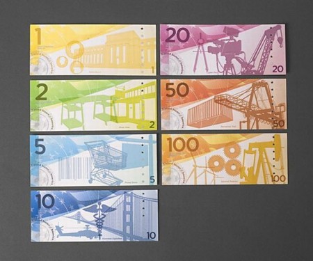
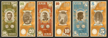
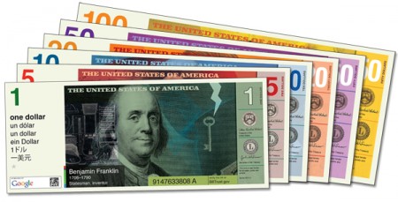
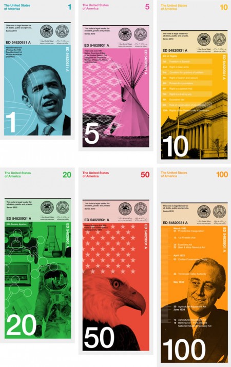
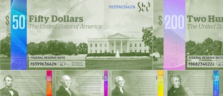
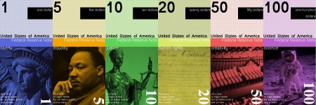
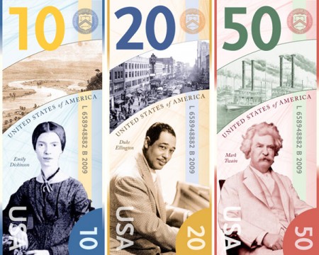
A great practice idea for graphic designers is redesigning the US Dollar, compared to Canada and many European countries I feel we just got screwed a bit, while the detailing in the US dollar is classy I feel like the overall collection from coin to paper is not the best it can be, I don’t think any of the designs above are the answer either. I was thinking would anyone be down to submit redesigns to ISO50 and we can have a contest with giveaways? Let me know below if its a good idea and i’ll get together a submission post.
The US Dollar needs a redesign?
09.12.2012

Yo Scott
As long as there is a rule for NOT using helvetica. hahahh I just dont see it working on money, they look like pamphlets 😉
L.
^ Jakub
I love the idea! Let’s do it!
Sounds good, but we should make a rule that Obama or Obama branding can’t be on anything. I mean realistically the sitting president would not be honored on any money.
Great idea! And yeah, some guidelines would definitely be in order (what specifically is getting rebranded? colors, type, content, imagery, etc?). Sounds like a fun project, I’d enjoy doing it!
Do it–I’d submit!
I’m in!
Yes!
I have always wanted to re-design the dolla dolla bill. I think this is a great idea. I also think guidelines are in order. Im IN
I’m game!
Some of these designs are amazing… except for the one depicting OBAMA. Really? I know most artists are bleeding liberals (or socialists), but seriously? And I’m a democrat.
Actually, there should be at least a 20-yr waiting before putting any recent president on U.S. currency.
Both parties and their greed got us into this financial mess.
Made me think of http://ericarcher.net/devices/moneysynth/
Im actually surprised that you said the designs weren’t right fit for currency. I actually beg to differ, the idea of larger denominations being a larger size somewhat is a novel idea, and placing things other then presidents, like the Moon landing for example, is actually very progressive.
I don’t have the skills to design one, and if i did it would be way sub-par comparatively, however I would love the opportunity to critique on some designs if possible.
I’m in!
I agree, some of the designs above are OK.
I think one rule SHOULD be to have different sizes for each bill. Many countries do this already for blind people. Think about it: how else could you differentiate between US bills now.
I have an article somewhere about the call to the dollar redesign. I’ll see if I can dig it up. But one major reason is to change sizes of denominations.
I’d get in on that!
Sounds like a great idea. Would love to showcase your submissions on our site: http://richardsmith.posterous.com/
I can only suggest of not using too many strong political statements (especially the “progressive” or religious ones). Nature, iconic & historical urban scenes etc. would be a-OK.
This would be a great challenge yet great practice. Definitely something i am sure most of my BFA classmates @ Long Beach State would be interested in being a part of. I think its a great idea!
We need to get rid of the whole concept of money.
As a brit can I just say I love how dollars look. I know this will sound dumb, but its just so American, I love how they’re all the same colour, the designs, its stuff you see in movies and stuff, like yellow cabs or something. So my 2 pence is your money is fine as is
https://store.nwtmint.com/images/products/2081__orig.jpg
I’d certainly exclude “Federal Reserve Note” on the new design as the FED needs to go and be replaced with our own governments reserves. Well, I suppose that’s a whole other story, but worth understanding. Nice concept though.
its up:
contest rules: https://blog.iso50.com/29484/iso50-us-dollar-re-design-contest/
See more ideas here: http://www.dollarredesign.com/submissions
Hi,
You might have seen this before. The Swedish government made a similar contest this year and Stockholm Design Lab made a really nice proposal.
Read about it here: http://www.stockholmdesignlab.se/proposal-for-new-money/
They didn’t win….
I’m always up for a good design challenge! Guidelines would be great!
It does seem strange while im on holiday in the US (from the UK), that all your notes are the same color and the same size, yes is looks cool (nod to ‘A’), but how to blind people tell the difference? What about when its dark, how many times have you handed over a $10 (or a $50!) instead of a $1 and been ripped off at a bar?
Maybe in a new design you guys could do something totally new to solve these kind of problems, rather than copy many other areas of the world and have different colors and sizes?
I look forward to seeing the results