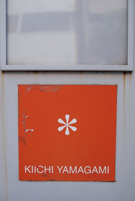
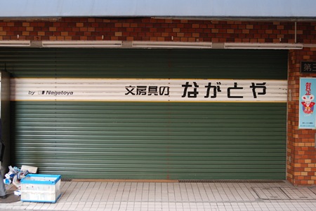
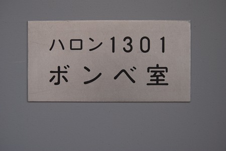
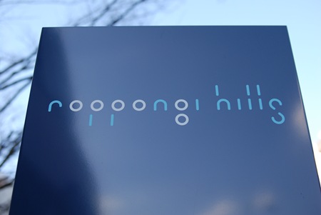
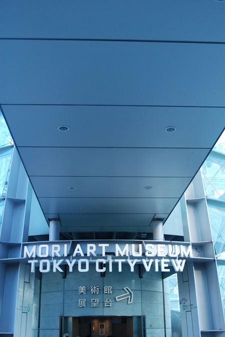
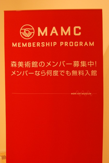
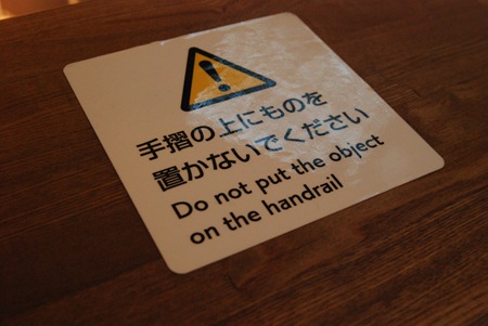
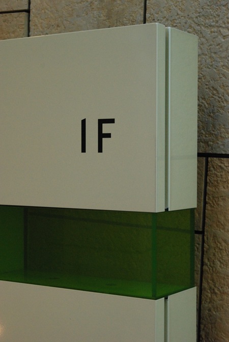
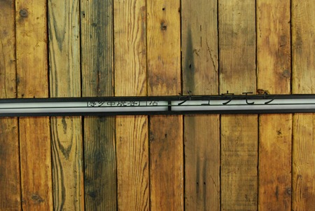
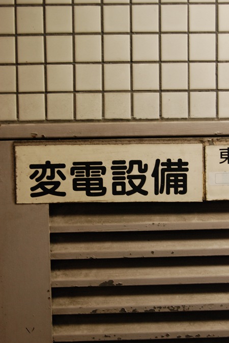
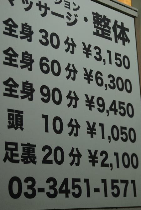
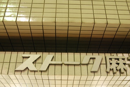
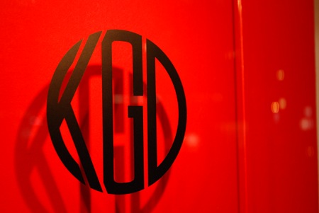
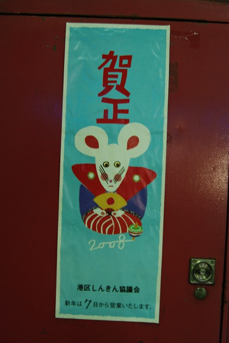
The typography in Tokyo is absolutely incredible. Everywhere you look you’ll find great examples of type usage. The images above are just a random sampling, mostly from the Roppongi Hills area of Azubu-Juban Tokyo. I wish I had more time to take some better shots with film, but I’ve been using my Nikon digital for quick posting. I will try to get the Lomo out in the coming days, it seems to be the only camera I can get consistently good results with.
Tokyo Signage
01.04.2008


Your photos really brings back good memories. Keep em’ coming!
thank´s for the terrific desing…
the nagatoya garage is pretty awesome
wow! anyone knows if this:
is actually a font?
edit:
ah, no html in the comments. i was referring to the fourth picture with the “roppongi hills” sign.
Damn, great stuff..expecially photo 4, keep us posted!
later.
@ alex,.. I think it a font created for the logo. Never seen it used before. I have seen the logo though.