httpvh://www.youtube.com/watch?v=5wWBLbQInqk

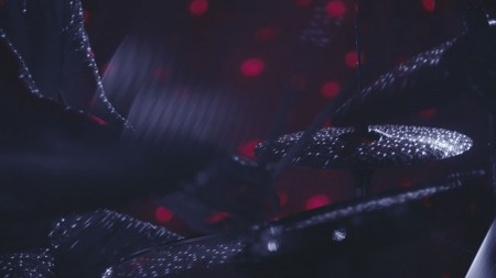
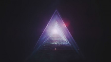
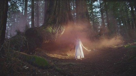
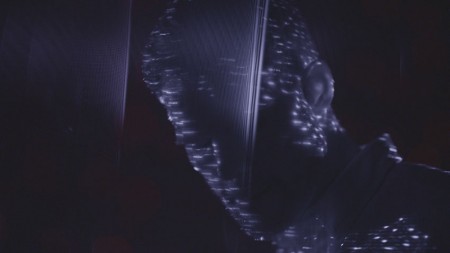
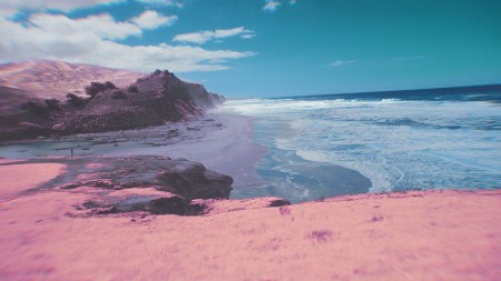
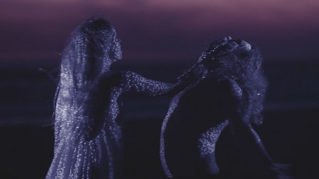
We’ve released a new Tycho single and a GMUNK-directed video to go along with it. Lot’s process over at GMUNK’s blog. Enjoy!
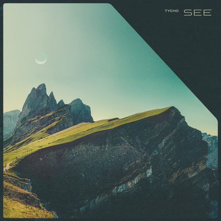
Cover Art Credit
Design & Layout: Scott Hansen (Tycho)
Photography: Lukas Furlan
Video Credit List
Director: Bradley G Munkowitz
Assistant Director: Ian Colon
Executive / Line Producer: Andrew ‘Demansky Devankeys’ Devansky
Concept: Bradley G Munkowitz, Ian Colon, Joe Picard
Director of Photography: Joe Picard
1st Camera Assistants: Magaera Stephens, Noah Hassie
2nd Camera Assistants: Dakota Wilder Smith
Grips / Lighting: Tej Verde, Dakota Wilder Smith, Patrick Walsh
Props design and fabrication: Conor Grebel, Mike Williams
Practical FX design: Conor Grebel, Mike Williams
Lead Actress: Hannah Helena Bjørnø
Lead Actor: Eone Darke n’ Cray
Makeup: Melissa Capistrana
Production Company: Ground Control UK
Executive Producer: Michael Stanish
Editors: Bradley G Munkowitz, Ian Colon
Post Facility: Glassworks UK
Colourist: Matt Hare
Flame Artist: James MacLachlan
Process Photography: Dan Cowles, Maris Curran, Dakota Wilder
Process Editorial: Cyrus Tabar
Camera Rentals: Chater Camera, Keslow Camera
Equipment Rentals: Little Giant Grip & Electric
Extra Special Thanks: Autofuss + Bot & Dolly, Ghostly, Tycho


man the single art (top) is a really excellent direction. a play on sci-fi but nothing we can’t experience here on earth. lo! we live in a fantastic place!
video was fun, with some excellent visuals. seeing you guys live is ever more on the top of the to-do
Fantastic job
Scott you are amazing. I love all of your music. I was so stoked tween I found out you were playing in my town in Va. The show was short which made me sad but soo incredible. The show was beautiful but I still had my eyes closed for almost he entire set just disappearing into the euphoria that your music brings me. I can definitely say I have never felt a high like I did the day of your show. Thank you for what you do.
Will there be a remix album or EP/Single?
Fresh & crisp.
That girl is very surprised and amazed by all the things happening to her. She can’t handle the woods. Send a helicopter to get her in the forrest… hurry! Before it’s too late!
The cover art is stunning. It’s what I’ve come to love about the aesthetics of ISO50 – visual and audio. It provokes imagination.
But dude WAT – dat video? Your work has always seemed to me about ambience, color fields, fuzzy optimistic memories. I just found it a bit literal, not to mention the hippy girl on acid. Her faces were killing me.
I think the trip should be implied, not showing ACTUAL people bugging out in the woods with circles and shapes and stuff. A little cheese.
Still a fan though.
I’m with Maestro Muerte and Bob,
I love all you work, graphic and musically speaking. It has been one of my inspirations for some time now…
But… That video just gave me the creeps.
In comparison with the visuals/video of Ascension it’s just a big step down.
the actress is just terrible… No words about her face, it’s just plain and clear uncomfortableness all around… And the concept is just so… I just don’t have words.
I’m sure Anna Martin from Ascension video would make that 10 times better, but I’m just saying. 😉
Anyhow, it’s just… I feel like saying that that change you made to the whole concept and feeling of your music, post making it to the band, is getting some strange figures in the end… and they are not fitting all up.
Just saying.
anyhow, lots of love!
Great track- thanks for the inspiring music over the years. I caught your SXSW show in Austin a few years back and had a great time.
Gotta agree to Zigmas and the other guys,
I adore your concept and music, but that video felt pretty ‘wannabe’ – would have liked it a lot more with only the scenery and without any stuffed in story…
Thank you anyhow !
I couldn’t agree more with some of the other comments! I am usually totally inspired by you guys visually but that video is just terrible.
I must say, I somewhat agree with Zigmas‘s sentiments. There seems to be a very pronounced disconnect between the music videos, and everything else. Your design and artwork have always had a perfect symbiosis with your music, to the point where they seem inseparable.
The official music videos are very flat. With what seems like a cobbling of abstract visual themes, which feel kinda directionless.
For me, Meridian by Brian Bowman was the closest thing to a Tycho music video.