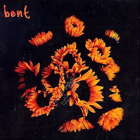
 An old favorite, this one never goes out of style. The loose breaks are so key, they really carry the song. And no, that’s not the cover to “Programmed to Love” up there. The real cover is so excruciatingly bad that I just couldn’t bring myself to post it along with such a nice track.
Invisible Pedestrian
10.14.2008


Thank you for all the good music and wonderful art !
bent does rules…. but what’s so excruciatingly bad about the real cover? don’t really get it… at least its on tone with the quirky style of the music and its memorable that way… at least more memorable than bleach bypassed generic flower shots no?
Great song, I remember discovering this one in the late fall of freshman yr on one of the internet radio stations…I had it on a mix CD I made right after dropping out of a fraternity I was pledging.
Fantastic Scott. I haven’t heard this in quite awhile. I love the opera-style voices near the end. This song also reminds of the Four Tet song Smile Around The Face.
I love Bent. Actually, I’m not that familiar with their “Programmed To Love” album though. But I love Ariels
johnsson-
I’m not a fan of the original cover (Link) in a strictly visual sense and for me, it wasn’t in line with how I feel when I listen to the music, so it doesn’t really communicate properly. so yeah, I guess for me personally, it failed on both of the main objectives of design. if it had one or the other it would be passable. also, the typography was not my style at all, and typo is usually the first thing I gauge a good design by. of course, this is just my opinion, and I am sure bent and the artist who designed the cover feel very differently from me and that’s what matters since it is their music. as for the cover I did put up, it’s another one of their albums…. you’re right, it’s nothing special but I couldn’t find any imagery relating to them online that really grabbed me and so I went with this.